Minimal Twine Styling
An Opinionated Guide
I’ve been working on a web page with a color/font picker and a live demo of what the text looks like, but I keep not finishing it, so I’m just going to post this text for now and I’ll come back and add a link when I finish the tool.
I’m not a typographer, or a graphic designer. In fact I think a lot of the stuff they get really het-up about is pointless navel-gazing. So take this with a grain of salt: it’s more “if you have no idea what to do, here’s one possible starting point.” I think these things are fairly easy and can help your presentation stand out.
- Shorter lines are more comfortable to read. Aim for somewhere in the 50-75 character range.
- Good contrast is imprtant (light/dark).
- Fully-saturated primary colors tend to get overused, so consider changing the hue a bit and also making the color a bit less intense.
SugarCube - line length
.passage {
	/* an "ex" is supposedly the width of an 'x' character.
	 * A lot of characters are narrower, so you get more. */
	max-width: 55ex;
	/* Set the side margins to "auto" to center the block. */
	margin: 0 auto;
}
Harlowe - line length
tw-passage {
	/* an "ex" is supposedly the width of an 'x' character.
	 * But a lot of characters are narrower. */
	max-width: 55ex;
	/* Set the side margins to "auto" to center the block. */
	margin: 0 auto;
}
I think it helps to pick just two or three colors and stick to variations of those.
You want to be sure you have good contrast, so choose quite a dark color for your background and very light colors for your text (or vice versa).
Complementary colors (those directly across from each other on the color wheel) also tend to stand out against each other.
Beginners tend to pick fully saturated intense colors, so graying them out a little is a cheap trick to maybe seem like you know what you’re doing? I also tend to avoid pure colors (straight red, yellow, magenta, etc.) for this reason.
I saw an old paper once that had an idea that seemed fun to me: count a 3/4/5 triangle around the 12-element color wheel. It doesn’t really matter but I like the idea of it being slightly askew rather than directly complementary colors (straight across the color wheel) or a perfect equilateral triangle.
So find a color picker with a color wheel:
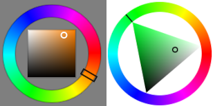
Pick a dark background color.
Then pick a light color for your main text by going straight across the circle and picturing it as a clock face and moving it by one hour so you have a 5/7 split. You probably don’t want your main text to be too garish, so make this closer to an off-white than a really intense color.
Then split the bigger side not quite in half again, and use that as your link color. This one should also be light but you probably want it to stand out more so make it more intense. And you might choose a dimmer value of the same color for when you hover over a link with the mouse. Harlowe also uses a different color when you’ve visited a passage, but maybe let’s keep things simple and just use the hover color for that.
SugarCube - colors
body, #ui-bar, #story, .passage {
  background: #141335;
  color: #ffe9b8;
}

a { color: #4aea75; }
a:hover { color: #36b157; }
Harlowe - colors
body, tw-story {
  background: #141335;
  color: #ffe9b8;
}

tw-link, tw-enchantment { color: #4aea75; }
tw-link:hover, tw-enchantment:hover { color: #36b157; }

tw-link.visited { color: #36b157; }
tw-link.visited:hover { color: #36b157; }
And finally, you can choose a different font if you like. Google Fonts isn’t a bad place to look. Click on a font you like, then there will be lines of text in different weights and styles, and you choose which ones you want: you probably want to select at least the normal (and italic?) 400-weight and the 700-weight bold. Then there will be a bar on the left that shows your selected families. In the “Use on the Web” section, select the @import rather than the <link> format, and paste that in at the top of your stylesheet (make sure you put the @import statement above where you try to use the font).
So your stylesheet will have something like this (note that for multi-word font names the import statement uses + symbols and the font-family style name uses spaces).
I’ve also chosen a fairly large font size to go with the shorter line lengths.
SugarCube - font
@import url('https://fonts.googleapis.com/css2?family=Libre+Baskerville:ital,wght@0,400;0,700;1,400&display=swap');

body, #ui-bar, #story, .passage {
  font-family: 'Libre Baskerville', serif;
  font-size: 18pt;
}
Harlowe - font
@import url('https://fonts.googleapis.com/css2?family=Libre+Baskerville:ital,wght@0,400;0,700;1,400&display=swap');

body, tw-story {
  font-family: 'Libre Baskerville', serif;
  font-size: 18pt;
}