Faerethia
Art: More white text on black background, but the dressed-up-for-Ren-Faire version. (It kind of reminds me of a still from a silent film, which, at least it reminds me of something). 2/5
Blurb: Gets across its point, albeit bluntly. Blame “The Ones Who Walk Away From Omelas,” or for that matter the original Utopia, for me suspect the blurb is hinting at some underlying cynicism, despite outright claiming it’s not. (Other nitpick: The recipe/“generously seasoned” framing is rather stock, and a bit glib for the probable tone of the story.) 2.5/5
Intangibles: Music is good. +0.5
TOTAL: 5/10
Fat Fair
Art: I hate to say it, but this is decent. The sign portion knows and conveys exactly what it wants to (which, well, we’ll get to that). The background isn’t as good—it should be more lurid, less generic 3D render, and there are artifacts all over the place – the sky, the borders. 3/5
Blurb: Again, on a pure craft basis, this is OK; it doesn’t immediately settle on a coherent/consistent aesthetic, but eventually gets there. Most of the weight (no pun intended, I swear) is pulled by the title, and the following sentence, which just looms: “Contains crass humor. And worse.” 2.5/5
Intangibles: I’ve tried very hard to keep this out of the main sections, but I can already tell that this game is flagrantly not for me. -1
TOTAL: 4.5/10
Flight of the CodeMonkeys
Art: A lot of major problems: a heavy-bordered, cartoony drawing that’s haphazardly sharp then blurry, cut off at the top with some parts not fully painted over; a clip art-y computer with lighter borders than the monkey, an oddly sized sliver at the bototm and heavy artifacting; unstyled text (could use a drop shadow, could use less janky kerning/sizing, could use committing to whether it wants to be terminal font or not) that crashes into the art.
It’s weird, though, because Marc Marino’s past work is a lot better visually designed than this (Mrs. Wobbles and the Tangerine House is the game that made me want to use Undum/Raconteur), and the problems here are so many and so blatant that, given the game’s theme, I almost think this is supposed to look bad, as if the image is “buggy” and needs to be fixed. But the problem with that is, that’s still the image you’re presenting your game with. 0.5/5
Blurb: Suggests a fairly common plot: “you are a worker cog in the machine, but will you resist? Is resistance even possible??” While timelier every day, and not quite played out (I’m biased, having recently written a game with the plot), the genre is heavily populated and often relies on the same few beats, hit loudly and unsubtly. The blurb here suggests the game will consist of the loud, unsubtle bits, and has a lot of awkward trail-offs. (One of which, the “special friend” bit, also introduces a sudden suggestive tone I’m not sure is intended.) There are more interesting parts to highlight than the plot beats, at any rate—the winged monkeys, for one, or… 2/5
Intangibles: I did click through and start playing this one, and it’s hosted on Google Research, of all places, and built around actual code manipulation. As always, I am in favor of cool experiments. I’m also in favor of people who do cool experiments making it more obvious that they’re doing so. +1
TOTAL: 3.5/10, but I am almost certain this is underselling the work dramatically.
Flygskam Simulator
Art: I’ve mentioned this before and will mention it again: One of the most common problems I see in IF cover art—cover art in general, really—is tonal mismatch. Ideally, every component of your cover art should cohere, and not talk over one another in color scheme, mood, etc. When looking at the photo, your gaze shouldn’t feel torn from place to place. It’s possible to do tonal mismatch on purpose, but as with any breaking of rules, you have to really, really know what you’re doing, and even then it may not work. A lot of times the clash happens with art vs. text – see Bradford Mansion above. Here, it happens with art vs. art.
The top third is fine; it maybe gives off a bit of a children’s phonics reader feel, but that is 1% the font and 99% because for the past week I’ve been proofreading dozens of children’s phonics readers. In the rest, we have real-world photos that are just slightly dingy, and full of little interesting details, particularly in the middle. They convey a clear intent: heavily leaning on the sense of a real place, with real quirks. (That said, the details get lost at small size, and there is a slight distracting “wait, is this comped?” element to the three buildings.) In front of the photos is a cartoony, neon green, MS Paint bus. Serious and goofy. Candy and potpourri. Preschoolers and thirtysomethings. And the whole thing recedes beneath the big heavy white of the top third; even the bus doesn’t fully balance it. As a result, I have no idea what this is trying to convey, which part is intentional and which isn’t. 2.5/5
Blurb: Sets up an initial premise, but nothing after. The blurb could be the start of a plot-heavy story. It could be the start of a deadly-gauntlet series of misadventures. It could be the start of a mundane board-the-bus-leave-the-bus-remember-your-stuff simulator. It doesn’t seem like it’ll be comedy, but who knows? I also wonder if I am going to literally be Greta Thunberg. (Well, technically speaking I don’t wonder, because I’ve played this and know which it is, but that’s cheating.) 2.5/5
Intangibles: The “flight simulator” pun did make me smile. More seriously, this is exactly the kind of topic I want to see more work tackle, if it indeed tackles it. +0.5
TOTAL: 5.5/10
For the Cats
Art: The font isn’t Papyrus, but it’s way too damn close; the color is a bit too green, or the wrong green; but otherwise the text is basically fine. The photo is less fine—it kind of seems like the intent is to look vaguely lurid, but the cat itself is fuzzy – almost uncannily so, like something off This Cat Does Not Exist – and, besides seeming vaguely off, doesn’t really provoke an emotional response either way, which is the opposite of what you want from a cat picture. You might not want to go too far into disturbing given the game’s theme, and obviously it would be easy for a cat to be distractingly cute. But this approach doesn’t seem right either. 2/5
Blurb: Does its job, gets in, gets out, though the tone is a little arch/earnest for my taste. But the content warning, in particular its specificity, is appreciated. 2.5/5
Intangibles: It is kind of funny that there are now two entries this year that can be described as heartwarming AU versions of Chandler Groover games. +0.5
TOTAL: 5/10
For the Moon Never Beams
Art: Clearly trying to emulate Infocom box art, which undoubtedly gives a lot of people a big nostalgia dopamine hit, but to those who lack those particular nostalgia-dopamine receptors looks like a lot of puzzling choices. The stripes are a bit more garish than the ones on the old Infocom boxes, the text is vaporwave-y in a way that suggests the 2019’s idea of the 1980s retrofitted onto the 1980s; the portrait doesn’t read '80s at all so much as those online paper doll sites that were all over in the mid-2000s, with the accompanying strangeness of expression and pose. I don’t know whether the idea is more ambitious than the artist had the present skills for, or whether it just needs a pass for polish, but it honestly just looks like a knockoff. 2/5
Blurb: I’ll mention this again (with this many entries it’s hard not to repeat oneself), but there’s a particular reflex in blurbs that almost never works: the “…or is it?” postscript. The preceding sentence virtually provides all the necessary hinting and irony on its own. Here, you don’t need to suggest there’s something sinister; leaving the blurb hanging on “Is it something you said,” in a story with a lonely road and a Poe reference, is sufficient and stronger. Otherwise, the rest is fine; the blurb suggests a kind of Monsterhearts via “Annabel Lee,” even if it does also suggest a nonzero chance of the premise veering into yikes. 2/10
Intangibles: Also, this is very specifically set in 1993, so the chance of teenage-girl anachronisms is very nonzero. (I’ve played a bit of this; the yikes haven’t materialized, but the anachronisms have.) -0.5
TOTAL: 3.5/10
The Four Eccentrics
Art: When I said that some covers would be infinitely better with no text, this is the one I had in mind. The white text is just sort of slapped on, clashing with the rest (white on yellow usually does that), and distracting from an otherwise good photo. I’m not sure the photo is right as this cover art—it’s very good at being an evocative, saturated autumn scene, and not that good at conveying four or any eccentrics—but it’s right for something. 3/5
Blurb: Promising premise and good worldbuilding that sound less compelling than they may well be because the blurb is contorted into generic story-jacket talk: “Can you wake up? Can anyone help you escape?” (It also says “dream” one time too many.) But at least it surfaces, if not quite showcasing, its interesting elements. 3**.5/5**
Intangibles: Substantial chance of this turning out to be the Eunice of this year’s competition, i.e. way too earnestly twee. -0.5
TOTAL: 6/10
Frenemies
Art: N/A
Blurb: Not terribly promising grounds: the teen angst of “so-called ‘friends’” ditching you for parties, the sexually frustrated angst of your so-called friends ditching you because they also have daaaaates, the phrase “immersed in your favorite IFs,” seldom before uttered by any actual person, the canned escape-room premise. 0.5/5
Intangibles: “I won an Andy Phillips game!” is the weirdest of flexes; this seems very much like a nostalgia piece with an audience of two. Actually, make that an audience of one; I’m not convinced even Andy Phillips is still in it. -1
TOTAL: 0/10 (might be higher with art)
Girth Loinhammer and the Quest for the Unsee Elixir
Art: Is certainly… overt, in an Oglaf kind of way, though the text does crowd the art somewhat, and the whole thing does leave some questions about the exact level of pornography that will be involved. (Also, the red-border-and-possibly-drop-shadow styling of text is one of my biggest design peeves, but it’s a battle I’ve given up on winning.) 2.5/5
Blurb: Meets the bar for minimum viable blurb, but then there’s that “…or can they?” again. If your game is titled The Quest for the Unsee Elixir, the audience can assume that the things, in fact, can be unseen. Also, those things seem fairly likely to be a lot of cheap gags about sex and/or kink. 2.5/5
Intangibles: One of my favorite comedy sequences is Bill Murray’s dentist scene in Little Shop of Horrors. This seems like it will entirely consist of A) that joke, and B) not as funny a version of it. -0.5
TOTAL: 4.5/10
Gone Out for Gruyere
Art: N/A
Blurb: Huh, well into the G’s and this is the first obvious shitpost (Fat Fair, somehow, has legit effort put into its blurb). The blurb is itself. 1.5/5
Intangibles: Nonzero chance, given that the author has also released an Andy Phillips trivia game, that this game was written to score a Stilton-plus on the Cheese Rating Scale, which as in-jokes go is a seriously deep cut. +0.5
TOTAL: 2/5 (scaled: 4/10)
The good people
Art: Aiming deliberately for a defined effect, but there are a number of things that aren’t working for me. The “an interactive story by Pseudavid” text is both way too small and unnecessary (the former because it’s in the comp, the latter because it has a Pseudavid logo); the particular font and shading are somewhat WordArt, and become difficult to read when they crash into the image; the image is mostly good but would really work better on a non-white background (my instinct is something close to the purple or taupe). 2/5
Blurb: Three sentences, each of which is progressively better as a standalone blurb, but that together, come off as three separate drafts of a one-line blurb, for some reason shown together. As usual, the explanatory part is unnecessary, including “a computer or tablet is strongly recommended to play.” In a festival setting, on Itch, etc. this would be important to know, but I suspect very few people play comp games on mobile, and none only on mobile. 2**.5/5**
Intangibles: N/A
TOTAL: 4.5/10
Hard Puzzle: 4 The Ballad of Bob and Cheryl
Art: Black text on a white background, plus a photo of a stool. It’s not particularly wacky, but at least competently done, and realistically speaking, nobody’s here for the art; they’re here for the Hard Puzzle. 2/5
Blurb: Again knows its tone and achieves it, with understatement even (I’m assuming the “stool” thing is a joke). “A silly little IF puzzler. Can you solve it?” as usual is extraneous, being implied by the blurb and by calling the game HARD PUZZLE—or by people having played the first three. Not extraneous: the fake/snarky recommendations from, I assume, beta testers. The joke is stock, but I haven’t seen it much in an IF context, and it still amused me. 4/5
Intangibles: The latest in a series that some people like a lot—the forum thread for it is massive—but that generally hasn’t been my thing. -0.5
TOTAL: 5.5/10
Heretic’s Hope
Art: Oh my god you have no idea how refreshing it is to see a cover image this vivid after a sea of blank backgrounds. I don’t think this is finished per se (my gut sense says it needs a few more tweaks—maybe text placement, or the fact that the portrait’s less detailed and more watercolor than the background; I wish I could be more helpful), but it is clearly in an entirely different league. 4.5/5
Blurb: Also basically good, although the ratio of generic (gods and monsters, blessings and curses) to specific (a giant insect apocalypse, possibly the divine decree if I knew what it was) is too heavily tilted toward the former. 3.5/5
Intangibles: N/A
TOTAL: 8/10
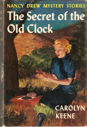
The House on Sycamore Lane
Art: Basically fine, gives me a bit of an early-Nancy-Drew-cover feel. I don’t love the text (mainly, the solid black against the dark clouds), but it’s true to those covers. 4/5
Blurb: Less fine. Gives me the impression the game will be functionally identical to Bradford Mansion and to any other specified escape-the-dreary-manor game. 1/5
Intangibles: N/A
TOTAL: 5/10
iamb(ici)
Art: This year seems to have a mini-trend of extreme close-up pixelated backgrounds. I don’t like it particularly, but paired with the terminal text here, it seems like a more purposeful choice than some. Similarly, I don’t love the fuzziness of that text (and it doesn’t at all work full-size), but at least it is going for an effect. Bumped a point because I’ve played the game, and to be fair, it isn’t super easily translatable to art. 2.5/5
Blurb: This sort of faux-corporate affect is very hard to get right—not only is it easy for the irony to drip too heavily, but actual corporate communications do a better job satirizing themselves than any fictional versions can. The blurb does suggest some potentially interesting mechanics/structure, but could suggest them harder. 2.5/5
Intangibles: The content notes seem to suggest this will be in a visual-novel idiom that is very much not my thing, but I’m still tacking on a point for the suggestion the author is trying something ambitious. (This is another entry I’ve briefly skimmed, and while it really could use an editor and a UI, or even just CSS beyond the default Twine styling, the author is in fact trying something ambitious.) +1
TOTAL: 6/10
Island in the Storm
Art: Well-composed, good choice of mosaic, but something is off. (It may be as simple as the white background. Or maybe it wants to be a portrait-orientation book cover, with more space at the top and bottom?) Still, clearly the work of a designer who generally knows what they’re doing. 3.5/5
Blurb: Less good—generic premise, awkward phrasing, grammatical errors. Another perennial comment: I’m seeing a lot of blurbs that lean on statements that there will be, somewhere in the game, a mysterious twist. But mysteries are compelling because of the mysterious circumstances, not just the idea that there might be some mysterious circumstances somewhere, maybe, if you press on. 0.5/5
Intangibles: Statements like “this is the first full-length game ever designed in [obscure engine]!” I assume are meant to read as “I am a trailbreaking innovator” but often actually signify “this is meant as a proof of concept, not a standalone game,” or “this is a janky groverengine that may well be unplayable on your machine,” usually because if they don’t demonstrate a use case for the new engine besides proving you can homebrew IF with it. (Also, I now have “Islands in the Stream” stuck in my head. I’m not taking points off for that, but I do.) -0.5
TOTAL: 3.5/10
Jon Doe—Wildcard Nucleus
Art: Another text-on-solid-background cover, but one by someone who can clearly draw and has a good eye for design, though the author’s name could be a tiny bit larger. Another one I think might work better as a book cover, given that it’s definitely emulating one. (That said, based on a quick Google it doesn’t seem to be emulating any James Bond covers, or movie themes, which seems like an obvious missed opportunity.) 3.5/5
Blurb: Laser-targets what it intends to get across, which is “this is an extremely tropey game about spy intrigue that will not take itself seriously.” If anything—and I don’t say this often—it could lean more into the wacky. “Be a hero, save the world, get the girl!” in particular is a placeholder where a joke could be. 3/5
Intangibles: “Wildcard Nucleus” sounds like the Foodfight! version of Rybread Celsius, but I’m boosting this a point because I’m fairly sure this is a deliberate parody of similarly meaningless Bond titles like Quantum of Solace. (I’d say I reserve the right to retroactively un-boost it if it isn’t a parody, but that’d go against the idea of first impressions.) +0.5
TOTAL: 6.5/10
Language Arts
Art: A photorealistic, if poorly cropped, image of a billboard, with text that is obviously and half-assedly comped on—more like quarter-assedly, really. The stuff around the “THE FUTURE IS CLEAR” text (below the H, above the EAR, obviously left over from the selection box) would take like 15 seconds to clean up, even in MS Paint. The text sizes also make it very hard to tell what the title is—not so much a problem in the comp, where the title is right there, but an issue if you ever want to publicize it elsewhere. 1.5/5
Blurb: The same issue as iamb(ici)—and the fact that it’s relatively close to iamb(ici) alphabetically demonstrates how samey these blurbs end up feeling, though of course the author couldn’t know that would happen. This has a few more grammatical errors, though, and, I don’t get much of a sense of mechanics, or of anything else really. 2/5
Intangibles: I’m not sure everyone approaching the comp is going to know what “Zach-like” means, but I do, and find it promising. +0.5.
TOTAL: 4/10
The Legendary Hero Has Failed.
Art: Another competently designed image, this time in a “card from an indie card game” way, but still: black text on a white background. (I go back and forth on whether I like the fire being dark gray and not black, and the text could maaaybe be moved down a bit, but I think it’s fine.) 3/5
Blurb: There’s a “The sun is gone. It must be brought. You have a rock.” sense), terseness to the blurb, and it surfaces its interesting elements while still getting the main plot beats across. I’d change or get rid of the subtitle, since it is far less strong than the blurb, but otherwise this is close to ideal. 4.5/5
Intangibles: N/A
TOTAL: 7.5/10
Let’s Play: Ancient Greek Punishment: The Text Adventure
Art: Simple, but effective pixel art, which is why it’s looked like this for eight years. Obvious missed opportunity to put a parser prompt and/or accompanying joke on the cover. 4/5
Blurb: “You’re dead, but you’re not on Charon’s list.” is close to a perfect one-liner—though, of course, that’s because the author’s had eight (8) years to iterate on it. I don’t really think the second paragraph is needed. Even if someone isn’t familiar with the other games, the title is self-explanatory. 4.5/5
Intangibles: As you can tell, I am familiar both with Pippin Barr’s work in general, and specifically the many iterations of this particular joke (I particularly like the UI version). So I also know that this will be short to the point of brutally concise, will be sparingly implemented on purpose, and will rank lower than it deserves. +1
TOTAL: 9.5/10
Limerick Heist
Art: Simple, icon-based art; doesn’t look bad, but the leading (space between lines) is off, and the whole thing feels like a missed opportunity, unless there’s a rebus-style interpretation of the icons that turns it into a limerick that I’m missing. (If there is, this immediately turns into a 4 at least. I’ve sat here for like 4 minutes trying to come up with one because I want there to be that much) 2.5/5
Blurb: Wordplay blurbs need to go big or go home. The limerick almost scans: not totally (the second line, specifically, could go back to the drawing board), but enough to be generally competent. More importantly, it has jokes besides “look, I wrote a limerick!”—maybe not jokes so much as “Fight Club references,” but something besides. I originally thought the last paragraph weakened the blurb, but… 4.5/5
Intangibles: I liked this a lot better once I realized that the “content warning” is itself a limerick. (And that the author resisted the probably-strong temptation to make it an actual content warning, like in the field.) +1
TOTAL: 8/10
Lucerne
Art: It really is remarkable how little jazzing up—here, a gradient—it takes to make a solid background less boring. The designer clearly knows about effective (not unique, but effective) visual symbolism, how far you can go with text contrast while keeping the text legible, etc.
BIG OL’ HOWEVER: I noticed some artifacts mostly in the upper left and right corners and wasn’t sure if they were deliberate, so I loaded the full image to make sure, and bam: Shutterstock watermark. 1.5/5; would be at least a 4 but come the fuck on.
Blurb: Full of generalities, cliches, and redundancies (“her greatest fear” is expressed by the kidnapping; “including her world” is expressed by leaving everything behind). Maybe I’m just salty about the Shutterstock thing, but I don’t feel like this would be more compelling if I weren’t. 1/5
Intangibles: I’m still salty about the watermark, but I feel like I’ve dinged this enough. (I also realize that by complaining about this I have invoked the art equivalent of Muphry’s Law, and that there will thus be another blatantly watermarked image in the comp that I’ve gushed over in this post.) N/A
TOTAL: 2.5/10
Meeting Robb Sherwin
Art: The picture is actually quite good and vivid, if a bit obviously comped. The text crashes it back down into amateur land, specifically for the “ok, where can I squeeze this in” placement, that still grazes/crashes into the photo. (Even if you’re doing that, there’s conveniently an almost black edge at the bottom, so why not just add some extra space and put it there?) 2.5/5
Blurb: The title suggests a takeoff of Being Andrew Plotkin, itself a takeoff of Being John Malkovich. The blurb suggests that it is literally going to just be about meeting Robb Sherwin, which as a game experience (as opposed to actually meeting Robb Sherwin, which I’m assured is a good experience) is not overly compelling. 1.5/5
Intangibles: I really hate the phrase “slice of life,” because it tends to imply that any non-genre fiction is banal stenography. I also have the sneaking suspicion this game is going to deliberately be that. -1
TOTAL: 3/10
Mental Entertainment
Art: Not overly original, but well-composed, good color scheme and light, good symbolism; again, the work of someone who knows what they’re doing. 4/10
Blurb: Specific if bland about its premise, but to its credit, resists the urge to do either the peppy corporate-speak mode mentioned above, or the breathless, ripped-from-the-headlines mode of certain other game blurbs. (I have something specific in mind, but not anything in this comp.) I’m a bit skeptical about doing this in parser for reasons explained below, but at least that’d be an ambitious use of parser, a rapidly disappearing thing. I also hope the Dayton, Ohio thing is going to be signal some kind of specific/deliberate grounding in place, and not just there for the hell of it. 3.5/5
Intangibles: I am somewhat biased since Sam’s writeup compared this to Human Errors, which I wrote, so I can’t approach this objectively. But actually, it reminds me more of Eliza. (Also Westworld, but that isn’t IF.). I really liked Eliza, and while I’m skeptical this is going to be better, I’m clearly a fan of this kind of thing, so: +0.5
TOTAL: 8/10
The Milgram Parable
Art: Basically fine 3D rendering, text placement/styling, knobs with annotations, presence of coffee cup. It doesn’t deviate far from its “make game art about the Milgram experiment that also clearly references The Stanley Parable” brief, but it fulfills the requirements. 3.5/5
Blurb: However: As mentioned in Sam’s blurb, the Milgram experiment has been debunked, sort of (as has the Stanford prison experiment, really many experiments along these lines), and the “uncomfortable facts about oneself” are already known to anyone who knows what the Milgram experiment is. It’s not bad, just rote, which suggests something about the necessity of the premise. 2.5/5
Intangibles: We already had a blatant homage-at-best to The Stanley Parable last year. I was not in need of another. -1
TOTAL: 5/10
The Mysterious Stories of Caroline
Art: I’ve said a lot of IF art wants to be a book cover; this actually is one. As a book cover it is very good; as game cover art, the details get a bit lost. (I go back and forth over whether the font on the author’s name really fits, but I don’t have a stash of similar books to compare to right now, so I guess it’s fine.) Seen on its own, it also runs the risk of making people misattribute the story to its fictional author, which, given who the fictional author is in the story, may not be what you want. 3.5/5
Blurb: Contains the same “your choices matter” boilerplate that is unneeded when blurbing a choice-based game. But there’s a larger issue, related to but not quite the same thing as content warnings. Certain themes, like pedophilia, are incredibly easy to be mishandled even unintentionally, and the consequences of doing so are massive, as mishandling goes. The author’s job, then is twofold: to let people know the themes they’re addressing, and to reassure them that they won’t fuck them up dramatically.
Reading the blurb, I don’t get the sense that this will be dramatically fucked up, or intentionally offensive. I do, however, lack a sense of how they will be handled. “Repressed memories” in particular can suggest a broad range of specificity, and in a story about one of the textbook PTSD triggers, that will give a lot of people pause. 3/5
Intangibles: This is one of the games I have played, and A) the theme is indeed not dramatically mishandled, in my sense; and B) the story includes other themes, like colonialism, that are important to the narrative but not surfaced in the blurb. I think the presentation here is doing this a slight disservice; bumped accordingly. +0.5
TOTAL: 7/10
(continued in next post)