Lexicon Lair — a new browser-based platform for creating and sharing interactive fiction

Hello IntFiction community,

I’d like to share a project I’ve been building for some time now: Lexicon Lair, a browser-based platform for authoring, playing, and sharing interactive fiction, as well as my game “Ashbury Haunting”.

I know this community cares deeply about the craft of IF, so let me lead with the authoring capabilities rather than the optional AI features:

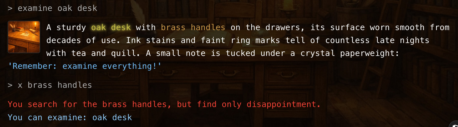
The engine supports a hook system that will feel familiar if you’ve worked with Inform7 or TADS — before/instead/after rules on 50+ verbs (look, take, open, attack, climb, swim, listen, smell, etc.), with priority ordering, cooldowns, and room-level or global scoping. The game format is pure JSON with strict schema validation.

What the format supports:

  • Branching dialogue trees with compound conditions (AND/OR/NOT)
  • NPC schedules (they physically move between rooms by time of day), memory (tracks meetings, topics discussed, items exchanged), and dispositions that shift based on player actions
  • Day/night cycles, weather systems with gameplay effects
  • Full combat with XP/leveling, configurable XP curves (linear, polynomial, or custom), luck-based critical hits, abilities with resource costs and cooldowns, status effects, and per-turn stat regeneration
  • Stat ceilings and resource systems (health/mana pools with separate current and ceiling values)
  • Companions with party management, equipment, and combat participation
  • Crafting, containers (nested, equippable), fuel/charge systems (lanterns burn down, weapons need reloading)
  • Companions with party management, equipment, inventory carrying, and combat participation
  • Multiple endings, achievements, quest tracking with branching objectives
  • Customizable parser personality (witty, formal, minimal, or fully custom failure messages)
  • Author-defined custom themes

The visual editor is free and doesn’t require AI — you can hand-craft every room, item, NPC, and dialogue node. For those interested, there’s also an optional AI generation feature that can scaffold a game from a text description, which you can then refine in the editor. An AI debug chat lets you describe problems and get suggested corrections you can preview and apply. (Games made with AI are tagged as such).

The platform is currently in beta — fully functional and playable, but you may encounter bugs or rough edges. I’d genuinely appreciate bug reports and feedback from this community.

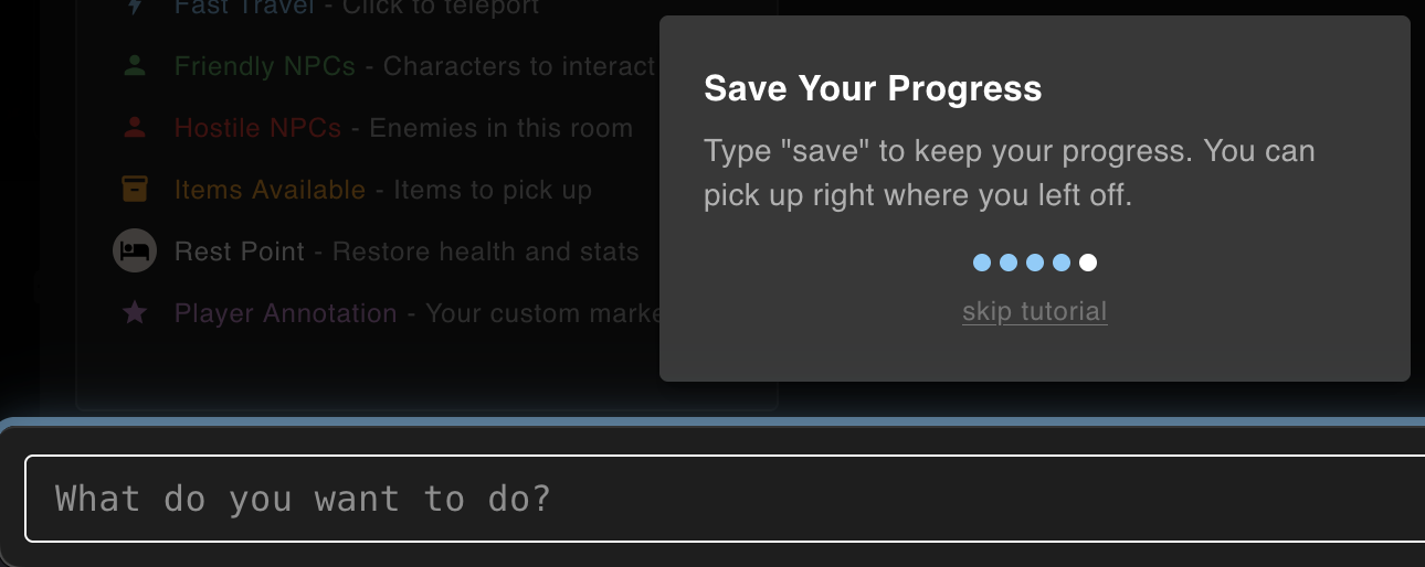
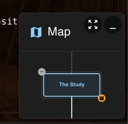
The player aims for that classic IF feel with modern UX: typewriter text, keyword highlighting, mini-map, save/load, undo, journal, hints, and six visual themes including sepia (book-like) and terminal-green.

Published games go to a community marketplace where others can browse and play instantly in their browser.

I’d genuinely appreciate feedback from this community — especially on the game format, the hook system, and what you’d want from a modern IF authoring tool.

2 Likes

Find it here: lexiconlair dot com

Is there a way to get started without creating an account?

2 Likes

Short answer is no, if you’re talking about building a game or browsing the game marketplace (those require an account). But you can play games with the direct link to it without an account. Also, the two base sample games can be played without an account at “play dot lexiconlair dot com”.

My game is called “Ashbury Haunting” and can be played without an account at this link: “play dot lexiconlair dot com/play/d38fad88-dd91-4acd-af27-c439c28a1ffa”

I’ve only poked at the builder a little bit, but at first blush, this seems pretty well thought through and fairly sophisticated. I don’t care for the AI integration, but I take it that that it’s possible to work without it.

I gather that you plan to monetize - out of curiosity, what’s your monetization plan?

I played the demo game. In the player, I really dislike the typewriter text. Is there a way to disable it? I especially disliked it during the tutorial, as it was typing away in the background while the tutorial screen was up.

I hit a couple of small glitches in the UI…

I’m not sure what I did here, but I reached a state during the tutorial where I couldn’t type into the text box to complete the tutorial.

I think it’s because there’s some confusion here about what it means to use the compass. If you click the square icon at the middle of the box, it shows a map? Or moves a map around? It’s confusing. But it doesn’t satisfy the tutorial and it hides the text input, so you can’t advance.

At some point while I was in the builder, I reached a state where clicking the Player and Marketplace buttons didn’t work.

This map pane causes confusion, because it sits over text, and I wanted to drag it out of the way, but trying to drag it selects the main text behind it, but then also registers as a click? Which opens a map window I didn’t want?

There’s some confusing use of color in the main text.

I found through trial and error that glowing yellow text is a clickable link, but non-glowing yellow text is just colored, and the same with blue glowing text / non-glowing blue text. The distinction between the glowing / non-glowing text of the same colors is confusing, and I wonder how well that outer glow serves for accessibility. I also found some bolded white text, and later in the game more colors of text. Overall it lead to confusion. I would say try to limit styles.

I found this note telling me to examine everything, that I couldn’t examine, frustrating and ironic.

Similarly, I was confused by the yellow text on “brass handles”, which seems to indicate that I should pay attention to them, but then they’re not an object.

This View Fullscreen button is poorly labeled. I expected it to open the browser into a full screen view, but instead what it does is hide the text and show the room background image in a lightbox. That label should say something like “see room” or “show room”.

With regards to images overall - I found the thumbnails and lightbox treatment to be interesting and effective. Thumbs up. Though, hiding the text on entering a room to briefly show the room’s background image is a little disorienting. Related to that, when typing into the text input and auto-suggestions pop-up, that is a little abrupt. I think it could use something to soften it, even if it’s just a fade-in transition.

I found some questionable parser responses…

> turn on oil lantern
You don't have any "on oil lantern".
You are carrying: brass key, oil lantern

> give key to lantern
There is nobody here to give items to.

> eat oil lantern
You are not sure how to use the Oil Lantern.

> eat gardener
You don't have any "gardener".
You are carrying: brass key, oil lantern, red rose

> give key to gardener
You give the Brass Key to Elderly Gardener.
> take brass key
You don't see any "brass key" here.

Giving the brass key to the gardener broke the game.

> unlock chest
The chest is locked. You need a small key to open it.
The chest is locked. You need a small key to open it. That brass key from the supply closet might fit this lock.

Some duplicate messaging there.

A large oil painting depicting a sunset over the ocean, its surface cracked with age yet vibrant with color. The brushwork is exquisite — each wave seems to ripple beneath your gaze, and the amber sky almost glows with fading warmth. A small brass plaque at the bottom reads: 'The Journey Begins'.
> x plaque
A plaque? Here? Unlikely.
You can examine: mysterious painting, brass key, oil lantern

This interaction was very awkward:

> restart game
Are you sure you want to start a new game?
All progress will be lost.
Your saved games will be preserved.
Type "new game yes" to confirm or "new game no" to cancel.
> yes
I don't understand "yes". Did you mean: "west", "rest"?
west, rest
> new game yes
No pending new game request. Type "new game" to start over.

I did try to start a new game, but at that point the page froze and I could no longer click anything.

Three turns to find out what’s in the chest. I would expect to see the chest’s contents on open:

> unlock chest
You unlock the Locked Chest.
> open chest
You open the Locked Chest.
> look in chest
Inside the Locked Chest you see a Golden Medallion.

The Locked Chest is still called a Locked Chest even after it’s been unlocked.

> eat librarian
You don't have any "librarian".
You are carrying: brass key, oil lantern, red rose

> take librarian
You don't see any "librarian" here.
You see: adventure journal
4 Likes

I played the first couple of minutes of The Haunted Lighthouse but found the interface pretty overwhelming. First there’s the intro, in which every new paragraph is accompanied by a button with a timer. So I’m trying to read the intro text but also worrying about what happens if the timer runs out - turns out it advances to the next paragraph automatically, and actually my reading speed is fast enough that I’m ready to click the “next” button before the timer runs out anyway, but why inflict this stress on your reader?

Then we get into the game proper, and I can see typewriter text (please no typewriter text!) appearing underneath the tutorial boxes which have now popped up to cover the screen, so I’m anxiously trying to figure out how to dismiss the tutorial, never mind what it says, so that I don’t miss anything, which requires me to figure out the difference between “skip” and “skip tutorial” …

4 Likes

4 posts were split to a new topic: Use of #ai tag on the Forum

I checked it out the other day and had the same impression of inhuman, chaotic design decisions after a few minutes. My interest waned after that. I felt rickrolled.

2 Likes

Wow, this is an excellent assessment — and extremely beneficial to me — thank you, Ivan! It’s very meaningful to me that you took the time to check out the web-app and to document your findings and thoughts. I’m going to get right on fixing the items you addressed. Having some fresh eyes makes a huge difference, since me spending so much time alone working on the project leads to a lot of missed stuff when my blinders go on.

I wanted to answer some of your questions.

  • You’re correct on the Builder: no AI usage is required, it’s just there as a helper/tool for users who would want to use it (games that leverage AI tooling would get tagged as such when published)

  • Monetization is not something I intend to add beyond what’s there already. At this point there is a way to donate as a means of supporting the app development (“Support the Lair” — which unlocks cosmetic rewards), and then there is a feature for connecting user accounts to Stripe in order to enable game authors to receive “Tips” from other users for their games (of which 100% of the tip goes to the author, minus Stripe processing fees).

  • I see what you mean about the typewriter text. I personally dig it, but it can be disabled completely in the “triple-dot” settings of the Player app header during gameplay (this needs to be improved, I see now — it’s too buried).

  • Relating to your point about the text color styling, especially for the instance you mentioned for “brass handles”, that is a game-specific Builder configuration. Specific text can be styled directly in the Builder within description fields. I can see why this allows for potentially problematic/confusing gameplay. I will consider how to tweak this capability for better usage, and at bare minimum for now remove that styling from the current “Foundation Games”.

Again, I deeply appreciate your feedback here. I’m excited to get these fixes and enhancements in place! Also, I granted your account the top Supporter tier cosmetic unlocks, if it’s any consolation.

Adam, thank you so much for the feedback. I am planning to incorporate your suggestions to make for a better intro sequence, and better tutorial. I agree, and now see how that UI flow can create a stressful and less-than-inviting beginning to a game.

The typewriter text can be disabled within the “triple-dot” menu of the Player during gameplay. I see now, though, that this is too buried and needs to probably be something that is a preference question at the users first game played.

Thank you again for taking the time to check out the web-app!

HAL9000, thank you for the feedback and taking the time to try out the web-app. I’m bummed to hear you felt rick-rolled! That is definitely not my hope for this project. I can certainly see why you might consider the design “chaotic” — this is likely a result of the amount of functionality and customization I have tried to build into this, where I have potentially tried to cover too many use-cases (a full-suite Builder engine, but also an embedded Player app) and not enough concrete, direct representations of a sensible UI app that gives a clear identity. Were there specific things you recall disliking, or feeling/appearing chaotic/inhuman? My goal would be to improve or even remove these things where sensible to do so.

Thank you again for your feedback!

1 Like

Overall:

A really nice and quite promising system with a lot of features. Layout is mostly good and the hints and tutorials are done well. Also picutres and sound are working well.

I played on desktop and mobile. Mobile usage is good, no problems.

Issues:

The “intros” are really annoying. Although thankfully, they can be skipped.

The plain font lets the visual presentation down somewhat.

Text that is not a clickable should not use same colour as those that are clickable because it is visually misleading. Or, another idea would be to show clickable text underlined.

The default location of the mini-map could be higher up on the screen, since currently it tends to obscure fresh text and not old text. I had to close it to read the text.

The map screen is nice. I was expecting to click on adjacent locations to “go” there.

Widening the window should not allow the text line length to exceed a limit. For example 14-20 words, instead introducing a wider margin. Unless the vertical space is also too small.

Maybe there should be a clickable way to refresh the room location (ie “look”)? Perhaps a button on the toolbar?

When entering a new location, there is a very brief flash of the picture, then the layout changes to text-over-picture. This can be a bit annoying as it doesnt serve any purpose and you dont have time to see the picture.

Settings/display line spacing, doesn’t work. Made no difference.

There is a “pop” with the ambient audio when changing locations. These should be cross-faded.

Text entry box, up arrow should re-edit last input.

When you kill someone (eg father Thomas), you can examine him, but trying “get him”, it says, “You don’t see any “father Thomas” here.” Also the room description says he’s kneeling before the altar. etc. General problems with dead NPCs.

Light theme doesnt apply to picture view (or npc).

General Points:

Classic IF prefers referential closure, where anything mentioned in the text is examinable. So people will say this. However, I controversially, think that this is no longer necessary for games with clickable text. Because the text tells the player what can be clicked on so they don’t have to waste time guessing. So this is something you’re already doing. As well as directions.

Having said that, some prominent objects like the fountain are both in the description and the picture, ought to be there.

I really like the pictures. Some people won’t. Some people like me would like bigger versions of them. For example when you click on the “view fullscreen” button. 1200x720 max is a bit limited, as is 640x640 for NPCs.

It’s an unsolved IF problem how to ideally display both text and pictures at the same time within the same space. I call this “the text and picture problem”. many system have no picture or they are small, and this is not a problem for them.

Your solution: dim the picture and overlay text but retain a view button.

Nothing wrong with this idea, but it does mean you can’t really appreciate the picture whilst playing. Also later, if you want to add clickable picture elements or have the picture change with gameplay (eg character overlays, taken object disappearing), it wont be easy to visualise.

Suggestions:

Consider parser-less mode, because many games can be played without it. This would hide the input line. You would also need to have save/load etc on a menu or tool button. Also a “look” button. This mode would be useful for mobile play where use of the keyboard is frustrating and possibly default there.

While in conversation, prevent actions including directions (which currently are allowed!), but allow “examine”.

While in conversation, hide the text entry box. I could not find any input that worked in this mode (except “bye”). Unless there is? keywords?

Extra cool stuff:

I was able to attack and defeat the NPCs like father Thomas and Eliza. Awesome! There was nothing to loot though. The larks!

2 Likes

Thank you so much for taking the time to write this up, I seriously appreciate it! I’m going to incorporate the fixes and enhancements you mentioned, there’s some very meaningful insight here. I’m glad to hear that overall, from what it sounds like, you liked it. I also definitely agree with your points about adding UI interaction buttons for “look” and maybe other similar commands, as well as UI-focused flows for the Save/Load functionality. I also really like the “parser-less mode” idea, I had not considered that before. On the note of images, I actually relate to you: I like the idea of bigger images. I did create the Builder app in a way that game images are completely optional, so there’s no need for them to be used in a game where an author doesn’t want that. But, I can see how larger image versions would actually be more meaningful when images are being used.

Thank you again so much for your feedback. I’ve granted your user the top-tier cosmetic rewards, if that interests you!

1 Like

You’re welcome. Feel free to try my work which tackles similar problems. I don’t claim to have all the answers.

Try the demo.