40 characters per line is good advice (which reminds me that I need to supply a format option that actually does this in Budacanta).
Small fonts are useful if the game is expected to be played with noses close to the screen on a big monitor, but there should be the option to have larger fonts as well (I recommend allowing at least 32 point-text for the largest permitted size. Perhaps even 48 points if you think the teacher might run the game on a computer at the front with whole-class debate over which option to select). If your students are emerging readers, also consider having only 2 lines per box in 32-point mode - semi-fluent readers (Year 3 is the youngest year where that’s typical) will be able to handle the third line, but children who find reading itself a challenge may not. TV subtitles are a good source of guidance for this, because they’ve been wrestling with similar issues for a few decades.
Your font choice is good and I’m pleased to see you have good contrast between the font and background colours - you’d be amazed how many expensive games get that wrong.
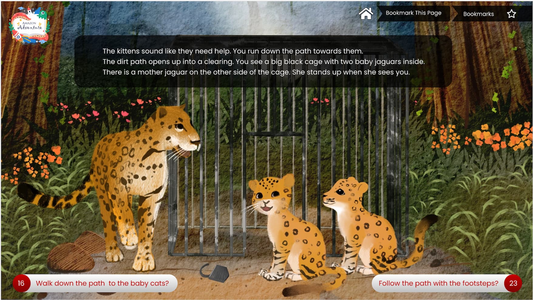
I recommend putting the options and the main text on the same half of the screen, to reduce eyeline movement. In this instance, you can either move the text downwards and the background image’s focus area (those cute jaguars) upwards, or move the options upwards so they are under where the text is now, shifting the logo and navigation bar to the bottom of the screen. The former is the more common way of doing it, but the latter will require a lot less work from the “art department” (I suspect you’d be able to move elements without overlapping the jaguars). Make sure that change is consistent across your entire game, though most game construction engines these days will do so automatically.
Do you have an option that allows your students to switch between that mode and just looking at the background image? If so, I recommend documenting it somewhere the teacher can see it. They may want to use it if presenting to the class to show off that gorgeous artwork - and be aware of it for the students-exploring-by-themselves in case students spend too long staring at the pictures instead of reading the text.
I assume the numbers are references to page numbers, to make it feel more like a choose-your-adventure paper book. If so, that’s a good answer - and I’d advise documenting the official reason, because some teachers will get asked about it by curious students.
Unfortunately Google doesn’t like my computer, so I cannot advise on the progress map.
You have an attractive layout, so what I’m suggesting are tweaks rather than show-stopping matters. I hope your students enjoy the app you are creating for them!