To use syntax highlighting on an IFWiki page, you can enclose the code in <syntaxhighlight> tags. For details, please see the extension’s page on MediaWiki.
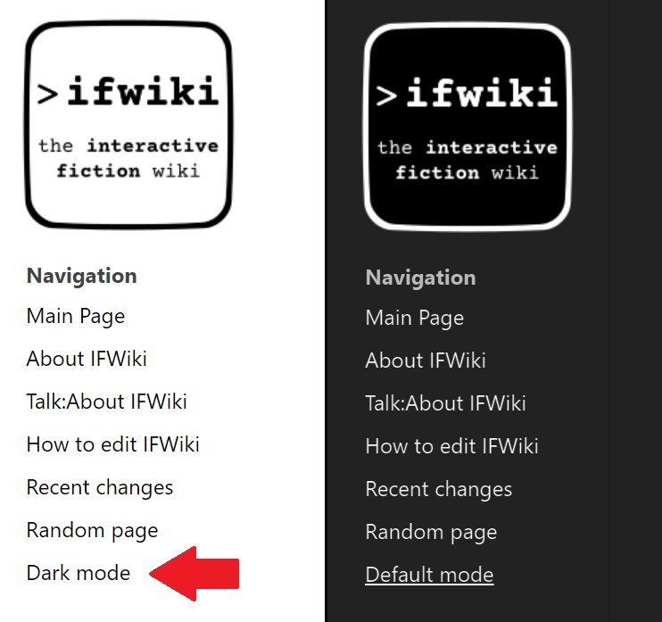
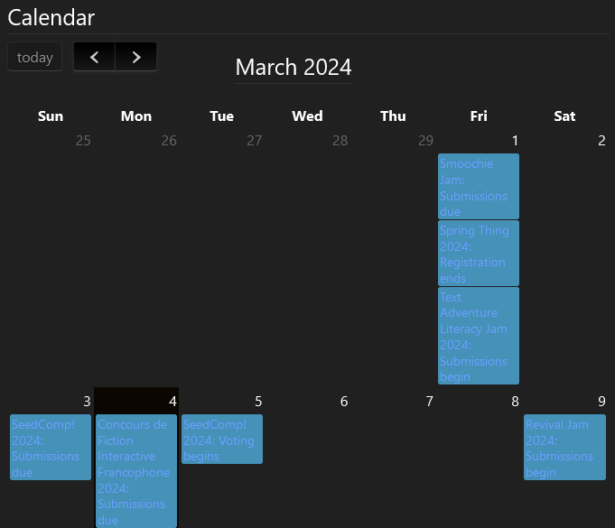
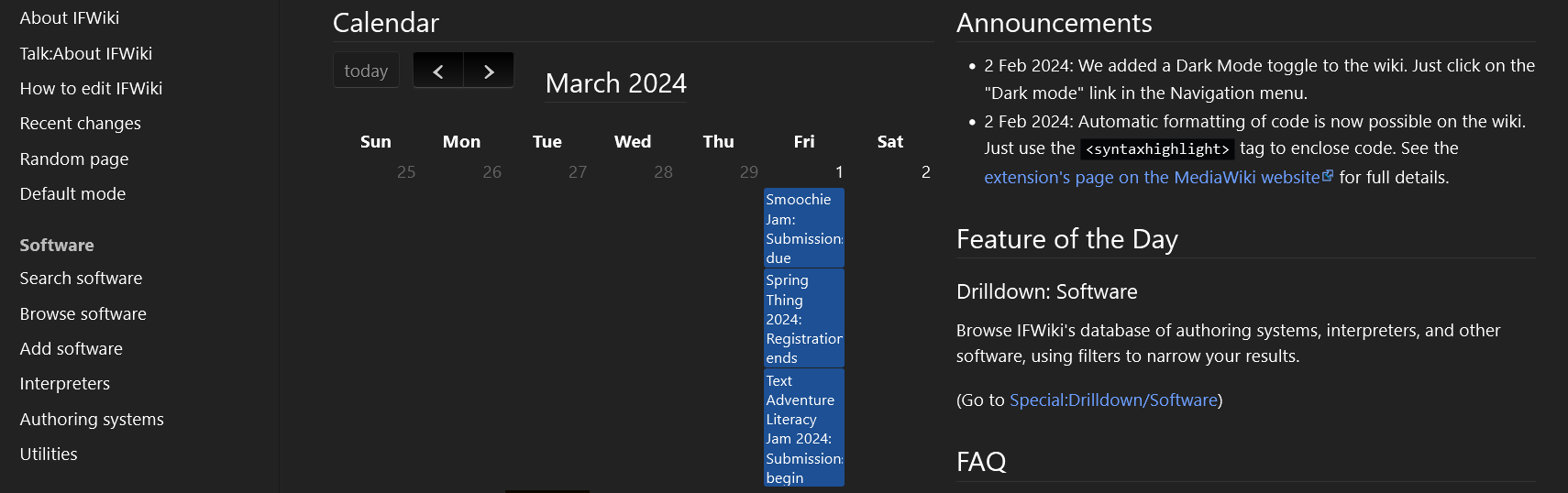
Dark Mode is about light text on a dark background. It’s a bit jarring to see the calendar links next to the rest of the site content, in its current state. I suggest changing the calendar links to white text on a darker blue background.
Another concern I have is that the site doesn’t remember your Dark Mode choice. The Dark Mode link must be clicked constantly with every page visit. This was observed without logging into IFWiki.
I really appreciate the effort to get dark mode working for IFWiki. I don’t mean my bluntness to sound like a complaint; just constructive criticism.
Dark mode (on the wiki now) just does filter: invert( 1 ) hue-rotate( 180deg ) on everything.
However, it’s possible to exclude or change specific elements. We’ve done that for the header bar to stop it turning from dark to light. If you could give me the exact colours you want for exact things I could look into that.
If you’re not logged in I don’t think MediaWiki stores any cookies for you. When you log in it does, and the dark mode persists. The answer is to stay logged in.
Perhaps the Dark Mode link can be hidden if you are not logged in? It’s just unexpected to have the option always flip back automatically, if you’re just visiting (arguably the largest percentage of the website’s audience).
Maybe something like this? It’s a similar colour to the existing links in the rest of the site. I just edited the browser’s inspector to get the colour to show, but with the colour shifting happening it was harder for me to find the right tone. The pixel colour you see is #1D5094, but with Dark Mode hue inverting, I used #77AAFF in the browser inspector and that’s the colour it gave me.
Anyway, it’s not my intention to demand specific changes. I’m really only trying to provide feedback. I hope that’s coming across.
What I did instead was just exclude the calendar items from dark mode entirely. There are different colours for different types of event (have a look at NarraScope in June, which has a green background) and I didn’t want to play around with each individually. And with the standard dark mode, the blue/green boxes seemed to be becoming brighter in dark mode!
I’ve never logged into IFWiki before. I use it as a hub for jams, competitions and authoring tools. However, I can make a login later tonight and take a peek.
I did notice that calendar events have both a border and background of the same colour in the website code. If you make the links blue or white and just keep the border colour (to the 4 possible colours, even if they are brighter) with a transparent background colour background-color: transparent;, it should allow for text legibility without worrying about colours interfering. Just a suggestion, but I hope that makes sense.
Edit: You may want to tweak theborder-widthif you want to implement my suggestion.
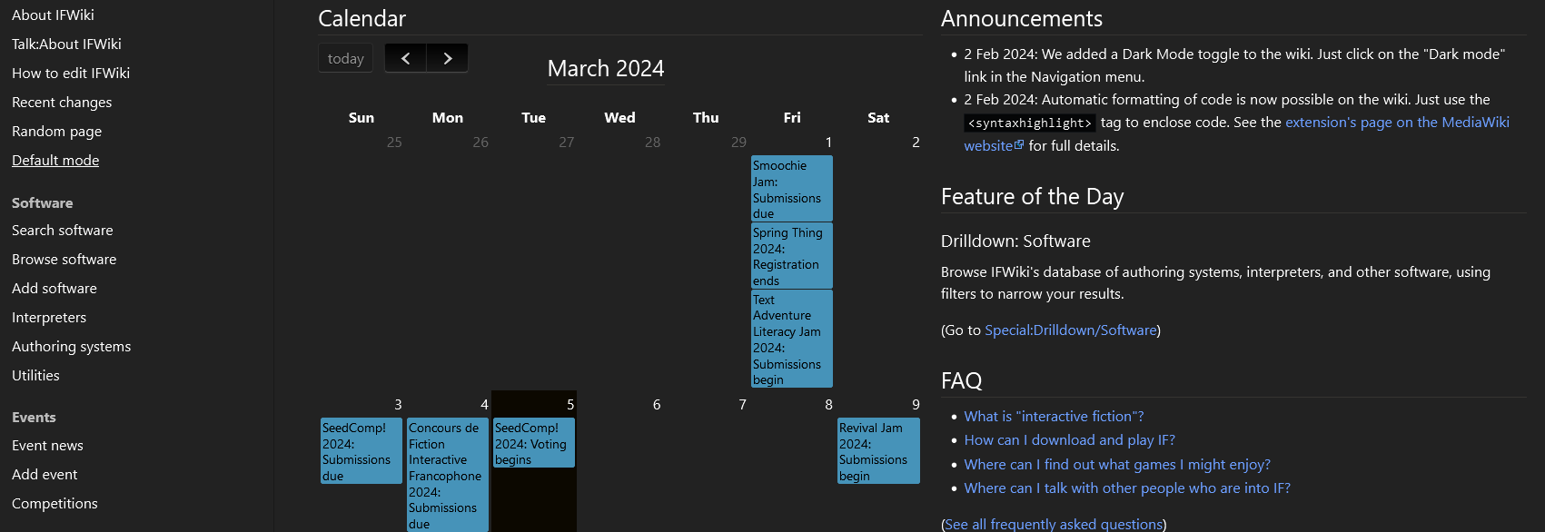
Update: I logged in and checked out the site. Seems pretty good as is right now. Thanks so much for making Dark Mode happen!