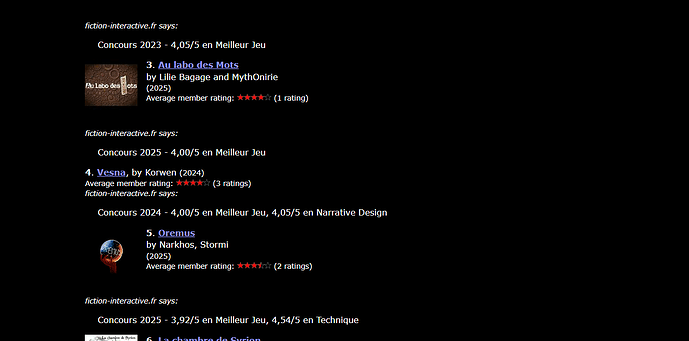
IFDB’s list feature is really useful for recommending stuff (especially since the “suggest similar games” feature seems underused, I’m not sure why, I think it shows a lot of potential), but the layout of the lists themselves is a little confusing for sighted users.
I see two main issues with it:
- The absence of a cover art breaks both the alignment of the list items and affects how much “white space” there is within the paragraph (the author and year of publication are set on the same line as the title and the extra white space between the cover and the “[user who made the list] says:” disappears. The pop of colour of the link/title prevents entries without cover art to completely escape my notice, but overall, I’d say the current layout minimizes their importance visually.
- The actual comments from the user who made the list float halfway between the [user who made the list] says:” mention and the next list item. It leaves some ambiguity as to which entry the comment applies to, especially in the case of games with cover art, in which case there is more whitespace between the current entry and the associated comment than there is between the comment and the next entry.
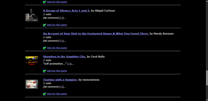
For comparison, here is an IFDB poll, which I find visually more consistant and less confusing:
I imagine this is not a priority, lists are functional as they are after all, and I don’t know enough to know how to fix things for sighted users in a way that wouldn’t break stuff for people who use screen readers or older browsers, but I figured a post couldn’t harm, so here it is.

