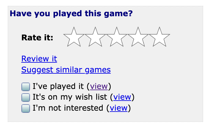
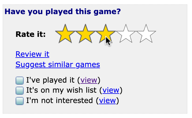
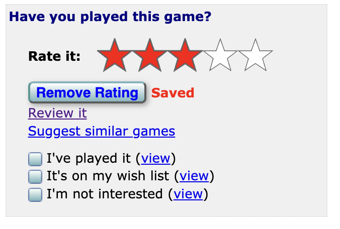
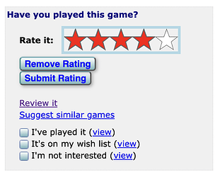
IFDB has a new star rating control, designed for accessibility.
-
The new star controls are designed to be bigger, easier to tap on on touchscreens.
-
They’re also designed to be keyboard accessible. You can use tab to focus on the star control, and then use arrow keys to select a rating. (When you do this, you have to tab over to the new “Submit Rating” button to submit your selection.)
-
Under the hood, they’re secretly radio buttons, so users of screen readers will interact with them like radio buttons.
-
We’ve replaced the little star icons with new SVG icons. I think they’re nicer to look at, especially on high-resolution screens (like phones).
We’re curious to hear feedback on this, especially if you normally use IFDB with keyboard controls or a screen reader.
Questions we had:
- The new star control appears to screen readers as a bunch of radio buttons. On iOS VoiceOver, there’s no quick way to announce which radio button is selected. You just have to read each button, until it says, e.g. “Four stars. Radio button. Checked. Four of five.” Is that how you’d expect it to work? Should we have a separate label that declares the current star rating?
- If you’ve written a review with a rating, the “Remove Rating” button only removes the star rating, without deleting your written review. To remove the written review, you have to click the “Revise my review” link.
- Should we warn you if you remove a rating from a written review? (Where would we show it? What would it say? Would the warning be annoying?)
- The old star control simply wouldn’t show the “Remove Rating” button if you have a written review. To remove your rating, you had to click “Revise review.” Should we do that again? (Would it be confusing if the “Remove Rating” button was simply missing?)
- The “Submit Rating” button only appears when you use your keyboard to select a rating. When you use your mouse or touchscreen screen reader, selecting a rating automatically submits the rating. Does that feel right?
- Is the “Remove Rating” button too big? We considered replacing it with an “X” or something.
- EDIT: When you use arrow keys to select a rating, pressing the Enter key does nothing. (You have to tab over to a button and then press Enter to push the “button.”) Is that good?


