On background: I initially attempted this topic as a development question, but I think hearing from players would be more productive. Some questions for those who use sight to play with an IF interpreter (Parchment, Lectrote, etc.), how do you configure your interpreter (if it can be configured)? Play with defaults? Or else configure:
Font (fixed and proportional)
Font size (or zoom level for Lectrote)
Color (text and background)
For testing my game, I usually alternate between WinGlulxe, Lectrote, and Gargoyle. My configuration:
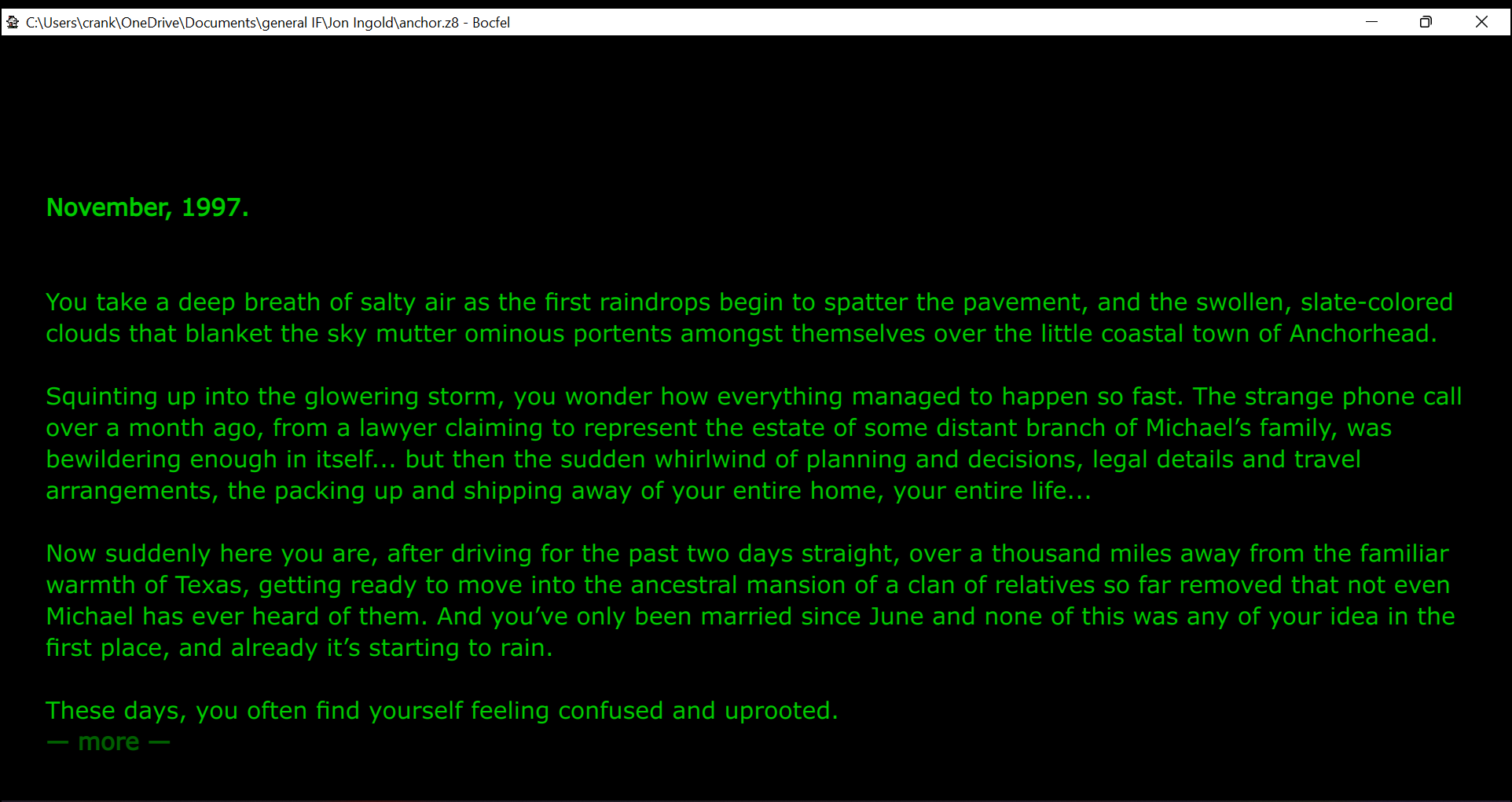
I use a relatively large proportional serif font, with light text on a dark (but not black) background. Ideally I can make the lines at least a quarter inch tall on my screen, which makes for comfortable reading without straining my eyes.
I’m currently using the Breeze Darker theme in Gargoyle, with a couple modifications to make links and input lines easier to see against the dark background, and a 48-point font size.
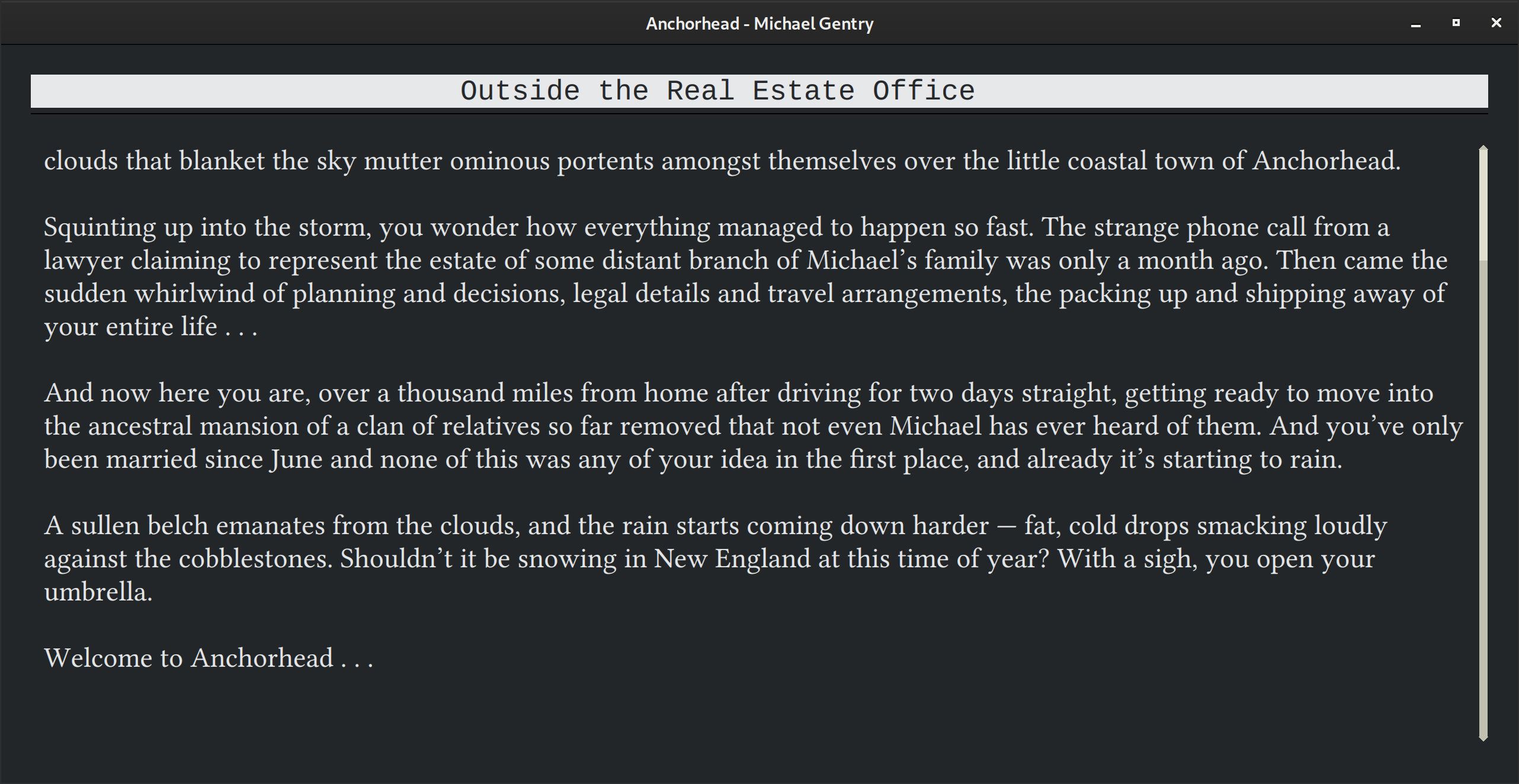
I have my Mac laptop running permanently in larger text display mode, which looks like 1024x640. For most IF I use Lectrote, and zoom in 3 levels beyond the initial default. Here’s what the start of one of my own games looks like running in it. It pretty much fills the screen.
As you can see above and to the right the system text bits - which are already pretty large because of the resolution I use - are much smaller than my in game text. Lectrote doesn’t use a font size preference, so I can’t give a guide re that. But it’s big!
I need to use a larger font size to be able to play games comfortably with my brain damage from a progressive neurological disease. It’s why I often struggle with custom systems. Even web based ones like Twine I will run massive.
I have generally run Lectrote in light mode up till now, but might switch to dark in future! I usually run my Mac in dark mode.
In general (that’s what I tend to use for IF, but also for other things):
Main text font: Proportional serif. (I really like Alegreya; there’s also Alegreya Sans which is nice too if you prefer sans-serif.)
Fixed-width font: I go with the default because I haven’t really found a favourite, and it’s usually not important since it’s only for the status bar.
Font size: at least 22px. (Pixels in the CSS meaning. It might not be true 22 physical pixels with a high-res screen.) (Lectrote zoom level 5.)
Line height: Around 1.4-1.5.
Line length: Around 75 characters (if I recall correctly). At least I try to have sufficient margins on the left and right. (It’s a bit more difficult to set with Glulx games that have multiple windows, though.) (Lectrote margins 25% when in full screen.)
Colors: Light text on dark background (but not true white on true black).
That’s all that I can think of right now. Sorry I don’t have screenshots; I don’t have any interpreter set with all that.
I’ve always found Lectrote a bit lacking in customisation. You can’t precisely set the size or the margins directly, you have to fiddle with the zoom level. And it’s not possible to have colours outside of the presets. Gargoyle, on the other hand is a chore to configure.
(I’m still considering developing my interpreters that suit my need because of all that.)
In the end I use Lectrote, it’s good enough and has better text rendering IMO. Anyway.
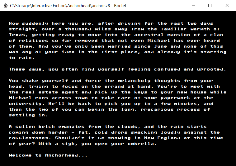
(That green though, it kills the eyes! No offence of course. )
The full extent of my compulsive customization can be seen in how one can play Extensions’ examples in my extension smoketester output, e.g., Amphitheatre from Approaches by Emily Short.
A solarized dark color scheme, ET Bembo proportional font, Source Code Pro monospace font. The player’s input is monospace to maintain a visual distinction from the game output, and the command prompt is in the margin to the left of the text so the left-hand edge of text aligns throughout. 42rem width.
You can consider Parchment/iplayif.com to be my personal visual preferences. I have added a dark mode to Parchment, but it is currently only shown if your OS/browser communicate that sites should use dark mode. I’ll add a manual switch in the future.
I added built-in themes to Gargoyle recently (to be in the next major release), and realized at that time that I had botched the link colors, but then completely forgot to update the Wiki with the new colors. Thanks for the reminder! I’ve just made some changes so the Wiki themes set all colors, instead of inheriting whatever was set before for links and borders.
I use Gargoyle. 60-character-max-width column of text, black background, silver text color, with 16pt DejaVu Sans font. Serifs make text too hard to read for me. I’m prone to light sensitivity, especially when reading text, so I like to keep colors dim and dark, and keeping the column narrow help me keep my place when reading.
When I was on my high school’s newspaper, I was taught “sans-serif for headlines, serif for body text.” I persisted using that style for screen layouts for many years.
About 2005 or so I came around and acknowledged that—for screen reading—sans-serif body text is easier on my eyes than serif. That’s how I do things now: Serif for headers, sans-serif for body text.
At the moment I’m a fan of Lato for body text. I like Libre Baskerville for headers, and recently switched my web site to use it.
Much as I love my serifs, if I ever were to bundle my customizations as a template for others’ use, I’d switch to using a sans serif face for the body text by default. It makes things more readable for a bunch of people.