One thing inherent to text-heavy games that I didn’t fully acknowledge until recently is how hard it is to make interesting trailers and screenshots for them.
I know this sounds silly. Or at least it would have sounded silly to me a year ago. “Such a superficial idea!”
Well, if we talk about IF economics, this is a huge detractor. All the literature and all the GDS videos I’ve seen agree that the first impression, the trailer, the first few screenshots, are absolutely critical to a game’s success. They’re a multiplier in the success equation, not an additive.
By their nature, text games don’t have much to offer in terms of eye candy. It’s easier for me to make a captivating, colorful visual by programming a simple 2D physics game in a week in Unity (and I suck at Unity), than to do so with a text game I’ve been working on for years.
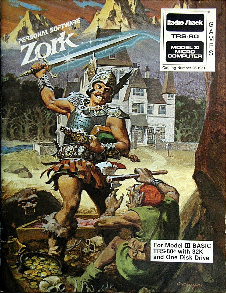
In the old days, this was less of an issue. First, there was no huge marketplace of games with eye candy visuals back then. Second, games were sold in packages that provided the eye candy via box art.
I like what Choice of Games does in promoting their games. They basically re-introduced the idea of box art. Choice of Robots, for example, has a beautiful, colorful picture. They use it as their first screenshot, and they use it for the icon. There’s also the trailer, which is captivating, sells the premise, and does not show a single screenshot or screencast of the actual game.
Of course, even this still isn’t enough to compete with the eye candy of an average videogame. But it’s an order of magnitude better than the default approach I see among text games, which is to take a screenshot of a (mostly monochromatic) wall of text. If that’s the first screenshot you’re showing to people, you’re immediately making your game unattractive to the casual browser. (Including the text game enthusiast, like me. I’d like to say that looks don’t matter to me, but rationally I know that I’d be lying. My eyes are drawn to interesting shapes and colors as much as anyone else’s.)
I think there are ways out of this:
- If you have the resources, do what Inkle did with Sorcery! and other games. Put a map there, or a minigame. A part of the game that’s visual — something more “videogame-y”.
- Take inspiration from apps. Many apps are also text-heavy, but they use tactics that make their store pages much more captivating.
- At the very least, do what Choice of Games do. Add a single, colorful, evocative illustration and make it the center of your promotion.
As an aside: I know IFCOMP games have been getting better at presenting themselves via their square image, and I’m grateful for that. But it’s not the same as a store page, which needs to include screenshots, and should also include a video, and a banner, and whatnot.