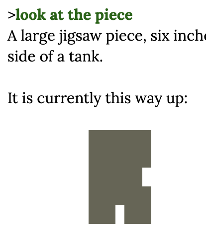
The picture of a puzzle piece is an arrangement of Unicode characters, possibly █ (“Full block,” U+2589), displayed in fixed width so that the spaces in between take up as much space as the █s. Essentially, █s and blank spaces become black and white “pixels.” “Drawing” with text in this way is incredibly inconvenient but it’s SO MUCH FUN. (Well, it’s fun for me. It’s not fun at all for people who play with screen readers, so you gotta keep that in mind.)
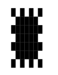
Here’s a trivial example. I went into my text editor and drew a beautiful sun with █ characters:
█ █ █ █
 █████
███████
 █████
███████
 █████
█ █ █ █
Whoops! When I paste it into a forum post, the leading spaces get removed, multiple spaces are collapsed, the and spaces are rendered as much more narrow than the boxes. So it looks more like a neat bug than a beautiful sun.
I will use the forum’s option for preformatted text (put a line that says ``` on the top and bottom) to present it in fixed-width text:
█ █ █ █
█████
███████
█████
███████
█████
█ █ █ █
The forum’s option for preformatted text has a built-in setting for line spacing that is stretching out my sun vertically. But you can see how if those lines were squished together, it’d look like a beautiful sun.
The same stuff happens when I try to display the sun in Inform 7. If I make a rule that says
say "█ █ █ █[line break] █████[line break]███████[line break] █████ [line break]███████[line break] █████[line break]█ █ █ █[line break]"
the spaces don’t display correctly and I get that neat bug. If I include [fixed letter spacing], as in
say "[fixed letter spacing]█ █ █ █[line break] █████[line break]███████[line break] █████ [line break]███████[line break] █████[line break]█ █ █ █[variable letter spacing]";
the space characters are fine, but the lines are still spaced out too far.
Jigsaw doesn’t have this problem! So there’s some other step to take to make those puzzle pieces look nice—I think it’s accomplished at the Inform 6 level. I don’t know.
I do know a dumb workaround, but it only works for browser interpreters. (This is how I made Unicode QR codes in Ryan Veeder’s Authentic Fly Fishing.) First, Include Glulx Text Effects by Emily Short. This lets you style text as [first special style].
You also want to Release along with an interpreter.
Then, replace your references to [fixed letter spacing] with [first special style], as in:
say "[first special style]█ █ █ █[line break] █████[line break]███████[line break] █████ [line break]███████[line break] █████[line break]█ █ █ █[variable letter spacing]";
(We still use [variable letter spacing] at the end to return to normal-style text.)
When you compile this game in the Inform 7 IDE, the beautiful sun will come out looking like that neat bug again. And when you open up the HTML page with the Quixe interpreter, it’ll still look like a neat bug!
But you can change the properties of the “first special style” by changing glkote.css, which is in the Interpreter directory of the Release folder. At the bottom of glkote.css you’ll see:
.Style_user1 {
}

.Style_user2 {
}
These classes contain the properties of text that you refer to in Inform 7 as [first special style] and [second special style]. You can change some of their properties in Inform 7 (see the Glulx Text Effects documentation), but you can change all of their properties here. We want to add fixed-widthness, but we also want to change the line-height.
You can see elsewhere in glkote.css that line-height is normally set to 1.4, which spaces things out nicely for comfortable reading. Intuitively the correct line-height for lines being perfectly flush with each other should be 1, but after playing with it for a while I think it looks best at 1.15.
So make it say:
.Style_user1 {
    font-family: "courier new", monospace;
    display: block;
    line-height: 1.15;
}
Save glkote.css, reload that Quixe interpreter—and at long last we get to see a beautiful sun, just as the artist saw it in his mind’s eye: