Hello!
Story Format: SugarCube 2.30
So what I want is for the image to never go outside the window’s view, but to resize (contain), and when the image is narrower than the window view I want it to be centred. It seems to me that this would be the simplest thing of all, but oh well.
I’ve tried margin-left: 0; margin-right: 0; or margin: auto; and max-width: 100vw; max-height: 100vh or object-fit: contain; in varying combinations on everything I can think of: html, body, #story, #passages, .wrap, img. But it either doesn’t contain the image in the window view, or has it all the way on the left, or has a big margin on the left (which can shove it out of the window view).
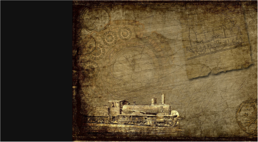
Here’s what I don’t want:
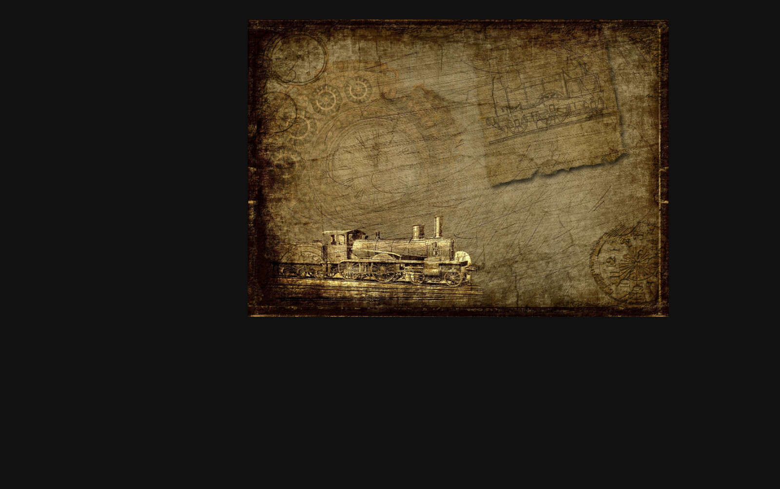
What I do want is basically what happens when you copy an image address and open it in a browser tab (at least on Chrome). When you resize the window smaller than the image, it simply resizes, staying centred.
Here’s a gif of that:
This is what I want to happen, but on Twine. I’ve tried inspecting the element and copying stuff over, but on Twine it doesn’t do the same things (as one would expect).
Anyway, I’d appreciate any help. Thanks!
You don’t state if you’re using a HTML <img> element to display an image within the ‘current’ Passage, or if you’re trying to display a background image behind the ‘current’ Passage, and knowing that can change the techniques you use. For my explanation I will assume you’re trying to do the former and will start with the following Passage content…
Blah blah
<img src="images/small.png" alt="small 256 x 256 image">
More blah blah
…and the following CSS within my project’s Story Stylesheet area.
.passage img {

	/*
	 * the following border is only used to demostrate show the area
	 * the image is being shown in, the border can be deleted.
	 */
	border: 1px solid red;
}
You will see the image defaults to being displayed on the left side of the area of the page that the the ‘current’ passage’s content is display in, and the red border shows the default area that has been allocated to the image. You can also use your web-browser’s Web-Developer Tools to Inspect the <img> element and the CSS being applied to it.
The first thing you need to do is increase the area being allocated to the image so that it has a width the same as that of the area being used to display the passage. This can be done by assigning a min-width property to the <img> element.
.passage img {
	min-width: 100%;

	/*
	 * the following border is only used to demonstrates the area
	 * the image is being shown in, the border can be deleted.
	 */
	border: 1px solid red;
}
Now when you look at the red left & right borders of the red, and the image itself should be automatically centred horizontally.
Next I will change the image being shown to something a little larger.
Blah blah
<img src="images/larger.png" alt="large 1206 x 799 image">
More blah blah
Now the right side of the image is likely to be outside the current view-port. This can be fixed by assigning a max-width property to the <img> element.
.passage img {
	min-width: 100%;
	max-width: 100%;
}
I updated my post with some clarifying screenshots; the min-width stretches the image rather than containing; nothing needs to be above or below it.
Change the code displaying the image so that the <img> element is contained within a <div> element, which is a block based element so it automatically horizontally scales to be the same width as its ‘parent’ element (which is the area the ‘passage’ is shown in.)
<div>
	<img src="images/small.png" alt="small 256 x 256 image">
</div>

<div>
	<img src="images/larger.png" alt="large 1206 x 799 image">
</div>
Then remove the min-width property from the previous <img> element targeting CSS and add instead:
- A display property that changes the
![]() element from being inline based to being block based instead. This will allow the element to be assigned the following properties…
element from being inline based to being block based instead. This will allow the element to be assigned the following properties…
- An automatic calculated left & right margin property, which will cause the element to be centred within its
‘parent’ element.
The replacement CSS would look like the following…
.passage img {
	max-width: 100%;
	display: block;
	margin: 0 auto;
}
1 Like
It then shrinks the image and pushes it up into a corner, like so:
And doesn’t resize it vertically with the window.
I’ve tried display:block; in various other places ( ) but still nothing.
I updated the post with a gif of what I want to happen.
A couple of things about the image that appear below this quoted comment:
-
Area of the page reserved for displaying the format’s Left Side bar.
It appears you are suppressing the sidebar. Did you use the recommend UIBar.destroy() function which also gives back the left area of the page reserved for the sidebar, or did you use some other method to supress the sidebar?
-
The default dimensions of the area of the page where the output of the ‘current’ Passage is shown.
The default maximum width of that area is 54em and the default height is the minimum required to display the content of the ‘current’ Passage. So unless you’ve uses CSS to alter both of these defaults then the contents of your ‘current’ Passage will never scale to fill the whole view-port.
Yup, I was using display:none; for the uibar; the API fixes that problem anyway: thanks! 
I don’t see where to get rid of “max-width:54em;”, I’ve added “max-width: 100vw !important;” to #passage, .passage, .passages, #story, .wrap, body, and html ( ). Nothing changed until I added it to img: then the image got larger than the viewport in both height and width (it goes beyond 100vw because I set that as max-width?).
It’s on the #passages container—note the s. Try the following:
#passages {
	max-width: none;
}
You can find SugarCube’s built-in stylesheets linked in the docs.
Yup, I was missing the “s” - thank you!
Now how to centre it - it resizes correctly now, but it was only when the max-width was 54em that it properly centred itself. Now it’s shoved over on the left again (with “max-width:100vw” it’s shoved all the way over, with “none” it has a little space on the left that pushes it a little out of the viewport when you make it narrower than the image).