How do make text way clearer? (version 2.3.12)

How do I make text much more clearer when using different backgrounds? Some people have tested my interactive story and a few of them could barely see the text. I want my text to be clearly visible, no matter which fancy background I’m using.

Format: Harlowe 3.2.1

1 Like

If you’re using solid colors, you want to make sure the color contrast is sufficient for text and doesn’t interfere with legibility or cause fatigue. I know I have major problems reading long passages of pure white text on a bright red background. Many people have some amount of red color blindness, so purple text on red is also a problem.

The other issue is if you’re using repeating wallpaper-y backgrounds or busy images, that can also swallow similarly-colored text and make it hard to read. You may wish to avoid putting text over images with similar colors such as dark branches against a bright sky because your words will get lost in the background. You may wish to eliminate busy backgrounds altogether, or correct it so your background contrast is less so text will stick out. Or if you have a complicated background image, put a solid color block behind the text using CSS. Sometimes you can even get away with outlining your text in a contrasting color, but that can get overly busy also.

https://dequeuniversity.com/tips/color-contrast

1 Like

Another option is a semi-transparent background behind the text, like how the boxes look in most VN-style games.

1 Like

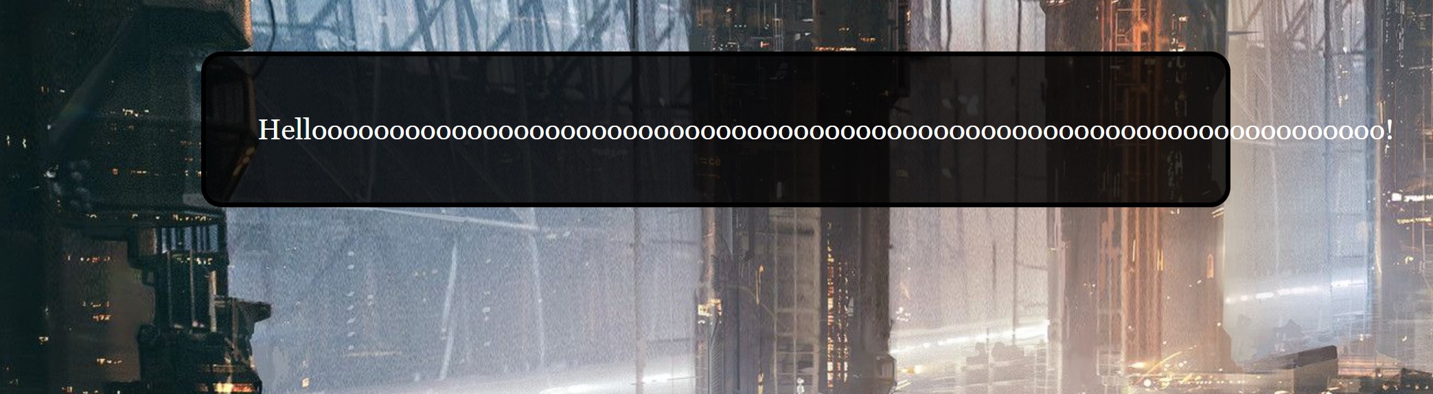
If you need to check the readability of text on your background, then the WebAIM Contrast Checker may help. I’d strongly recommend a contrast level of 7 to 1 (7:1) or higher.

Other options include adding a translucent background behind your text to increase the contrast in cases where you have complicated images as backgrounds, or to add a “border” around your text using text-shadow. For example, you could add this to your Stylesheet section:

.bbwt {
	text-shadow: 1px 0px rgba(0,0,0,0.7), -1px 0px rgba(0,0,0,0.7), 0px 1px rgba(0,0,0,0.7), 0px -1px rgba(0,0,0,0.7);
	color: white;
}
.wbbt {
	text-shadow: 1px 0px rgba(255,255,255,0.7), -1px 0px rgba(255,255,255,0.7), 0px 1px rgba(255,255,255,0.7), 0px -1px rgba(255,255,255,0.7);
	color: black;
}

Then, if you have white text you could use the “bbwt” (black border, white text) class for your text, or if you’re using black text, then you could use the “wbbt” (white border, black text) class. The “0.7” in the above code means “70% opacity”, so you can modify that number for more or less opacity in the border (1 = 100% opaque, 0 = 100% transparent).

Hope that helps! :slight_smile:

1 Like

Do you know how to add translucent backgrounds? I’m not really sure. A few of the backgrounds shows busy, futuristic city streets.

You just add it to the passage element. So if the background is on tw-story, then CSS like

tw-passage { 
  background: rgba(0, 0, 0, 0.5); 
}

should work. You can adjust the 0.5 number to make the background more or less transparent.

1 Like

The whole text ends up in one, large black box. Can you divide it so the shadow only covers one sentence at a time?

@Zev (note: I’m going to assume you are talking about an effect like Chapel’s tw-passage level one.)

To apply styling at a sentence level you would need to wrap each sentence within a HTML element and apply the styling to that element.
eg. Change your Passage content from…

This is the first block of text....
This is the second block of text...

…to something like the following if you wanted the effect to extend to the right edge of the passage area for each block of text…

{
<p>This is the first block of text....</p>
<p>This is the second block of text...</p>
}

and replace the previous tw-passage based CSS rule with something like the following…

p {
	display: inline-block;
	width: 100%;
}
tw-passage p { 
	background: rgba(0, 0, 0, 0.5); 
}

If you don’t want the effect to always extend to the right edge of the Passage area then changed the Passage contents to something like the following…

<span>This is the first block of text....</span>

<span>This is the second block of text....</span>

…and replace two two rules in my previous CSS example with the following single rule…

tw-passage span { 
	background: rgba(0, 0, 0, 0.5); 
}

@Greyelf

I will try it out and see how it ends up looking.

How do I shape the black box so it smooths around the text and fits the screen?

Which technique did you use to implement your ‘box’? (show the CSS you used)
What do you mean by “it smooths around the text”?

If you used the <p> based technique, and added the p based selector CSS that includes a width property setting to your project’s Story Stylesheet area, then the box should horizontally fill the area allocated to the displaying of Passage content.

Greyelf
I use the code suggested by HiEv and Chapel. “What do you mean by ‘it smooths around the text’?” Rounded corners and a dark area that don’t stretch beyond the text.

How do I make sure the text never ends up outside the box?

Without an example of the code you are using I will assume that the black box represents the boundaries of the element in which the Helloooo textual content is being displayed. You can use the overflow CSS property to control what happens when a element’s contents is to big for its context.

How do I reduce any empty space after a button prompt to the next passage?

What other content is in the Passage after the Continue link shown in your image?

Blank ‘lines’ in the HTML output is often the result of unsuppressed line-breaks in the Passage content that generated that output.

It seems like that was the problem, thanks.

Can I deactivate the dark textbox in a specific passage?