lol I was born in the 70’s
3 Likes
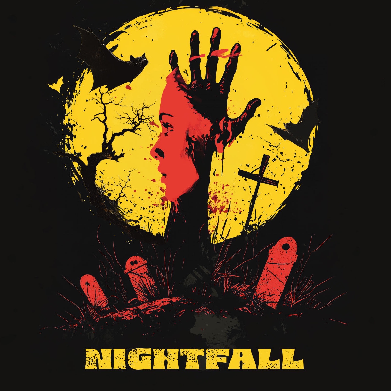
This cover art is good ! Like, really good.
1 Like
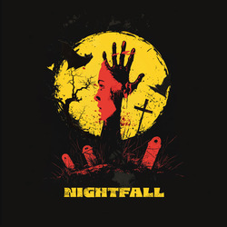
Yeah, I really like it. The only issue I have is some of the details (like the blood on the hands, the paint splatters in the forest, and the tall grass) are really hard to see/read at small sizes. I resized it to the 250px size that (I believe) is used on the IFDB:
3 Likes
I’m not convinced about the border size. The idea of spacing things out is good for large pictures. When you shrink to icon or thumbnail, youre better filling the space. Same for mobile.
1 Like
Well, the border is easily tweaked. About the details… one can correct them by hand, thickening the thin lines (I’m not an artist, so you may need one), but it’s a simple case of “short blanket”: either you cover your nose or your feet. Either you have the details or you draw for small sizes. I’m all for removing the details, tho ![]()
4 Likes
I like it, gives strong “creepy” vibes… Bravo !
Best regards from Italy,
dott. Piergiorgio.
2 Likes
I’m a key-art/logo freak also and I really love Marco’s interpretation. It looks like 70’s move poster and the balance is great. You are so good @Jamespking
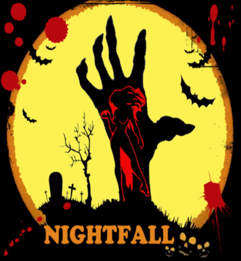
If there were to be a “square thumbnail” variation to make it readable at smaller size - that’s easily done - make the text the orange color, remove the red grave stones and drag the title up in their place, make the title bigger/full width, possibly overlapping the circle a bit to emphasize the title.
3 Likes
I really like the first cover image. It has a great 70s horror vibe. Love it!
I just cleaned up the yellow to be all the same shade and toned down the saturation a bit, but I love that “pow” of the silhouettes on the bright yellow. I’m a sucker for zombie movies though.
It has a certain campy look that I find appealing. Love the blood splatter thrown about and how that colour ties to the woman.
I appreciate the professional feel of Marco’s. However, I keep seeing an unintentional rooster/punk rocker and the woman looks like a victim, and not the perpetrator. Not sure of her role in the story, but that is definitely an important detail.
1 Like
I just realized my problem with the original graphics is mainly the deformed circle (it’s stretched vertically, as well as the hand and some other minor detail, and the thing just rubs me the wrong way…).
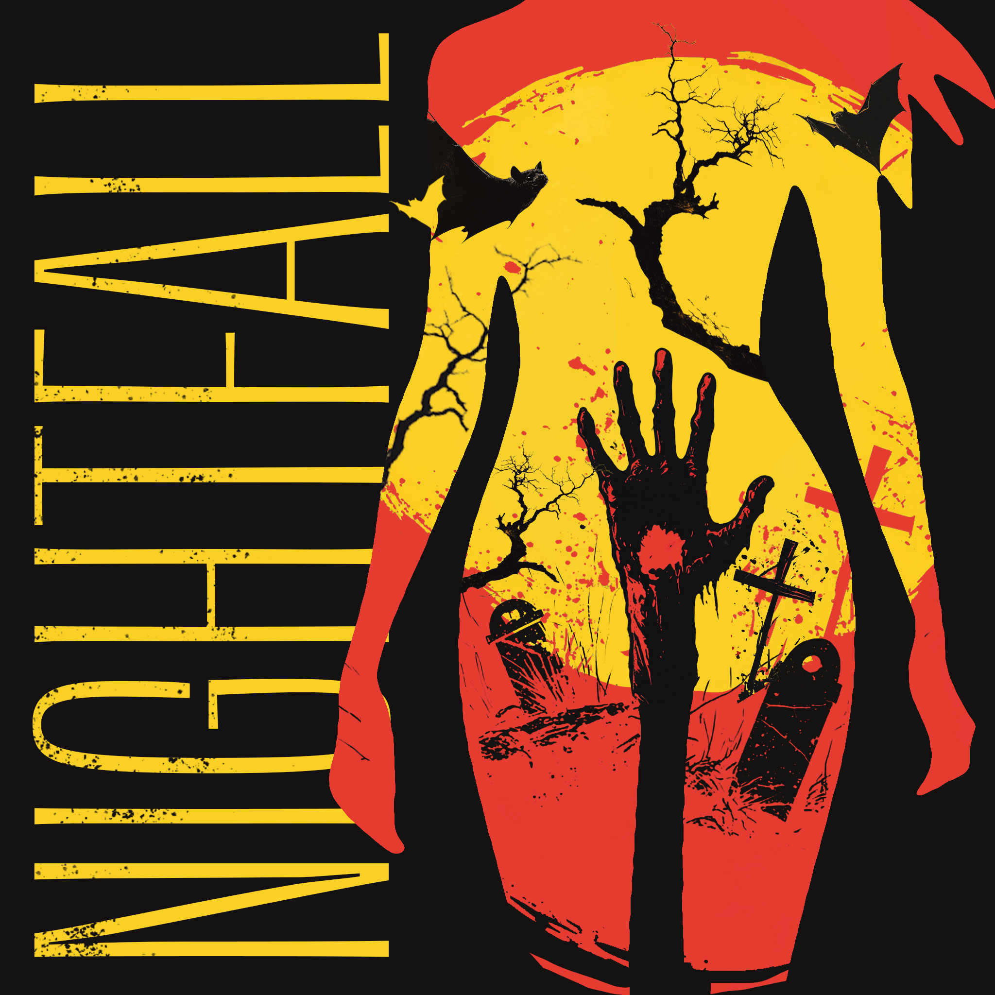
In the meanwhile, given I took off my very first Friday back to work – yeah, the fun bits of being the owner – here’s another solution. Large and small.
I think I LOVE the way the hand is born from the woman’s fertility, adding a millefeuille of concepts, double meanings and insights into the subject “the Seventies and softporn in Giallo cinema”.
I don’t know why I persist in convincing myself that there is a connection between the Seventies and this game: perhaps it is the colors and the magnificent mirror that I created independently with Barcarolle in Yellow by Victor Ojuel.
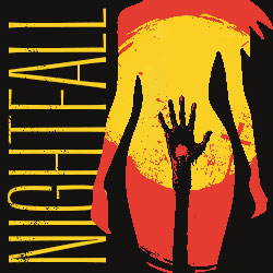
ETA: Ps: the tombstones! They are dick shaped! I didn’t realize it, how freudian…
Anyway: is the woman the victim or the villain?
6 Likes
Maybe it’s Person of Interest style: you only receive her social security number and have to discover the rest.
2 Likes
For me, it was the blood splatter for the sake of it (classic horror movie stuff) and the type face. I mean, that font was born of the 70s. I can already see a smiley face with “Have a nice day!” written below. Also, that silhouette of the woman is reminiscent of the mud flap girl from trucks in the 70s. There’s just a bit of 70s all over the place, but that’s from a North American perspective.

Very interesting take with your latest incarnation! Super creative!
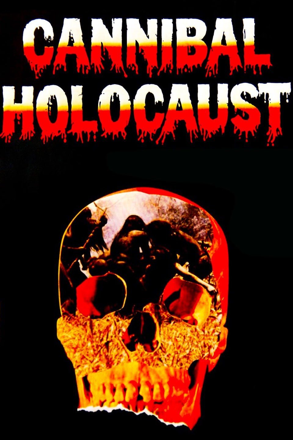
Maybe you have Deodato’s famous movie in your mind for the 70s connection?
2 Likes
Yes, I suppose it’s the color pattern and some of the cliparts used, especially the zombie hand and the bats…
The original font could be Cooper, but I bet on Microsoft’s pirated version, Cupertino. It distracts me because it screams “sales poster on a Brooklyn shop” so loud!
Ah and yes, of course, many posters from the 60/70s look like that. So that’s where I got the inspo.
I don’t know. As professional and intelligent your art obviously is, I find this interpretation a bit in-your-face with, as you say, 70s Italian exploitation splatterpunk vibes. Interesting, but maybe this is not the original tone intended for the game, which is described as “A Horror Mystery” and I had the impression of a more classical gothic style. If the giallo feel fits with the author’s vision, then all fine, but maybe it conveys a different thing. In my opinion your first version could fit the original style better, but maybe I’m reading it wrong.
3 Likes
Yes you are obviously right. In all honestly, my graphics are just a reaction to the original one and the vibes it gave me. After all, I know nothing of the game itself, whose description is probably too generic to tell me anything. Take these as a divertissement, if nothing else.
I like the discussion, though!
the cross-shaped tombstone looks to me more like swords planted on the ground. gives multiple impression: one of murder mystery (weapons impaled on ground) one of mysticism (swords on the ground has many mystical symbolisms) and of battle aftermath but the gravestone-shaped one indeed look phallic, esp. the one at left…
“woman’s fertility” vs. “woman’s sanctuary”… now surely fellows here will start “scientific research” on the Italian refined wording on this bodypart ! ![]()
Best regards from Italy,
dott. Piergiorgio.
In the initial ones, it’s also the chunky serif font in a style that would be whimsical if not horror that gives me the 60s pre-grind house feel when the poster was much more lurid than the actual movie.
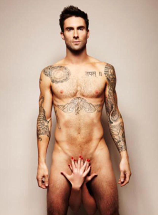
The second one with the sideways title looks like a stylish female-centric zombie flick. Or porn! The one with just the hand is more lurid - the zombie is Adam-Levine-ing her! Even though the tombstones are phallic, the extra graveyard scenery de-emphasizes the eroticism. If it’s just the hand I’m thinking it’s behind the beaded curtain at the video store. Or it’s the finale of a trilogy of pulp novels; previous installments include Dayfall and Noonfall.
3 Likes
A neat idea. I can see Steve Meretzky writing something called Starshipfall, given time.
1 Like
thank you. just getting started I hope to get better.
2 Likes
Ahh LOVE THIS ART! Can I Buy the rights to use it? ![]() As for victim or the villain . . . just have to wait and see.
As for victim or the villain . . . just have to wait and see. ![]()
1 Like
Buying? Nope.
Having it for free, of course, as stated in the first post of mine.
I’ll DM you.
5 Likes