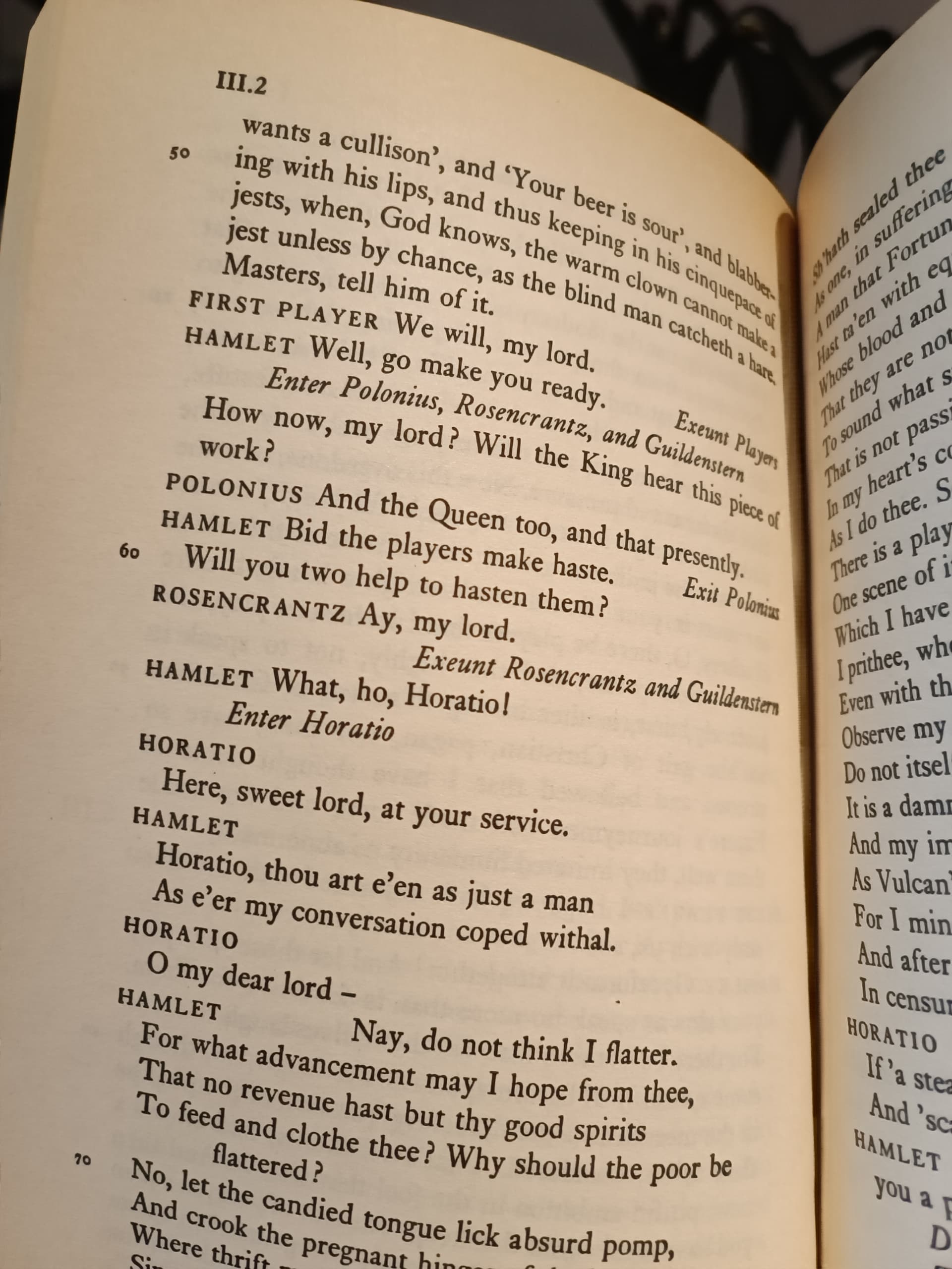
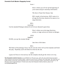
I’ve just checked eight different editions of Shakespeare plays I have. Six put names to the left of the lines, either in a margin or as the first part of the first line. One puts them on the left on their own lines. Only one does what Manon expects: on their own lines, centered.
I think there’s a small change where the prose turns into metered poetry (at the first line of Horatio), with the poetry lines being set to start at the left margin.
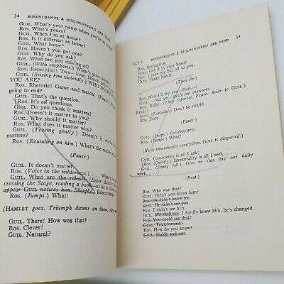
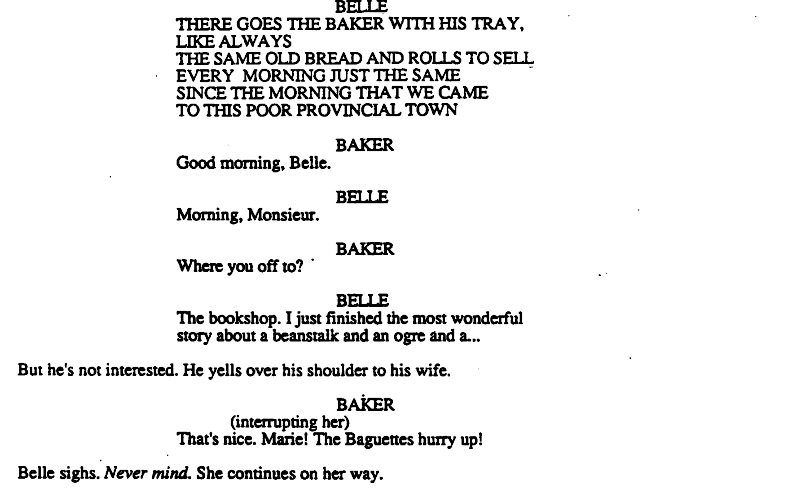
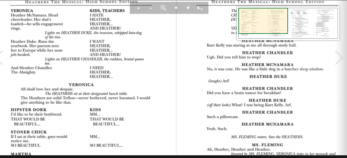
As the owner of a fair number of acting editions of scripts, I conducted a bit of research, and only two of the ten or so scripts I checked had the character name on a separate line. However, what every one of them did do is typographically distinguish the names from the lines in some way. All caps was most common, but some used boldface, and a few used both. I do think The Whisperers could benefit from doing something along those lines.
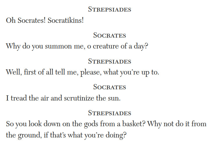
Just to add to this, my recollection (looking at modern editions of ancient plays) was that they generally put the speakers in the left margin, usually abbreviated to one or two letters. But when I pulled up the online Loeb, it has the speakers on their own lines:
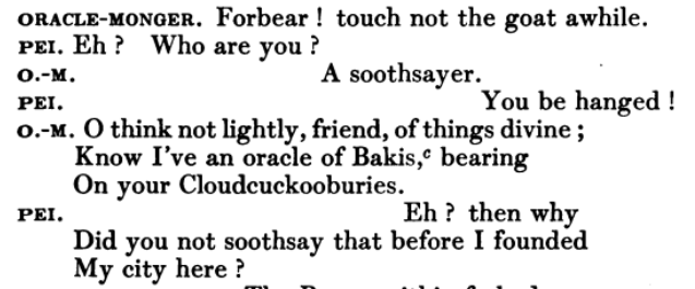
This seemed so strikingly different from what I remembered, so I looked for scans of physical ones (since the library’s currently closed), and it seems they did previously have the abbreviations in the left margins:
I guess once the printing press comes into popularity, putting text on the margin is a problem, hence centered names. That way, you’re keeping space for text available up to the margin.
Examples of plays I’ve seen that has names written on the side always wastes space, doing it as hanging indent.
So, as discussed above, scriptwriting often has formatting conventions that change depending on the use-case. These may seem arbitrary, but have reasons. Screenwriting has to be done to-format so that most scripts run one-minute per page.
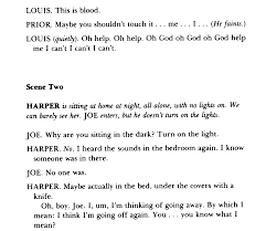
Stage scripts are different - unpublished old-school scripts often push all the stage directions to the right half of the page to leave room for notes, and page-count is less important as legibility and whitespace for notes. Often sung lyrics might be in all caps or italicized.
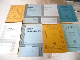
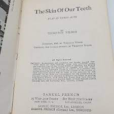
When you buy a published version of a play it’s usually compressed and
formatted to save page space. Similarly are “acting editions” you rent from a production company
Play scripts for production from a licensing company come in several different formats. Usually it’s a smallish (5.25"x7.75") booklet which is printed on both sides. Usually you cannot deface these and have to write in pencil and erase these and return them to the licensor at the end of the production.
One main difference between stage and screen scripts - screenplay dialogue is formatted with narrow margins to make the timing work for 1 page per minute. Play scripts often have wider dialogue margins extending across the page.
TLDR: if you make an IF formatted as a play, try to make things as legible as possible (aka differentiate the name of the speaker, actions, voice level, words spoken as best as possible). Readability > everything.