Drew reviews the visual appearance of html games (latest: Fantasy Opera: The Theater of Memory)

It will probably not surprise readers of this forum that I have taken an interest in the visual appearance of html games. A well-styled web page can add a lot to an experience!

This is not well-worn critical ground, I don’t think, but why should that be? Some authors invest the visual qualities of their games with considerable effort. I’ll keep a few things in mind.

  • Accessibility. Is there adequate color contrast for a given font size? Does the game offer light and dark modes?
  • General appeal. A purely subjective assessment considering color, layout, and other factors.
  • Would I do anything different?
  • Overall assessment. How well is everything working? Do I consider the visual design a success?

Note that I am not a graphic designer or artist. I will be writing from a place of ill-informed enthusiasm, which I hope all will forgive.

I will not be writing about games without any customized HTML styling. Perhaps I will not write about games that use a default color scheme with a custom link color either. My goal is not to exclude anyone, but rather to avoid appearing critical of works that do not emphasize CSS or other technologies.

Let’s get started! I’ll be going down the list of entrants in alphabetical order.

14 Likes

23 Minutes

23 Minutes is a long-form kinetic poem with a striking visual design. Darkened, blurred-out images of London sidewalks and streets afford background to white (#ffffff) text (font-family: Faustina, Helvetica, sans-serif;). Text becomes lighter and less distinct as it scrolls up the page, but the latest line is always white.

Accessibility

I believe this text will be comfortably legible for most readers, as some care has been taken to keep the text bright over a reasonably dark background. One consideration is that the font-size is relative to the total size of the viewport. That being so, the taller the window is, the more legible the text will be. I do not believe there is a light-mode equivalent scheme for this design, or, alternately, devising one would be rather high effort.

General Appeal

This is a nice work to look at. The images get changed up quite a bit, and their blurred nature complements the emotional qualities of the game. The content and presentation are well-married. In fact, I would go so far as to say each is essential to the other. So far as interacting with the html itself, I was surprised by the amount of clicking required: essentially once-per-line in a very long poem. This is not necessarily a problem with the work, but I think many readers will enjoy their experience most if they consume 23 minutes over the course of a few days.

Would I do anything different

As a trained (albeit unsuccessful) poet, I am a near-bottomless font of unsolicited opinions! So far as the actual presentation goes, I think I would experiment with advancing the text by stanza rather than line but have few other notes besides. I have recently embraced the practice of offering a choice between light and dark modes, but this work is closely aligned with its specific presentation. I’m not sure that offering a different color mode would easily reflect the intent of this piece.

Overall assessment

23 Days is a strong example of alignment between content and presentation. There’s an interesting use of overlay that is presumably enforcing a certain amount of contrast between text and image. I appreciate the way the washed-out, distorted images complement the mood of the poem and plan to study the CSS to see what can be learned from it.

This is a unified work that utilizes visual styling to great effect.

10 Likes

What a fun perspective for game reviews. This is really interesting for me, someone who has basically no styling skills; I love reading evaluations about things I’m not skilled enough to eval myself. Looking forward to reading more! (And glad that our default-appearance parser without any custom html will be spared a critical evaluation, haha.)

5 Likes

Cryptid Hunter is an enjoyable hunt requiring close reading and observation. I discovered two of three legendary cryptids and plan to return for the third.

Accessbility

Thanks to well-chosen colors and a generously sized font (Courier New), Cryptid Hunter is a highly legible game. I do have concerns over the red “visited” color, which does not contrast as well and, on one particularly green screen, may be hard for color blind players to make out. There is no light mode available, but I recognize that the overall spooky feel of the game works well with a dark screen.

General Appeal

Cryptid Hunter uses pleasant and utilitarian colors that suit its overall ambiance. I really liked the fuzzy photographs of the cryptids, which seem like a perfect match for the game’s story. There is also a very nice “Notebook” feature that players can use to keep track of their Cryptid discoveries.

Would I do anything different?

I would find another color for visited links, but that is my only suggestion.

Overall Assessment

I enjoyed my time with Cryptid Hunter and intend to go back. The colors are thoughtfully chosen and suit the story. Images and a notebook go the extra mile, and Courier New is a strong font choice for a game about capturing Cryptids. Form and content work well together in Cryptid Hunter, and I consider it a success for that reason.

9 Likes

Studies suggest that persons with Bipolar Disorder have greater difficulty maintaining attention than those without an attention-impacting diagnosis. My psychiatrist has advised me that my difficulties with inattention will likely increase over time.

When it comes to focus and attention, I have always had two modes: distractable and profoundly focused, with little in-between. It seems that, over the years, the types of things on which I can sustain focus have diminished greatly.

Way back in the 1900s, for instance, I beat Infocom’s Deadline without hints. I could never do that today. I can’t really play puzzle games anymore, a thing I mourn as a loss, but it simply isn’t possible. Only a few things are certain to sustain my attention over long stretches of time: Inform7 programming, writing about Inform 7, writing game criticism, and the rare video game. The problem of reviewing games when I have so much trouble playing them is currently unsolved.

This is all to say that I quite literally cannot evaluate the many puzzles that constitute Enigmart. I would like to say, though, that I have seen Enigmart discussed a good bit in online spaces, and it is clear that people are enjoying it.

But what of the visual presentation of Enigmart? This is something I can spend time with and evaluate comfortably.

Accessibility

Enigmart boasts two color schemes, a thoughtful touch that light-sensitive players will appreciate. Dark mode consists of a white (#ffffff) on blue (#00328a) background, and light mode consists of black (#000000) on white (#ffffff). Contrast is good at 18px font size, passing WCAG 2.1 and meeting or exceeding APCA. Link color, meanwhile, is either yellow (#ffe53e) or blue (#00328a). Both pass WCGA 2.1 and APCA at 18px font size.

While many puzzles are presented as images, they are accompanied by image descriptions that consist of text-only puzzles. This is a welcome and considerate practice, and an indicator of Enigmart’s commitment to accessible design.

General Appeal

Enigmart is a good-looking game. Questions of contrast aside, I really like the dark mode presentation, which is really more of a “blue mode” than it is the typical “black mode” or “charcoal mode” we often see. Corporate logos and visual puzzles complement the mood and gameplay of the work.


While most puzzles are solved by typing a word into a field, many work differently. For instance, a few puzzles consist of multiple drop-down menus. Such variants offer not only mechanical but visual changes of pace.

Would I do anything different

I would learn more about how font size is calculated. For myself, not for this game.

Overall Assessment

This is a standout game with an appealing dark mode, images complemented by alt-text puzzles, and an alternative color scheme. My impression is that a lot of care went into the presentation of Enigmart, and that effort has paid off. Contrast is very strong throughout. In terms of both accessibility and visual appeal, Enigmart succeeds.

Bonus point: it looks great on mobile, too.

13 Likes

Fantasy Opera: The Theater of Memory

This charming game has a lot to offer players, mechanically. Stats, dice rolls, puzzles. Other reviewers have discussed its features in detail! But what of its visual presentation?

General Appeal

Visually, Fantasy Opera: The Theater of Memory is an impressive, high-effort affair with a background image presenting classical columns that suit the operatic (literally speaking) setting of its story. Watercolor portraits of characters add visual appeal and additionally contribute to an overall sense of polish.

Color selection is more complex that what we are used to seeing, requiring as it does light and dark mode settings for multiple on-screen elements. The css is rather complex, so hopefully I have correctly identified the correct colors. Let’s have a look and review the relevant APCA checks.

First, though, I should say that I find the off-white and dark brown schemes appealing. They are easy on the eyes, and the background image matches them well.

Accessibility

Dark Mode:
body: bg (45, 25, 0) text (255, 247, 233) (calculated on my system as 17.6px)
tutorial: bg(12, 13, 1) text (255, 225, 173 ) (calculated on my sytem as 15.84px)
choices: bg (13, 66, 69) text (255, 247, 243) (calculated on my system as 16px)

These comfortable and appealing choices all pass APCA.

Light Mode:
body: bg (255, 247, 243) text (34, 36, 1) (calculated on my system as 17.6px)
tutorial: bg (248, 240, 201) text (89, 50, 2) (calculated on my system as 15.84.px)
choices: bg (248, 249, 250) text (0,0,0) (calculated on my system as 16px)

The light mode tutorial is the outlier, here. If I am reading the CSS correctly, it does not pass APCA. How big of a deal is this? There aren’t a lot of tutorial messages, and, in fairness’s sake, it is compliant with the current WCAG standard. However, I’ve been evaluating games according to APCA, so my assessment is that this is a less-impactful (subjective) case of an elelement that does not pass APCA (objective).

Would I Do Anything Different

I would verify the contrast.

Overall Assessment

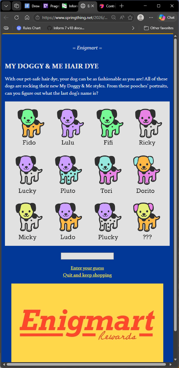
Nevertheless, this work achieves a level of visual polish I find comparable to Enigmart. These two works are undoubtedly the best-looking games I’ve seen so far. I really appreciate the charm and appeal of Fantasy Opera: The Theater of Memory, and the overall layout and visual design perfectly complement the mood of the piece. The artwork further enhances the experience.

Despite one minor accessibility concern, this is an outstanding visual design.

Bonus point: looks great on mobile

6 Likes

Thanks so much for the review, Drew, and for your kind words about the design!

I was surprised to hear this. I used this tool during development, which measures contrast for WCAG standards but does not list APCA specifically. So I wanted to look into it a little.

The foreground and background colors that appear in the game for the light mode tutorial boxes are:

Foreground: #593202 • rgb(89,50,2)
Background: #f8e6c9 • rgb(248,230,201) (You listed a very slightly different color.)

I ran these through a couple contrast checkers, and according to this resource this combination does pass the APCA color contrast method for WCAG 2.1 AA accessibility standards for the font size I used. From what I understand, this is the industry standard in web development.

@jeresig also ran the page through this tool to verify that the light mode tutorial matches WCAG 2.1 AA accessibility standards.

Thanks again for playing my game, and taking a look at its visual presentation!

2 Likes
Me rambling about what I evaluate and why

True, that is the current standard. APCA is proposed for WCGA 3 accessibility, and, because I’ve received feedback about poor legibility in my own WCGA 2.1 AA-compliant games, I’ve embraced the new standard. This is a personal choice, of course. Many find the current criteria sufficient.

In APCA, those colors, combined with that font weight and font size (if I’m reading them right) just barely fall short. An APCA contrast value by itself does not indicate a passing grade. It must be checked against size and weight.

It is more than a single point of measurement, in other words. I think this makes sense. Bigger letters are easier to read.

I don’t say this to argue or correct, but just to explain what I am looking for in a color scheme. I definitely don’t want to imply that you’ve been inconsiderate! I’m just working from personal experience and advice that I’ve received.

I use an APCA-specific tool for this (something like this). Note the matrix that evaluates multiple factors.

Anyway, it may be debatable whether I’ve taken the right approach, but I use APCA to verify what I want to see as a reviewer.

I recognize that I can be a bit wonky about these things, so thanks for your patience! Congratulations on a game well made.

1 Like