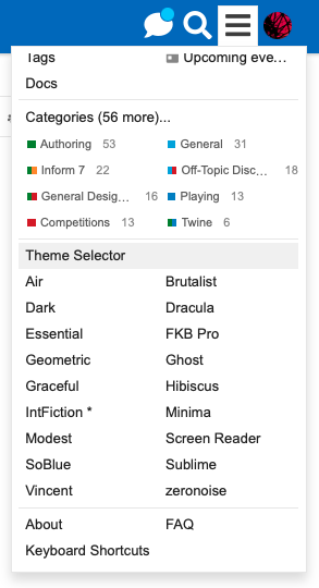
Our default theme is pretty awesome, but did you know there’s a dark version? If you click the hamburger menu on the upper right, there are other themes you can select.
Dark is the basic theme with an easy-on-the eyes reversed color scheme.
Like dark themes but want something a little different? Try Geometic or Vincent. My favorite is SoBlue, though Dracula was my jam for a while. It’s dark but with a slightly thicker font.
Need bigger text with serifs? Try Minima. Aesthetically pleasing soft colors? Hibiscus, Essential, or Graceful
Less clutter? Zeronoise, Modest, or Sublime.
Wanna feel like an 80’s hacker surrounded by neon? Take a look at Ghost!
Just want no frills and text? Try Brutalist - especially if you like to filter things by category or tag, you can click anything in the topic list for instant filter.
Want a message preview inline kind of like Mastodon, Twitter or Facebook? Look at FKB Pro or Air.
If you’re a whiz with CSS and think you could make a cool forum theme, we’re happy to take a look at it and make it available as long as it’s not too identical to another theme and doesn’t do strange things on the page. If you host your theme on a GitHub, we can access it and make it a part of the board. A basic tutorial and info is available on Discourse Meta (the forum about this forum software):
I don’t like reading light on dark except when playing IF games. So even though I like the So Blue colour scheme, I’m not going to use it.
I like some of the other minimalist themes, but they all have the one wrong detail that puts me off. Hibiscus has the awkward orange-pink for the chat/search/hamburger buttons, Graceful is too aquarium-blue, Minima has round avatar-windows (+ too aquarium-blue), zeronoise would be awesome if it weren’t for the ugly purplish buttons…
Instead of nagging, I’d better check out the theme-maker myself. Or not, Essential is pretty much perfect for me.
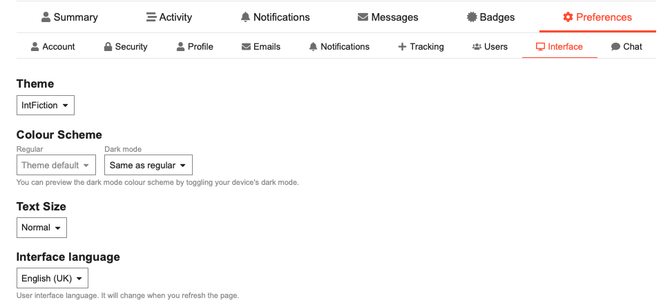
Once you choose a theme, you can also go into profile preferences under “interface” and choose a different color scheme…this may or may not work ideally for each one but there is some customization available.
Make sure you choose “save” at the bottom when you make changes from here, it won’t stick otherwise if you navigate away.
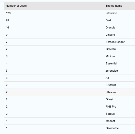
I’m glad only one other person is using my preferred theme–not in a hipster way, but because I’ve been asking hanon to experiment with the theme’s functionality for me and if 90 other people were using it that would probably cause some confusion…
rip to that one person using it other than me tho right now
(we’re gonna copy the functionality to another duplicate theme soon so that one person will get relief soon)
Further feedback on Hibiscus: it looks great on mobile, but something about the positioning of elements is off on my computer: the poster names are floating above the posts in such a way that they look almost like they should belong to the previous post.
This is what the previous two posts in this thread look like for me on my computer in Hibiscus: