Hello IF community.
I’m Jared - one of the game authors this year. This is my third IFComp, and I’d like to try something new.
You see, each year I look forward to the competition. There is such a great buzz here on the forums. The authors’ forum is super active and players are coming back to these forums and posting too. It’s always felt like such a miss that authors and players don’t mingle more during this time of excitement around IF.
I work for a large game studio, and I thought I would take a page from their playbook and write a series of developer diaries. These are little insights into what it took for me to write my game this year. Somebody may find it interesting, and maybe it leads to some conversations. If it doesn’t, that’s fine. If it does, I plan to stick to the competition rules. I won’t talk about any of the other games or offer any of my thoughts around the role of judging in the competition.
So here goes…
Art in Interactive Fiction
In this post I’m going to use the term art to mean visual art just for convenience.
‘Now Jared,’ I can hear you saying, ‘you do know this is an Interactive Fiction competition, right? At least 9 out of 10 entries here will have no art at all. Why start with a topic like this for this crazy developer diary idea of yours?’
Well, reader, I’m glad you entered my imagination and asked that question. There are a couple of reasons for why I thought art would make a good topic. The first is that if it weren’t for the art in my games these past three years, I probably wouldn’t be here at all. Making these games has always been a family affair. My daughter (who is now in 9th grade) loves making digital art and creating games together is a great way for us to connect. This is even more poignant in Tragic because the game is about Kelly, a girl my daughter’s age, creating a game for her brother, and in the game the art shown is what Kelly would have created for her brother. (this spoiler is something you will learn in the first 5 minutes of play).
The second reason for this topic is that I felt like it gave the best ratio of being interesting vs being spoiler free. Later on in the competition I may write on more geeky topics that delve into the game a bit more. This will give players a bit more time to explore the game first.
Art vs. Narrative
One of the biggest considerations around art for an interactive fiction title is when it is appropriate to break away from the text to make use of a visual element while still attempting to be true to the genre. There are several authors (and players too) that will say that you never should stray from the text. I sympathize with the sentiment. I would even say that you can do far more with narrative than you could ever do with graphics. This is the reason, for instance, that across all of my games I have never shown a visual representation of you, the player.
I do however make games that don’t quite fit the mold of traditional IF. My thesis over these three years has been that it is possible to fit fun gameplay elements from other genres into a narrative based game. This combined with my desire to create as little frustration with game mechanics as possible has always led me to create custom graphical user interfaces (GUIs) in each of my games. GUIs by their nature need visual treatment.
So for me, the player is strictly out of bounds and the GUI is always in bounds. What about the other elements of the game? In the case of Tragic, there are four gameplay elements I had to decide to describe in text or through art. These are the human characters engaged in dialog, the enemies you encounter in combat, the cards you collect, and the items in your inventory.
When evaluating decisions like this, I like to use the razor of ‘what will make the best experience for the player?’. In my past games, the characters engaged in dialog had visual representations. In Tragic however, I decided that wouldn’t work. There are elements of the story that unfolds as you progress further into the game that I think are better developed without prejudicing the player with a pre-conceived visual treatment.
So what about the cards? It is a card game after all, and most games in this genre are largely defined by the art on the face of said cards. I didn’t want to give that up, but it also did not feel right to have a visual card game and still consider the game worthy of being considered as IF. So, I decided that each card would have an arted card face, but that art would exist only in my imagination. I would have to translate the picture I had in my head to text. This decision turned out to be completely liberating. I was able to do a lot of fun things with the card face ‘art’ that would have been extremely difficult, if not impossible, to represent in a drawing alone. I hope you will see what I mean once you try the game.
I made a similar decision with the enemies in the game. I describe them only using text.
That leaves your inventory. In Tragic you equip gear similar to that found in your typical D&D-style role playing game. You never really interact with that gear once it is donned, but you do need to constantly keep in mind the effects that your kit provides. This felt like the right place to add some visual elements.
From Concept to Production
There are 73 equippable items in Tragic. So the first thing I had to do was become a Producer and convince my Concept Artist daughter to get on board with the project and get cracking on those drawings - because Dad has a deadline. I simply don’t posses the skills to make these myself.
So a few months before the competition I handed to Ellana a list of items grouped by equipment type (head, shoulder, weapon, etc.). This list contained names like ‘Belt of Grounding’, ‘Fortitude Sash’, ‘Soul Stone Necklace’, and ‘Sparking Knuckles’. It was up to Ellana to define the art style, and I think what she came up with looks great.
From my list, Ellana decided to create a single sheet of drawings for each group that I had given her. Using a Wacom tablet and graphical drawing program, she created sheets that look like this:
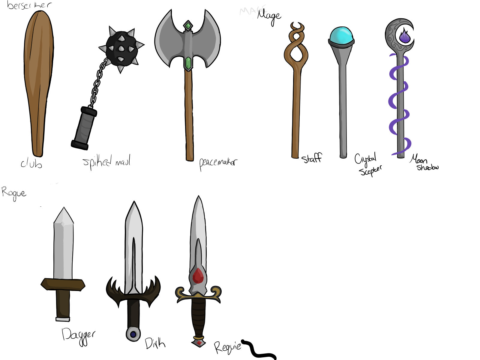
It was up to me to translate these into what you see in the game itself. In the game, the items appear as drawings attached to the top of poker chips. This meant that I had to take the concept art, size it to something that would show well inside a small circle and convert the background into translucency. In most cases I was able to fit the entire drawing. In some cases, like the ‘Moon Shadow’ shown in the link above, the details became too small to appreciate and I had to cut a portion of her drawing off. The end result you can see by playing the game.
Character Effects and Sprite Sheets
The rest of the GUI is comprised of background images, nine-sliced borders, text meshes, sprites, and sprite sheets. A text mesh is just a fancy way of drawing text using components your graphics card can work with. The ‘Tragic’ logo at the beginning of the game is a good example of a text mesh. A sprite is simply the name Unity uses for a two-dimensional image that shows up in the game.
Each sprite is a game asset and each game asset adds some overhead to the game. This isn’t really a problem in a game this size, but it is a good practice to group similar sprites together into a single asset called a sprite sheet. I did this for the icons you see for the character effects (buffs and debuffs that you see in the game). These I drew myself, which is why they are more simple shapes and don’t have quite the same sense of style you see in the equippable items.
You can see an example of a sprite sheet used in Tragic below. The sheet is sliced up, in this case into uniform squares of 64 by 64 pixels. The sliced up sprites are sent to the game code as an array, and I had to write code to associate each effect with a sprite.
The End Result
In the end, creating a game is a process of imagining an experience and trying to deliver that experience to the player. In the case of Tragic I wanted that experience to have the feel of a traditional role playing game and have a delivery that fit within the larger story of the ‘game within a game within a game’. I hope that experience is realized both through the writing and the visual presentation of the game.
I also hope that at someone out there finds details like those posted here interesting. If you have feedback on the format, I’d be glad to hear it.
Enjoy the games.
Edit: I figured out how to embed images rather than link to them.