Twine Version: 2.7.1
SugarCube 2.36.1
Hello everyone,
i am going crazy over this one, because i just dont understand whats happening here.
I am using the dialog API macro set, by chapel; for sugarcube 2. I am using this for a simple question with a simple yes/no answer.
I am using the standard twine button-macro and i want to give it some style (different color, hover effect) but only for the buttons in this dialog system.
Now for some reason the css style i created gets overwritten(?) by another css style.
What do i mean?
This is my css style:
#nbtn button{
    background-color: grey;
    color: white;
    padding: 10px 20px;
    border: 1px solid white;
    cursor: pointer;
    transition: all 0.3s ease;
    width: 56px;
    height: 36px;
    box-sizing: border-box;
    min-width: 0px !important;
}

#nbtn button:hover {
    box-shadow: 0px 0px 10px 5px rgba(0, 0, 0, 0.3);
    transform: translateZ(10px);
    background-color: darkred;
}
and this is the twine code:
<button id="yes-button">Yes</button> <<div id="nbtn"><<button "no">><<dialogclose>><</button>>
(The “yes-button” is not in action yet)
In the dialog system the two buttons are not side-by-side, there is break and they under-eachother.
I figured out why, but i dont understand…
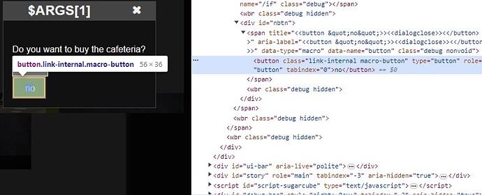
At first everything is as intended, width and height are as defined in css:
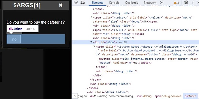
But the reason for the break is the second width for the nbtn button
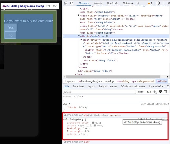
Which is inherited from here:
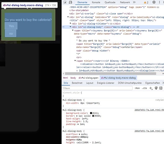
Which ultmately comes from here
…why? Why does my css style gets ignored/messed up/overwritten by that?
Any help is appreciated. Many thanks in advance.
(If someone has idea to do it without the button macro, i am eager to here)
Kind regards


