Creating a GUI

Please specify version and format if asking for help, or apply optional tags above:
Twine Version: latest edition as of 3/2/21
Story Format: Harlowe latest edition as of 3/2/21

Hello, forum!

I have a few questions and I am hoping you guys can answer. I have scoured the internet for an answer but can’t seem to find exactly what I am looking for, whether that be my own error or that there is nothing of this sort out there yet is regardless.

I am creating an interactive fiction using Twine 2, Harlowe, both the latest edition as of 3/1/21, and I plan on having this play out more like a game rather than a point-and-click novel, and with that in mind I want a GUI that matches the tone of what I am going for.

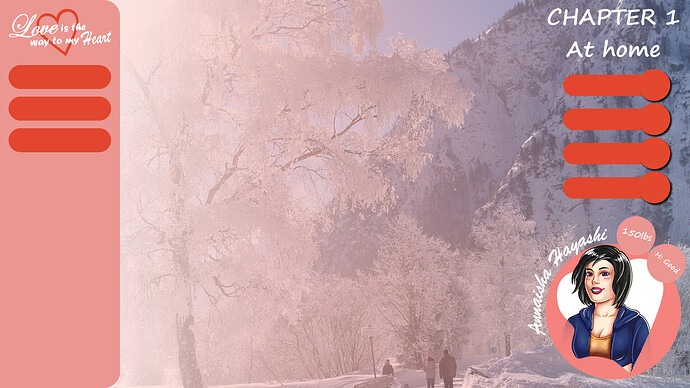
To cut it short, I am wanting to size a background image as the GUI base layer and have variables and words positioned over-top the layer to give the illusion of a full intact GUI. To do this, I need the background to resize to any computer screen at full screen play. For instance, if the background image is created in, say, 780 x 1080 resolution, I want that image to fit any screen resolution. I know that I gave a small resolution for the image to be stretched, but it is for sake of reference. I am going to have the image drawn much larger and then hopefully be able to shrink it to fit any screen resolution.

With that out of the way comes another problem: words, positions, and size of text.

The basic image is shown below, and in the left column will be 3 options at all times: Menu, Load, and Save. If the screen resolution changes and the background image with it, I have a good idea of how to keep those words in place to always match, but will there come a resolution where the words become larger than the boxes provided for them? If the answer is “yes”, perhaps I should only have the interactive fiction played in full screen on one’s monitor, yeah? And with THAT, will I run into the same problem?

I know this is a lot to unpack, and I do apologize if my question is too convoluted; I tried to be as precise as possible.
I’m not sure if you’ve done much coding yet, but if you’re not stuck on using the Harlowe story format, I’d recommend using the SugarCube story format instead. It not only already has a collapseable left-side UI bar for saving/loading and restarting the game, but it also has a bunch of other built-in tools which should make things easier for you. See also this “SugarCube vs Harlowe in 2021” post which details why SugarCube is currently better to develop in than Harlowe.

I’d also recommend making mock-ups of how you want your screen to look at other common screen resolutions (note: mobile resolutions, like 360x640, are often displayed as though at double that resolution, i.e. that resolution would be treated as though it’s 720x1280), that way you can figure out how you’d want to style things so they’ll look good at those resolutions. Once you have that figured out, then you can use media queries in your game’s Stylesheet section to create a responsive web design (e.g. a design that modifies itself based on screen resolution and aspect ratio).

Hope that helps and good luck with your game! :slight_smile:

2 Likes

Unfortunately I am stuck with Harlowe :confused: I am so far in now that I am committed!

It’s not bad but it does have its limitations.

So, there’s no way to do what I ask? I am fairly new to this coding, all self-learned and some by trial-and-error, so forgive my noob-ness hahahh.

I wasn’t saying that there’s no way to do it in Harlowe, just that it’s more difficult than it would be if you were using SugarCube, since you’ll need to code some things yourself for Harlowe which are already built into SugarCube.

I don’t use Harlowe myself, so I’m afraid I can’t help much with it, but the media queries stuff will work with Harlowe as well, since it’s just CSS code.

1 Like

I can’t speak specifically about Harlowe or SugarCube, but if you want general advice, you might want to research “responsive web design.” It encompasses CSS/HTML concepts for making web pages work on a variety of devices, including the use of media queries that HiEv mentioned. (Edit: And he called out the specific term “responsive” as well. So just to reiterate, responsiveness is a well-worn path in web design.)

1 Like

Thank you for the direction! I will look into this. :slight_smile: