Most choice based games will work on mobile, but when an author doesn’t leave blank lines between the menu options, it’s hard for my fat finger to touch the choice I want. So please, instead of
This is a really good point. For my own game (demo), I increase the line space and font size on the choices for that very reason. IIRC, I have the space and sizes change differently depending on screen size. It’s really easy to add and makes a huge difference in warding off fat fingered mistakes.
This doesn’t seem to be a particular problem in mine (at least not on my iPhone) but I am for sure an offender here — there’s a puzzle with a 5x5 grid that looks like a 4x5 grid. I am sorry; my games are optimized for a computer. Here’s David Lynch ranting about watching movies on a mobile device.
(Edit, I think this came out a little less jocularly than I intended! That grid has been giving me heartburn for a while now.)
I’ve a progressive neurological disease, and huge hand control problems as a result. I’ve had some difficulties controlling clicks in choice games, including one I playtested. So yup, there can be a variety of accessibility issues, and not always the most obvious ones. Though in my case I’m veering increasingly towards having to switch to Voice Control on my Mac to control clicks / the pointer etc. Actually I wonder how well that will work with some games. I need to go experiment …
I did some work in mine to make sure all the links had a tabIndex set so you could tab through them with the keyboard. Not sure if that’s enough to help.
Is there anything you’ve seen a choice game do that’s made the experience better for you in that regard? Any options we could be including that could be toggled on to improve it?
Can I get back to you after the competition? My hand control problems have worsened a lot in the last year, so this year’s competition will give me a thorough work out in this respect!
I haven’t tried tabbing through links before. Will see if that works well for me. Thanks for putting in the effort there.
The big problems I ran into recently with a game was the need to select a choice from a pull down menu of multiple options. Which was very fiddly for me to operate. Simple separate clickable options would have been much better for me. And yes, good spacing helps a lot.
Will report back with more thoughts in a few weeks!
i totally understand if you don’t end up with time to do this, but i should mention that any feedback offered about accessibility is something we’re planning on including as a first-class feature in the game engine we’ll be releasing. we’ve put a lot of effort towards trying to make sure it works as smoothly as possible with screen readers, but i’m sure there’s plenty more we can do on the way to an accessible-by-default IF toolkit for modern browsers.
(frankly, the hardest problem is just finding anyone to say, hey, here’s what’s not working at all with JAWS/apple/etc. but i wouldn’t ever want anyone to go to trouble to get that done, it’s a long-term effort.)
Totally! No pressure, by the way. I was just curious if you had any thoughts while we were talking about it.
To others: I learned recently that Firefox has an “Accessibility” view you can turn on from the debug panel which will automatically highlight all the accessibility problems on your website. This includes contrast problems (text too faint for people with limited visibility), links or interactive elements that can’t be controlled via keyboard, etc. It can even preview to you what your website will look like with different combinations of colour blindness.
It’s not exhaustive and I’m sure it’s paltry compared to what a real accessibility consult will give you but it’s a start! Made me think about a few things I had never considered before.
yep, this is in chrome as well. lighthouse should assess text size and contrast, and if you click “Inspect Element,” it’ll show you accessibility details for any particular element, including the role, title, and contrast ratio. it’s also important to note that it’s very easy to make designs with CSS that appear sensible to the browser, unreadable to the user, and won’t actually fail these assessments. in particular, something like an image or gradient won’t ever show up, because it’s not possible to assess statically.
(all of which is to say don’t take a 100% score as proof it’s accessible, it’s just a lack of evidence without manual testing.)
Totally. That’s a good qualification. As someone who’d never even considered these issues before, it was a really helpful start just to know what to look for.
I tried reading a few articles by Mozilla but they were quite dense for starter material. I need something for people at extreme end of ignorance.
As regards tabbability, Twine games are surprisingly inconsistent. For example, in many games that have “cycling links” (where the link says X and then you click on it and the link text updates to say Y, then you click again and the link updates to say Z, without turning the page) the cycling links are not focusable using tab.
And there’s a glaring bug in certain games where if you use tab to select a link, and then press tab again, the focus ring selects links in a hidden panel, so it looks like tab doesn’t work, but it does.
While it is possible in principle for authors to work around these bugs themselves, IMO this should be fixed in the story formats (Chapbook, Harlowe, Sugarcube).
Lighthouse isn’t great at discovering these issues, because Lighthouse is designed to evaluate a single page in isolation.
In ChoiceScript, clickable options have a minimum height baked in, so authors don’t have to remember to add double-spaces. Twine should do the same, IMO.
accessibility work, and more broadly the ARIA/WCAG standards, are often intimidatingly dense, preposterously large, and have few footholds for any developers to glean common-sense user experience guidelines (imho). color contrast is a notable exception to that because it’s simple, can be expressed in a single score, and browsers are fairly good at calculating this based on your rendered webpage. there’s a lot of other stuff that’s fairly hard to understand, most of it notional, and i think personal experience helps a bit there.
broadly i’d advise you to treat the times when you’re most stressed, or reading is most difficult, as a halfway decent barometer for what playing your game might be like any day for someone with a VI or neuro condition. same goes for anything that might give you RSI doing a million keychords in a row, or something you might mistype on your phone. anything that slows you down there will likely make it difficult or impossible to consume for others, and it’s also a common sense UX strategy for any webpage which involves tens of thousands of words of text. this is similar enough to my schema that if i find it slow to move through my game in development and testing, so will my players!
it’s funny, this actually was a primarily accessibility-driven concern a decade ago. now, we’re firmly in the mobile epoch, and in practice, most production websites get designed for fat fingers first, then the layout and feature set gets scaled up to high-res monitors. so i actually think “operable with big fingers and small screen” is more of a ground-level best practice today, at least insofar as it applies to web design!
and @tayruh, just remember, you can make the tab index -1, you can make it 0, but don’t make it any higher
I was a little confused by this suggestion that was ubiquitous across what I read. My game has vertical menu along the left-hand side of the screen (settings, save, back, forth, etc. kinda in the same spot as the Harlowe navigation buttons). The main prose passage is then to the right, which contains the available choices at the bottom.
With all elements having a tabIndex of 0, they use the layout to determine order, meaning you tab through the entire menu (5 buttons) first, then get to the choices. This means that with each new passage, you have to tab through the menu again. Presumably, people are interested in interacting with the choices more often then the menu, so I felt like maybe they should he later in the tab order.
Is my assumption wrong? Is it just that any deviation from the expected order from layout is just confusing and non-standard and best avoided?
it sounds like there’s a bit of a mixup between presentation and semantics. if you want your menu to be on the bottom of the tab order, place it in the bottom of the container element, and use CSS to present it to sighted users above the other ones. the only time this would be confusing would be if a sighted player were to tab through the entire document, and i don’t think it’d be especially confusing. it’s simply easier to make a page look different than it is to try to fix a semantic ambiguity or incorrectness.
more broadly, if you do want your menu at the top in both senses, but you want to make it easy for screen readers to navigate, there’s probably a few ways, each of which could complement each other. what we did was some combination of the following, all of which may only work for some environments, or might not help at all:
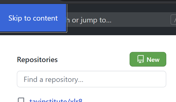
a link, non-visible to sight, mouse, and touch, with text something like “click to skip to content.” if you go on github, and tab from the very top of the document, you might be able to see something similar:
an aria-atomic or aria-live value, or a role like log, marquee, status, alert, etc., depending on need (alert is “impolite,” so consider the context of the tool as well as the narrative.)
applying presentation or group roles to any container elements which shouldn’t be treated as navigational destinations
embedding your menu or the menu contents in a container with a role like region or menu
embedding your live region into a container with the main role
there’s also the question of how to make tab navigation useful for people who can see, but not very well. in that case, i’d recommend using the :focus selector to either set a border or box-shadow. (you can tab through accelerate’s menus to see the outline effect.)
Okay, that makes a lot of sense. And I never realized github had that hidden button up there all along. Cool!
Also I just turned on Microsoft Narrator and tried to play my game. Let’s just say I learned a lot very quickly lol.
There’s a couple “glitch text” animation effects that are created by replicating the same word over itself a few times using ::before and ::after selectors and the screen reader naturally thought it should repeat the word three times. Also, I have the text of my previous passage slide out of the way of the new passage, and naturally the screen reader read that too, effectively giving you each passages narration twice.
Not the screen readers fault. These are perfectly reasonable things for it to do. I just never thought about it.