Changing Progress Bar Color

Can’t seem to find the original source for making the progress bar via the second line of the code:

$CRed[Health]: (color: lime)[$Hlth] of $CGreen[$HlthMax] <!-- This was my add -->
(print: '<progress value="' + (text: _MaxH) + '" max="100"></progress>') <!-- As originally located -->

Is there an EASY way to adjust the color so that perhaps…
It turns yellow when Health falls below 60%…
and Red when it falls below 25%?

Maybe an (if:) statement between the two lines, such as (these aren’t correct commands, but an example of what I’m hoping to do):

(if: $Hlth <60) [progress-color: yellow] (else-if: $Hlth <25)[progress-color: red]

A pointer towards the source and usage of the '<progress value=' and </progress> commands would be helpful too. Every search I’ve come up with points back to sugar-cube.

Thanks

I usually start at MDN for HTML docs: the <progress> element’s page is here: https://developer.mozilla.org/en-US/docs/Web/HTML/Element/progress

Sounds like it’s tricky to add styles: https://css-tricks.com/html5-progress-element/

Thanks for the links…and wow…

Looks like it is practically impossible, at least insomuch as making it work cross-platform. Thought html was supposed to play nice with all browsers but see that’s not the case. Different coding is required for each platform (i.e., edge, firefox, chrome, opera).

Guess I’ll leave it as it…

Regardless, it’s given me some new resources to reference.

What I’ve seen people do in the past is make a qsuedo progress bar using an image or even just colored divs.

For example, have something like this:

(if: $Hlth <60)[(set: _color to "yellow")]
(else-if: $Hlth <25)[(set: _color to "red")]
(else:)[(set: _color to "green")]
<div style="position: relative; background:#000000;width:300px">
	<div style="background:_color; width:(print: ($Hlth/$HlthMax) * 100)%; height:2em; margin-right:auto"></div>
	<div style="position: absolute; color:white; top:0; left:0; padding:0.25em">$CRed[Health]: (color: lime)[$Hlth] of $CGreen[$HlthMax]</div>
</div>

This isn’t tested and I’m not very familiar with Harlowe so I’m not sure if the script side is right, but I tested the HTML part.

The code displays a black div with a left-aligned colored div inside it that grows/shrinks according to the percentage of health remaining. If the Harlowe script is right, it’ll set the color the way that you want too.

Sorry beforehand if this is TLDR…or TLWR (too long, won’t read)

Other than my original coding, I wish I could say I understand what you attempted to convey Tayruh.

I’m assuming the <div to </div> is the html aspect. Went and copy/pasted it into my test story (has the same startup and css as the actual story. Didn’t see any bar…just ‘Health:’ in red, ‘Hlth’ in lime, and ‘HlthMax’ in green.

Does all that code go into a passage? Or does some of it go into the javascript area and is then ‘called’?

At least until I saw Josh’s post, I was really hoping for something as simple as the example I made in my OP; that is sadly NOT the case. Not only trying to keep the coding to a minimum, but using that which I can understand…

Sad to say…a lot of the modern languages baffle the hell out of me…people always said learning Basic first was a mistake. Mastered Apple Basic doing things the teacher had no idea about (probably dating myself), same for the Timex Sinclair…then got into Turbo and Dark Basic. Might not be nearly as powerful as C+ (or Java, html, etc.), but at least the commands made sense and you had a good idea of what they did.

I am probably going about this backwards…but right now only getting the display and character generation aspect done before getting into the meat of the story/game. Reason being it gives me a chance to learn and understand how or what and why I’m doing something.

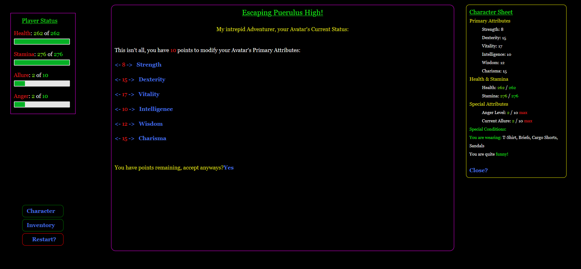
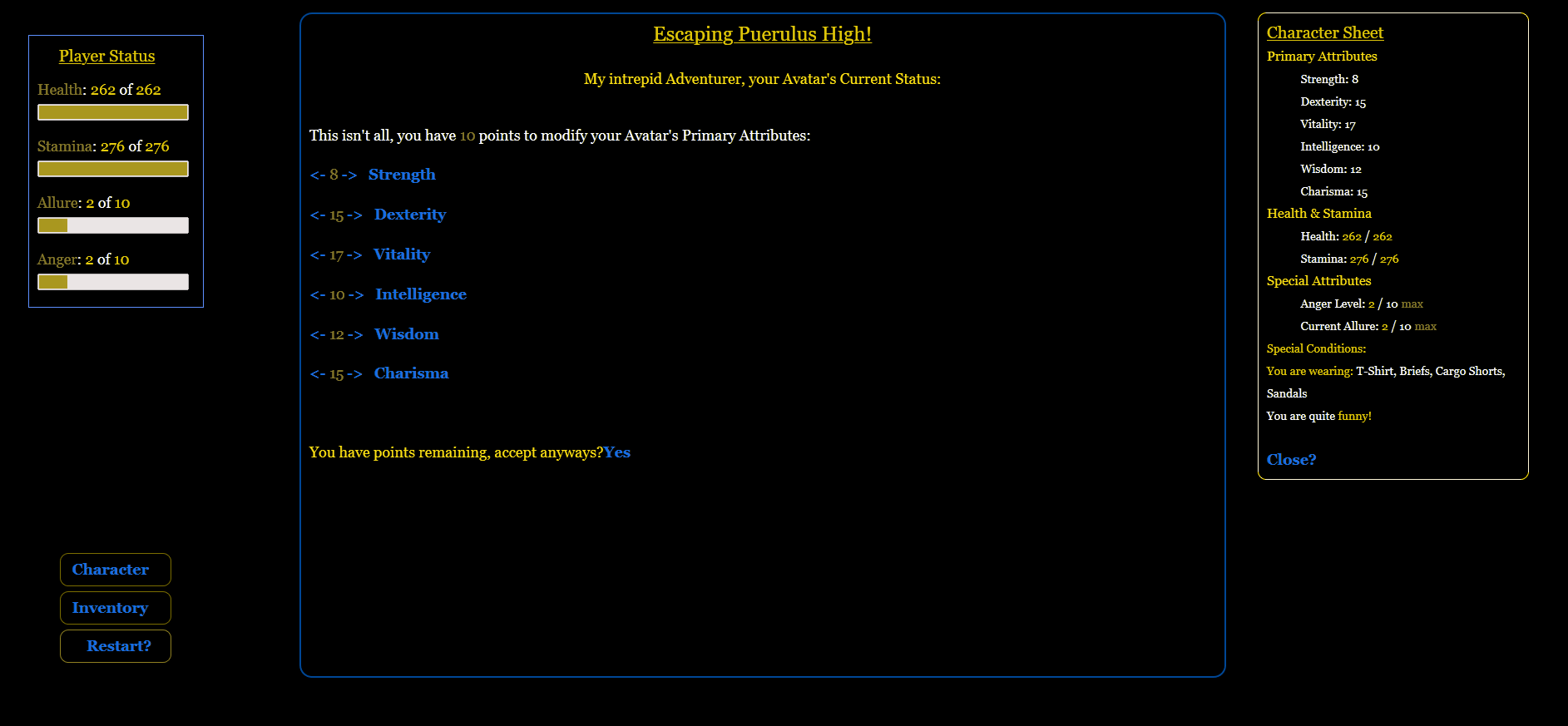
Believe I’m not doing too bad…I’ve now got individual panes for: main story area, a right side box for information and character sheet data, larger left side box for player status (health, stamina, etc), with smaller button-like boxes for ‘restarting’ the game, pulling up inventory and the character sheet. EDIT: Though wish I didn’t have to constantly reload pages to refresh altered values, but that seems to be a common complaint I’ve noticed.

One thing I found curious…tried saving the game but it came back saying it couldn’t because of the data stored in a variable- (set: $RLP to (goto: "Adjust")) -saying it was a complex yet empty variable; yet it had no problem with something like (set: $Title to (css: "font-size: 24px")+(color: green)+(text-style: "underline")) - so I deleted the buttons/links I made for saving/loading the game.

So unless I find a way that doesn’t take tons of code (like those on the web pages Josh linked); I’m thinking of going with a similar idea, but changes the color of the current health value based on it’s percentage of max health (same for stamina too).

Thanks for the help and replies

Sorry. I’m struggling with Harlowe here. The code I attempted to use is a bit broken and I’m not sure how to fix it. I’m struggling to get even the most basic stuff like outputting the value of a variable inside of a <div> on creation. It seems like no matter what I do, it won’t work. It just prints the command instead. There’s probably some magic command that I don’t know to let me use the basic of commands inside of HTML tags or something, but it’s late and I’m frustrated and I don’t feel like reading the whole manual to find it. :sweat_smile:

And for reference, since you mentioned programming history: I’m “fluent” (if you want to call it that with programming languages) in about 15 different languages and have been coding since about 1992. So the fact that I can’t get a simple “print” command to work is really frustrating the heck out of me. Heh.

I’m sorry to leave you hanging. Hopefully someone that knows Harlowe can maybe take my idea and make it working code for you.

The following line of code…

(print: '<progress value="' + (text: _MaxH) + '" max="100"></progress>')

…works by:

  1. Concatenate a number of String values together to form a String Representation of the HTML element you want the page to contain.
    eg '<progress value="20" max="100"></progress>'
  2. Using a (print:) macro to dynamically generate a HTML element from that String value.

Oh. So you can’t just output a variable in the middle of a div? You have to write the whole thing in the print statement? :slightly_frowning_face:

Well here’s what I’ve accomplished so far. About all that’s left before getting the ‘meat’ of the game is the Academic Archtypes…already set up the Athletic Archtype selection (except for ‘Customized Jock’)

Have not yet altered the “Player Status” panel on the left to that the current value of Health/Stamina are reflective of their comparison to maximum values (Red < 25%, Yellow 26-70%, and Green >70%).

From everything I saw on the pages Josh mentioned…it’s going to take a lot to alter the color of the progress bars and even then it’ll depend on which browser is being used. I’m currently running/testing it on Firefox; don’t like Chrome or Edge and IE isn’t much better any more.

EDIT:
The center is the main story pane. All others are have toggles and or flags as to whether they are open or even able to be open. Right now the Character, Inventory, and Restart panes are there for testing. Can see I need to make the story pane a little wider on the left.

Buggers, had no idea it was this late…so I’ll be quick…and it’s down to 22F…can’t wait until the snow is gone!!!

Not there yet, but I want it done before I get to the ‘meat’ of the game…Inventory System…

Listing, adding, and subtracting is easy, it’s the idea of having to use a (click:) command for every possible inventory item I find daunting. Is there a way to do it ‘on the fly’? Without a For...Next loop which I’m familiar with, not sure it can be done. If I was I had some BASIC (sadly it’s been a long time since I last used it, and don’t remember array’s being any easier then either) commands to use with twine it might look something like this…

<!--  This is NOT actual code, just what it might look like to get my idea across -->
(if: $Inventory.length is >0)[
  For x=1 to $Inventory.length
    (print: $Inventory(x)) (click-goto: $Inventory(x))
   next x
endif]

Advantage to something like this…a LOT less code is required and it minimizes the chances of having to trace down tons of typos! (so freaking easy to miss $DEX vs $Dex)

Hmm…the more I think and look at this the less likely I find it to be possible…might might as well toss it out there anyways with the hopes there might be an easier way.

Off-topic from your original question: I apologize if this comes across as harsh, but you really need to come up with a much simpler GUI color palette with complimentary colors.

You shouldn’t be combining purple, yellow, green, blue, and red, all into the same screen like that. I’d recommend cutting down to a near-white, a light-blue, and some warm color (for things which need to attract attention), on a near-black background.

Colors should also be consistently. For example, you have two purple box outlines and one yellow one. All of them should be the same color unless you’re indicating that one has focus.

In many of the places where you’re using color, you should instead be using bold or other styling changes.

Anyways, I just had an immediate negative reaction to seeing all of those colors like that in your screenshot, and thought you should be aware of that.

You’re looking for (for: ). https://twine2.neocities.org/#macro_for

Also, if you’re planning on doing a lot of coding and you’re not too far into your project, you may want to take a look into using sugarcube. A lot of the stuff you’re trying to do would be easier in it. Harlowe’s pretty good if you just want to do a standard CYOA style game. It’s not so great for stuff more complex than that, IMO.

Hey HiEv,

You were polite, so I don’t consider it harsh, and yes…you do have some valid points…which I am and will be taking into consideration. Please remember…this is my first…and for some clarification:

That right-side pane is a ‘pop-up’ (Character Sheet, Inventory, Encyclopedia Entry), usually only when the player calls it. When inventory is in use, any selected items will be displayed where you see the ‘Player Status’ pane.

Regardless…you are right! Yellow outline does clash and have been considering making it the same as the main story pane. Same for the two ‘Inventory’ and ‘Character (sheet)’ buttons: green doesn’t fit. “Restart”…will always be red (when available) though it has a secondary ‘Confirm’ link nested inside so the player can’t accidentally reset his game - and why I’m considering the (alert:) macro here.

Note: depending on where the player is in the story…those buttons might not even be visible/available in the first place; could explain why they are green in the first place. All buttons are there for testing atm, and the ‘Restart’ button will NOT be there during character creation - seems like it would be too easy in which case might as well let player set his own stats or heck, make them all 18 and drop 2 passages of coding.

As to your ‘Bold’ suggestion…I considered it and I do use it…rarely. I find it makes the text - ‘fat’ and difficult to read. It’s why I’m using colored text as I find it makes the text easier to read, separating titles(green), subtitles(Yellow), fixed and variable data(red/green), and text (white). Important stuff, whether warnings or where player input is needed - will be yellow/red (premise, Yellow: needed but not as ‘important’ while Red: This will have implications down the road)

Fortunately color schemes are easy to change and fiddle around with. That being said…there is something for ‘simplicity’ or ‘functional’. Not counting ads, but I find too many sites and programs that think they need every freaking little gimmick they can put in there thinking it looks ‘nice’ - where to me it’s a jumbled mess and seriously slows things down.

Again, thanks for the input and it’s something I’ll fiddle with…another one of those things I want to get ‘finalized’ / figured out before tackling the core part of the game.

For what it’s worth, your color scheme reminded me of old MUDs that I used to play. Specifically the ones based on a licensed series (like dragon ball or star wars). Whether that’s good design or not is another matter entirely, but it did make me a bit nostalgic for a moment. :sweat_smile:

Well, when choosing your colors I’d recommend making sure that they have a 7:1 contrast ratio with the background. This will help make sure that it’s readable by people with low vision. For example, your blue (#4169E1) text looks kind of fuzzy to me, so a lighter blue (#839EEC) would probably work better. You can check the contrast ratio using the WebAIM “Color Contrast Checker”.

I’d also recommend switching from a solid black background to a near-black (like #111111), since using solid black can actually make things harder to read.

Furthermore, I’d recommend against mixing colors which colorblind people won’t be able to tell apart. For example, here’s how your screen looks to a red-green colorblind person:


(Source - Colblindor: “Coblis - Color Blindness Simulator”)

As you can see, most of that color information is lost on them. This is why using a simpler palette and also taking advantage of things like bold, italics, and underlining, helps a lot in making sure your game’s GUI works for everyone who uses it.
 

Yeah, me too. And also some old Commodore 64 games I used to play.

Though, that actually highlights the problem, since a lot of old GUIs were quite bad, and we’ve learned a lot about how to make a proper GUI since then.

Anyways, hope that helps! :slight_smile:

1 Like