Someone else made a good comment that I am passing along.
Parser games are out of style more so today with the younger generation because the internet has taught people to skim the page, and if it looks too long, skip reading it. Parser games require really reading the text to figure out what to do next. It’s like what we use to say way back when: RTFM. (If you know what that means, consider yourself either well informed, or part of the older generation.) ![]()
3 Likes
Just a general comment:
The internet has hurt the attention spans of all people who use it. I know lots of younglings with great attention spans and critical reading skills. I know old farts my age whose attention spans have gone to crap and those who never had one, even pre-internet.
I agree that our extremely online culture is a problem for all sorts of reasons. But as soon as you start saying, “Kids these days are a problem because [insert latest generational worry here]” you have officially entered oldsville. It’s what all olds have done for the history of forever, but it’s always wrong.
21 Likes
This, and also: Your target audience is not everyone, and every generation is not a monolith. I know someone in their late 60s who is a huge computer nerd, avid reader, and compass navigator, but they will not play parsers.
Then, on the other side of this, we got @SomeOne2, squarely in the age bracket that everyone assumes will never play a parser, but the guy learned ZIL and made a faithful fan sequel to Hitchhikers.
Even with onboarding, the parser audience would be small, but with no onboarding, it’s never going to grow. Either way, you have to start with an audience of readers, because nobody else has a chance of sticking around.
It’s not productive to assume parsers have to also appeal to non-readers.
15 Likes
I know a person exactly like this as well! Scary how big the world is.
5 Likes
I think there’s an overlooked information structure problem with parser games. As in, they do very little of it. No live map, an amorphous transcript, and all the verbs are hidden. Everybody focuses on critiquing the hidden verbs but it’s not the only problematic element of parser games. Maybe not even the biggest one. Maybe part of Twine’s popularity is just that it clears the screen between passages, to give some form to the text.
6 Likes
I wanted to test out some of the ideas in this thread, so I made a very basic mockup:
https://mathbrush.itch.io/arrow-keys-and-clickable-buttons
This is an Inform game where you can use the keyboard arrow keys to move around, or some clickable buttons on the left.
Caveats:
- You have to type ‘yes’ before you can use those features.
Technical reason why:
Summary
I use ‘submit_line_input’ to submit text input to the main window. But I don’t know how to use quixe/glk to access the main window, so I just throw in a global variable called ‘lastwindow’ and anytime some text gets submitted, I set lastwindow to that window. So you have to type something first.
- The arrow buttons aren’t arranged in a pleasing compass rose. I don’t know how to do that in CSS, but someone easily could.
Let me know what you think! I think this would go best with a map-displaying extension like Xavid created. I’m not sure I really like either of these methods (the arrow keys especially limit the ability to copy your last command by hitting ‘up’).
11 Likes
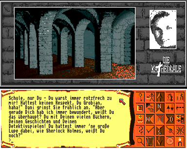
Weltenschmiede’s Die Kathedrale has extensive buttons for many necessary commands. The actions are represented with symbols, in a style reminiscent of multi-command (not just USE) point-and-click games:
7 Likes
Aww… That’s so considerate. Thanks for looking out for me.
>LICK TIMUR’S FEET
7 Likes
(turns off phone)
That’s enough forums for today.
9 Likes
Interesting conversation. I hated any efforts like this, with buttons and onscreen inventories and maps, that was tried in the 1980s; and, yes, they did try all these ideas back then, pretty early on in text adventure history; and I’d still hate them today.
I don’t do modern IF, but I know that I’d find a text adventure completely unplayable on something like a phone or if I had to click buttons or text. The way my brain works I need to be typing on a keyboard as that seems to be an integral part of how I connect with and solve a game. But I wouldn’t class myself as “normal” in the way I think and work.
I always see parser games as a crossword, rather than a wordsearch. At the end of the day, if I want to be clicking buttons instead of typing I’ll play a graphical adventure or a more choice-based text game. Any on screen clutter in a text adventure just takes me out of the “text”.
7 Likes
I completely agree.
4 Likes
The verbs aren’t hidden, they’re all freely available in every dictionary. Figuring them out is what makes a puzzle game a puzzle game. It’s no different to figuring out to solve a problem in real life, and that’s kind of the point.
Guessing the verb only becomes a problem when the player has the right idea but the author hasn’t provided enough synonyms. The English language is particularly replete with synonyms. It’s the responsibility of the author, with the help of their playtesters, to ensure they’re all implemented.
Mapping, with a pencil and paper, is also part of the fun of playing a parser game. People used to draw beautifully illustrated maps and send them to computer magazines to be published in the Adventure Games column. Nowadays there’s CASA and the IFDB.
Gruescript eliminates the guess-the-verb problem, but at the cost of some of the puzzle-solving. Having a “held” item as well as an inventory (an innovation that’s in Detectiveland but not in Draculaland) mitigates this problem a bit. It’s a good compromise between “ease of consumption” and retaining the parser game feel.
Why does the phrase “ease of consumption” make me think of whizzing food in a blender and feeding it in with a spoon? Don’t people like to chew?
5 Likes
Lots of Adventuron parser games do this too, and it was quite common in 8-bit games published on the ZX Spectrum. The disadvantage of clearing the screen is that you can’t refer back to something you did earlier in the game.
5 Likes
To reiterate: Figuring them out is what makes a puzzle game a puzzle game.
3 Likes
Absolutely - I’ll amend my post.
2 Likes
This was something I didn’t expect to be so controversial. I used to do a lot of screen clearing in early versions of I Am Prey, but testers hated it when that happened. So I took note that quite a few players rely on the ability to scroll up (especially in a game where turn counts matter, which I suppose should have been obvious).
6 Likes
Yeah, in most ZX Spectrum games you can’t scroll back through past text anyway (there’s not the memory to store that information) so the default that we sort of moved to was clearing the screen whenever the player changed location or something major, location changing happened.
The preferred default behaviour when I was producing games back then was to allow the input and response text to scroll underneath the static location description; so players could always see the important location text. That did, however, then limit the amount of “working space” left on the screen for the input & responses.
Old 8-bit tools like the PAW had quite a lot of options in terms of screen display. You could have (one-way) scrolling text with everything in. Or split the screen into two sections with one half scrolling under the other. And you could add things like areas for graphics, or inventory, or status, or compass roses to show exits, or objects.
The more you add, though, the more cluttered the “screen” gets and the more it takes the player away from the actual text side of things. Resolution has increased these days, in terms of desktop machines, but on something like a phone screen, I still think the same problems remain. The more buttons and maps and sections you add, the more it diminishes the text.
7 Likes
I totally dig the arrow keys. I would probably use these in a game since I struggle with compass directions and it’s so much easier for me with a visual representation of a direction.
The clickable buttons on the side, not so much, because they’re on the side and because they’re still labelled NEWS, which is a thing I think could just get gone altogether for an experiment. I think anyone who struggles with NEWS will be ambivalent to buttons labelled NEWS.
6 Likes
I agree. If the buttons were in the proper cardinal direction pattern, labelling them might actually enforce how NEWS should be perceived though. We are pattern recognition machines. It is possible to “rewire” our brains with practice.
4 Likes