Related: parser games where mentioned objects are described, but… resentfully. I can’t quite capture the style I’ve seen, but the game’s like You see trousers here and I’m like X TROUSERS and the game is all They’ve got two legs, dumbass, what do you expect me to say about trousers? and I’m backing off like jeez, buddy, sorry I asked. Strong impression that the author’s got fed up with the work of writing descriptions for all the objects in a parser game (which is a lot of work) and is taking it out on the player.
As for games insulting the player, yeah, it can definitely come off wrong. I think the only time I’ve really liked it is in Toonesia, which already has such a silly, joke-y tone you don’t take it seriously.
>X TREES
>“The trees look like trees, complete with branch-like branches and leafy leaves. Well, what did you expect?”
In almost every case, if it’s appropriate for the character and situation, that’s when it’s agreeable. You wouldn’t expect naval officers to be exclaiming “Shucks!” and “Dang!” and “Golly!” when the ship is sinking.
I’ll see myself out now… [grabs hat]
I actually do this, but not to the extent of your very correct example (eight different variations of yes"…) I do sometimes use a ridiculous amount of choices in situations that are mostly linear for specific reasons:
To obscure linearity in a cutscene and let the player improvise a bit in how they phrase a response despite there being no technical agency.
To obscure a binary choice of yes/no - left/right to make it seem less limited and perhaps get some character reflection or world building or parser snark into it. Or to make the choice seem more involved than it is. Go left. Go left carefully. Go right. Go right, even though in your experience doing the right thing has never worked out in the long run and you usually regret it.
To allow the player to role-play a response - the tone of the response might toggle relationship values as conversational agency and interaction.
To character-develop the PC or establish the PCs attitude or relationships obliquely without directly telling them “You feel frustrated at Janice’s request.”
Janice leans over from her desk: “Hey, can I borrow your pencil?” “Sure.” Hand the pencil to Janice wordlessly. Hand the pencil to Janice with a frustrated sigh. Drop the pencil on her desk and walk out. “Sure Janice, you can borrow my pencil any time, I live to make your life easier!” "Seriously, Janice, this is the eighth time since lunch. “Would you also like directions to the pencil store?”
Here’s an actual example from RSPM that uses choices to drop exposition about setting, time period, past relations, actions, and the player’s potential range of attitudes toward this character allowing for a range from PC amnesia, to a sneaky bonus link if you are able to role-play that you recognize this character based on knowledge from previous play throughs:
For (my own usually lame) comedic purposes, and kind of to get ahead of everything the player is thinking about choices they don’t have in almost improvisational fashion:
You peer down the dark stairway where the inexplicable noises emanate from. “You first,” Chad says, nudging your elbow. “No.” "No, you first. “Hell, no.” “Absolutely not.” “Beauty before wisdom…” “You know this is the point in the horror movie where characters make the wrong decision and people watching are screaming at them…” “I would rather eat my own face than let whatever is down there do it.” “noodleynoodleynoodley–Hey, that’s my phone, excuse me…” “NO.”
Sometimes a well placed profane tirade just works - For mouthfeel, for the pace of the line or the scene, or for humorous purposes.
Geeky example CW: *musical theater*
In the musical Spamalot there’s “The Song That Goes Like This” which parodies Andrew Lloyd-Webber’s tendency to make a boring song work by repeatedly modulating it higher for no apparent reason.
Finally Galahad hearing another modulation up just flat out screams “JESUS CHRIST GODDAMMIT!” at the conductor. I’ve seen video clips of renditions of this song that tried to eliminate or change the cursing (for a church production or high schoolers or jury recitals) and it just doesn’t work as well without it.
Unsuccessful rewrites include the singer just not saying the line or shaking his fist at the piano player. I’ve heard “Gosh dang it, not again!” “Oh, golly geeeesh!” “I’m coming for you, Mister Conductor!”
Slightly more successful solely due to the singer giving it all they’ve got were “I did not warm up enough for this!” “Oh my GOOoooOOOOoooOOOD” (inspired by the Trolls 2 meme but potentially still blasphemous in certain contexts) and one actor who leaned down and just growled “REEEEEEEEALLLLY???” at the conductor with full wide-eyed Jack Nicholson fury.
A televised UK version they changed to “Oh come on! Are you kidding me?” for broadcast. It also isn’t as clearly funny to the audience without the overt Phantom of the Opera set design.
When a game suggests a specific verb + noun combination, but then the parser doesn’t recognise it. For example, a door is stuck and the game prompts you “it looks like you need to jiggle the handle a bit” but then you type “jiggle handle” and it has no idea what you’re talking about.
Feeling like I need to check every single thing because I have no idea what might be important. I like exploring with a goal in mind. If I’m just going “x” and “take” through every single noun mentioned in a room description it makes me feel really disconnected from the game.
When a parser is looking for specific wording, rather than following general principles for recognizing phrases—in Inform, this happens when people try to parse out specific commands in an “after reading a command” rule. The result is that > TAKE FISH, > GET THE FISH, > LOOK THEN GET FISH, and so on give a default failure message, since only > GET FISH specifically is implemented.
The ironic thing - parser is supposed to let you “type complex sentences” and “do anything” when experienced parser players generally learn to condense everything down to two or three words mostly since they inherently understand what the parser is actually looking for in a command.
Default Twine game styling. The basic black-on-white text is so boring. It just makes me feel like the author didn’t care to pick out something that could fit with their story; you don’t need to be a CSS wizard, but just picking out a nice shade of turquoise in the background or something can make the game that much more visually appealing.
I know CSS, but I know absolutely nothing about how to find fitting colors lol. And if the background is too colorful, it distracts me from reading. By that I mean the colors of early websites that scream “Woho! We can do colors on our web pages now! Look how bright and piercing we can make them!”
That same problem came up when I created a Twine version for Spring Thing of my Inform7 game “One King to Loot them All”. I looked into using fancy fonts like e.g. the crom font which closely resembles the font used for the titling of the Conan the Barbarian movie ( Conan The Barbarian - Opening Titles (youtube.com)). It looks cool but when I put my opening text in that font it looks horrible and not very easy to read. Maybe I should only put the title in that font:
But then the text following it would not match that font. IMHO that makes things worse. You mentioned early web pages with a riot of colors. Well I was part of the “desktop publishing revolution” in the mid eighties and at the time we had people self-publishing “beautiful” web pages with a riot of fonts. Mixing up fonts of different font families is not always a good idea…
Another thing I looked at was using a color scheme. I wrote down I wanted to use five colors:
[1] “black” for background color
[2] “white” for foreground color (regular text)
[3] “blue” for links implying looking at or examining something (“intelligence”)
[4] “yellow” for links implying navigation to another location (“yellow brick road”)
[5] “red” for links implying actions like e.g. smiting monsters (“blooooood”)
And I also wanted to have an inverse color scheme (a “light” theme). But when testing these colors (I tried several different sets from IBM etc targeting color blind people), I often found two colors turning out to be indistinguishabe, so in the end I dropped the distinction between [3] - [5] and used a single color for links. If people think this is boring… well suggestions for creating a color scheme that actually works are always welcome!
Ordinary Mazes: These are just quite uninteresting. If they have fatal deadends (like Framed) then it’s just a tedious exercise of learn-by-dying. Otherwise it’s a mapping or memory exercise. As a puzzle, it’s the worst of both worlds: the solution is obvious, but the player’s enactment of the solution is long and tedious. That’s the opposite of what you want from a puzzle!
Games can have maze-like situations or locations as an added complication to another puzzle, that’s fine. In a game about exploring a city, or traversing a ruin, it would be very reasonable to make the streets maze-like, so long as the actual draw of the game isn’t just working out a sequence of directions.
Arbitrary Puzzles: I’m a big proponent of puzzles embedded in the actual narrative. If they are obvious out-of-setting puzzles, it’s much less satisfying to play. The classic example is the soup cans puzzle in 7th Guest. It’s a perfectly fine puzzle in isolation, but it has basically no grounding in the wider murder mystery / ghost story, it’s just an arbitrary blocker for the sake of having one.
Another way puzzles can be arbitrary is when they really do have a role in the narrative —the protagonist has a problem and the puzzle is a stepping stone on the way to resolving that puzzle— but the player can solve the puzzles before they have the problem just because they look like puzzles. In these cases, the protagonist is running around doing things for the sake of doing them, the purpose only appearing later. The narrative logic is backwards!
One thing to keep in mind: There are body text fonts and decorative logo/header fonts. They tend not to look good if you try to use them in place of each other. Specifically stylish fonts shouldn’t look like a sentence. A little arrangement and size variation can make it better.
Also rule of thumb: Avoid using pure white or pure black for text. Even if you intend black on white or white on black, nudge them both toward gray just a bit.
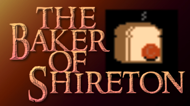
When I made Baker, I was specifically looking for that vibe and found an appropriate font. Only later did I discover the name of the font is “Ringbearer” so it’s literally a knock off of the LOTR font…
There’s an asymmetry in what Hanon is (correctly) saying that I think is worth emphasizing. Body text fonts may be a somewhat dull choice for headers. But decorative fonts for body text are a crime against humanity.
Of course many of The 7th Guest’s puzzles are barely connected to the story. It also has a maze that sends you back to the beginning on a dead end, so another sin there!
Still I like the game because of nostalgia…and the music. George Sanger, aka The Fat Man, is awesome.