I spent a bit of time over the weekend thinking about this.
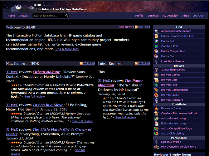
One confusing thing about a separate “games” box and “reviews” box on the home page is that the home page today includes all kinds of stuff, not just games and reviews.
- Site announcements
- New game listings
- New reviews
- New polls
- New recommended lists
- New competition listings
- Game news (“Add a News Item” on a game page)
- Competition news (“Add a News Item” on a competition page)
As it stands, all of those things can appear at the very top of the home page, at least for a little while. But if we split them out into separate sections, then polls, lists, and competitions will never be visible at the top of the home page.
It’d be even more stark on mobile, where we can really only fit one section at a time on the screen. In that case, we’d only show new games at the top of the screen. Many users might not even realize that there’s a “New reviews” section further down the page.
This kinda makes me think that it would be better to leave the top of the home page “New on IFDB” as it is, and just add in a separate pair of boxes for New Games and Reviews below that. We could also add in new boxes for Competitions and Lists. (We already have a separate box for polls.)
So the site might look like this, divided into rows:
- Welcome to IFDB! (collapsible)
- New on IFDB
- Games / Reviews: One box containing only new games, another box containing only the newest reviews. On mobile, we’d show Games first and Reviews second.
- Competitions / Vote!: A Competitions box showing new competition pages, followed by the polls box, as it is today. (Maybe rename the box to “Polls”)
- Recommended Lists / “New to IF?”: A new box showing new Lists, plus the New to IF? box.
In order to help users discover the other sections, there could be a list of links at the top of the page after the collapsible “Welcome” section.
Games | Reviews | Competitions | Polls | Recommended Lists | New to IF?
What do you think?
EDIT: Also, in my initial attempt to split games and reviews into separate side-by-side boxes, I found that they’re very cramped in there if we include snippets of descriptions/reviews.
I think the only way to fix that would be to get rid of the side bar. Most of those links aren’t needed, or could be added in elsewhere on the page, like this:
- Find/Browse/Contribute: All of these links would move into their respective boxes, e.g. Competition search/browse/add would appear in the “Competitions” box.
- Personalize: This box would go away completely; you can click on Profile/Settings in the header.
- Reviewer Trophy Room: Convert to a box in the page
- In the Database: Convert to a box in the page
- IF Links: Convert to a box in the page
- Competition Links: Add to the Competition box
… and stop linking to clubs entirely.
