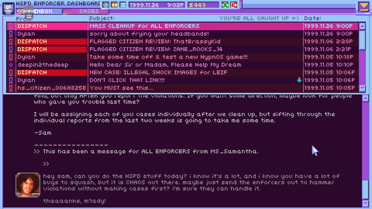
Hello, I’m writing a Twine story where you are looking at a list of emails where you select which one to read. Most of the emails you can read are for story immersion, but you can choose to just read a few to progress the narrative and move on. I’m trying to decide how to design it.
I looked back at another game where you read other people’s emails: You Are SpamZapper 3.1. It gives you a list of emails, then goes to a new screen when you click an email, where you decide whether to delete the email or not. This makes sense for the main gameplay loop where you have to decide whether or not each email is spam. In my game, your daughter sends you a bunch of emails and asks you to find which one is related to the information you want. And of course, they’re all related (but some are more than others).
Another option I’ve thought of is to have the list of emails in one block of text, with the email you click on appearing in another block of text to the right of it. This wouldn’t work well on mobile, but I think it would feel more immersive on desktop.
Looking at how Outlook works on my phone, if you select an email, it fills the whole screen with the email’s text, and lets you scroll to read the whole thing. If you go back, you can see the inbox list again.
Have you seen other games that use the “reading someone else’s emails” conceit with good design? I would love to learn from them.
(Twine Version: 2.12.0)