I’m trying to format my story so that it works across multiple devices.
I’ve explored the @media tag in another post. My question here is how should I manage Sugarcube’s default stylesettings so that the story adapts as smoothly as possible across different devices?
For example, on my laptop the story sits in the centre of my browser window, with the text align left. This is nice. On my phone, the text is nudged slightly to the right, whereas I’d prefer it to be closer to the edge of the viewport (ideally, still centered, as it is on my laptop browser, but just to a much smaller viewport).
I’m not sure exactly how you want it to look, but I can give you a method you can use so that you can fix problems like that more easily.
If you open the page in a browser like Chrome or Firefox on your laptop, and then open up the “Developer Tools” window (usually by hitting F12 or CTRL+SHIFT+I), that will let you play around with the CSS fairly easily. Now, look for an icon which looks like a cell phone in front of a tablet in the upper-left or upper-right of the “Developer Tools” window. Clicking that icon will let you toggle between a PC and cell phone view of the page. The cell phone view also lets you change the dimensions to match different phones and tablets, so you can see what they’ll look like.
So, just change the screen to the dimensions you want to check that way, and then play around with the CSS until it looks correct there. Then try a few other screen sizes to make sure it still looks good. Once you have it looking the way you want, just copy the changes you’ve made to the Stylesheet section of your game, and that should fix it.
Hello! Thanks for this! I found the functionality you refer to. However—to get it going I needed to upload the story to, and open it from, Twine’s online platform, rather than from the offline version published to my computer. When I opened the file from my computer, I received an error message, “File Not Found.”
Additionally, and more importantly, the rendering to different screen dimensions in the developer tools doesn’t seem to be accurate in practice. If I email myself the file and open it on my phone, it looks very different to what I see if I select the same phone from the developer tools options.
Would you have any thoughts on why this might be the case?
Please note: I’m building all of this offline, and planning to package it on a website once complete.
I would ignore the default phone names and just use custom settings. I use Chrome, but I’d imagine Firefox or whichever also provides the same functionality.
What I did for testing my stuff is I loaded the page onto my phone, and then I did a side by side comparison with the desktop browser. I kept adjusting the dimensions of the mobile layout in the desktop browser until it perfectly matched my phone. (Strangely, the dimensions that accurately represent my phone are not even close to my phone’s screen resolution.) Then I saved it as a setting and I use that for my testing. Now I know what it’ll look like on my phone without even having to use it to test.
This is a great tip, and I’ve managed to find a set up that, as you say, side by side has the same dimensions—even the font reads at the same size.
However, there are still formatting things that aren’t translating, or are getting lost on my mobile. As mentioned above, on my mobile, there seems to be more of a left margin indent than in the version on my computer. For example, text that is centered on the desktop browser, and in the custom setting in the browser’s dev tools, is nudged over to the left on my phone.
Based on your description, it could possibly be due to how mobile devices often hide the scrollbar when not scrolling. It may look off simply because you can’t see the scrollbar when you’re not scrolling the text.
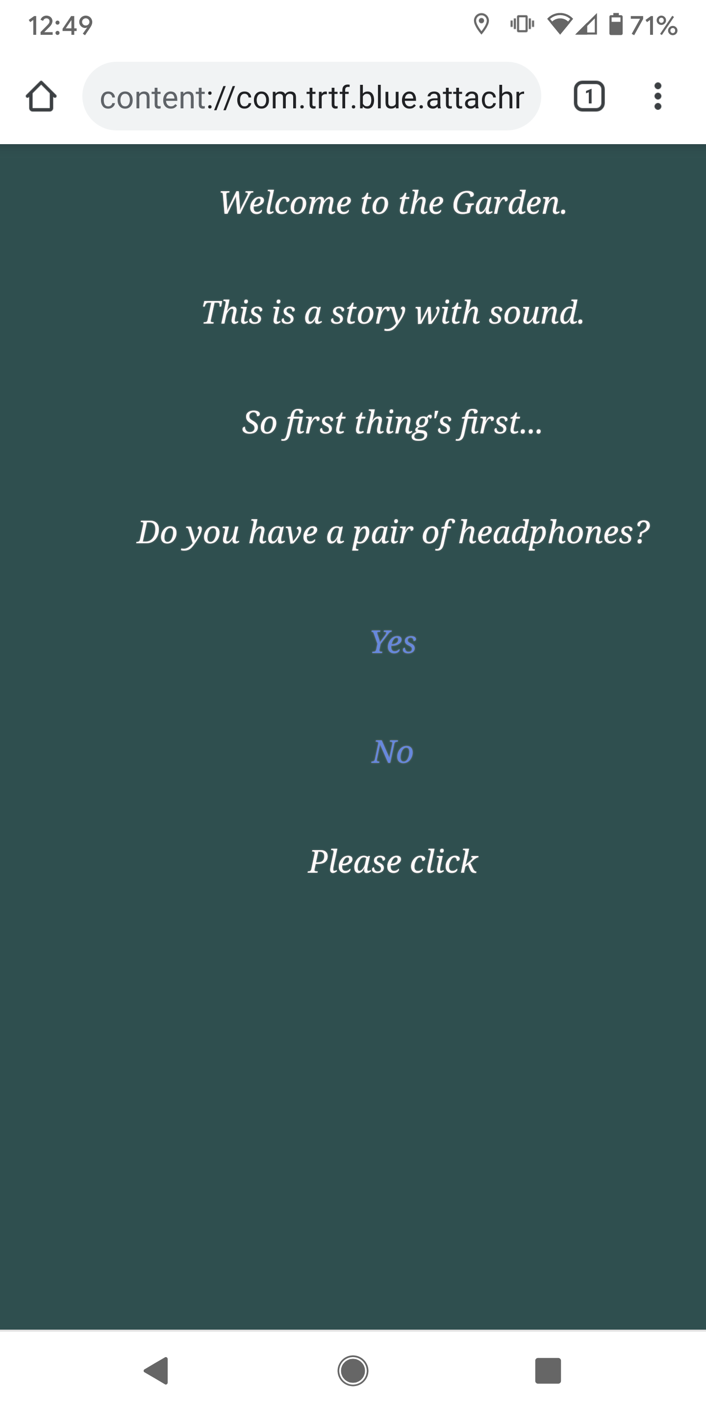
Would there be a way to test that? Check out the following screenshots. The first is from my browser, custom-phone setting. The second is from my phone. This is a very basic draft of the land-page, and beginning of the onboard process. As you can see, the phone takes the centred text and nudges it over to the right. Thanks! Ben
That’s probably because on the web, a pixel is not a pixel anymore. CSS defines a pixel as 1/96 inch when the content is viewed at arm’s length. This turns the pixel into an angular measure, about 0.02°.
Thanks to this triumph of modern engineering, we now know that the moon in the sky is about 24 pixels wide.
That page mentions the “A pixel is not a pixel” thing too.
Not to mention the fact that most phones use something like a 360x640 pixel screen (viewport size) as though it’s a 720x1280 screen (device resolution).
However, Twine/SugarCube does add this to the HTML it generates:
Weird. I thought the whole point of DPI was to track the ratio of inches to pixels of a screen or print. But CSS doesn’t care about true DPI? Why would they decide to do that?