Color Schemes/Readability

Also rule of thumb: Avoid using pure white or pure black for text. Even if you intend black on white or white on black, nudge them both toward gray just a bit.

Please do not support the war on contrast.

The most expensive and collectible books use the blackest inks on the whitest paper. E-Ink displays languages before the tech evolved enough to produce strong contrast (and higher resolutions). Paperbacks and newspapers are made to be disposable.

The WCAG 2.0 guidelines on the minimum contrast ratios well intentioned but entirely insufficient, and many designs apply them in contexts where even the guidelines say they don’t apply (like thin-stroked typefaces). (And many designers treat the minimum contrast ratios as targets.)

The rationale behind the contrast guidelines leans heavily on (1) older standards that were made for CRTs (often monochrome) and (2) research into minimal perceptual differences rather than readability.

The tools that check for compliance with WCAG do not measure the contrast ratios per the guidelines. (It’s complicated because the guidelines allude to a simpler scheme, and that’s what the compliance checking tools perform.) The result is that the tools often grossly overestimate the contrast ratios, making it seem like a design surpasses the requirements by a large margin when, in reality, they fail. The same goes with pre-made palettes of colors. The colors might meet or exceed the contrast guidelines, but there are more requirements to ensure that text rendered with those colors will do so.

We don’t have a good model for quantifying contrast that matches how people perceive it, especially with colors rather than shades of gray. (To the credit of the group that assembles the guidelines, they have an understanding of these limitations, and there’s a lot of work being done to improve subsequent versions of the guidelines.)

Even on “retina” displays, some form of antialiasing or subpixel rendering is still essential to approach the resolutions offered by consumer laser printers. When the contrast is reduced, there are fewer in-between shades available for antialiasing. As a result, even very dark gray text on a bright background often looks fuzzy, which increases the strain of certain muscles, slows reading speeds, and lowers comprehension. (But designers like it because it “looks better.”)

Lawyers also like to lower the contrast because fewer people will read the contract.

How much contrast someone needs depends a lot on the environment and the quality and calibration of their screen.

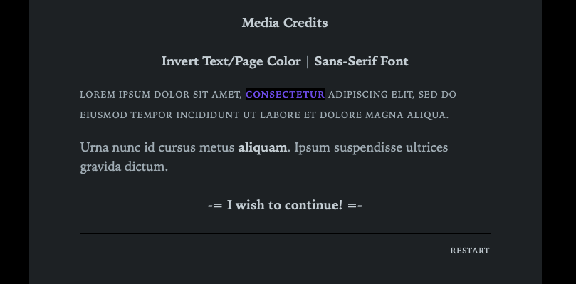
It’s true that there is a set of people with a very rare condition that makes full contrast text very hard to read. But nudging a bit toward gray isn’t enough for them. In most cases, those users need the contrast reduced below the minimum threshold that the majority requires. To accommodate everyone, you have to let the user choose what works for them.

Most people with standard vision who feel the text in a design has too much contrast are usually facing a different design problem, such as a poor choice of typeface, bad kerning and leading, insufficient negative space, overly long lines of text, etc.

14 Likes

Spot on!

This is my opinion based on experience with working with computers and having a very critical nature when it comes to user interface design and content presentation. Printed paper and computer monitors are two different beasts. I think the crux of your point makes sense though. However, I’d like to point out a couple of things.

The vast majority (arguably all, actually) of fonts are designed for black on white. The weights are engineered to maximized the visual appeal with that colour setting. There is also a filter called ClearType on Windows (all OSes seem to have their own flavour of it) that makes text pop even more by using blue and orange hues on either side. You can’t turn this off in browsers. Graphic designers know that Photoshop doesn’t do this so text in the graphic images looks different than text in HTML. I find ClearType looks worse with white text on a dark background.

When working with light text on a dark background, authors need to work with variable weight fonts and adjust kerning, line-height, etc. In fact, I refuse to use non-variable weight fonts for this very reason. When done with care, you can produce pleasing dark themed text. It’s just that most people don’t do those extra steps (or aren’t aware that they should) so most dark themed text looks worse than it’s light themed counter parts. The slight off-black and off-white also tends to soften the ClearType filter.

My take is that the way most fonts and operating systems work make dark text on a light background look better by default. Most people who make light text on a dark background, do it poorly. How many IF authors display multiple paragraphs of Lorem Ipsum text with different font weights by increments of 25 to find that sweet spot of legibility and comfort? How many authors are even aware of variable weight fonts? I’d argue very few. White on black Black on white is ready to go right out of the gate though.

From a “gut feeling”, I find the highest contrasts to be too harsh.

Kind of unrelated. Where I work, they swapped out all the old fluorescent tubes with bright white LED ones. We can see more detail now with the physical pieces we work with, but the office feels harsher and we all agree that the old, slightly yellow fluorescent bulbs were easier on our eyes. We are creatures of the sun so it makes sense that stark white is almost unnatural to us, but very useful for clarity.

Edit: Got mixed up there, but fixed it now.

6 Likes

Yeah, eyestrain is a problem on computer screens. It makes it less than fun to read.

2 Likes

I’m just suggesting “rule of thumb.” I personally will always choose a dark mode, but if the bright white background is too much or can’t be adjusted or it’s something ridiculous like red text on bright blue - or if the font is stupid - I’m not gonna play it. Pure white has its place, but if you’re already at the ceiling, you don’t have anywhere else to go.

Purest white and blackest black is much different in analog print with varying ambient light than on a glowing lit screen you stare at for hours. Though I do understand with new retina displays pure black might be optimal since that causes the pixels to not light at all.

When I was doing theater it was a common stagecraft guideline “never put pure white onstage unless you mean for that thing to take full focus.” A lights-up reveal of a set with lots of white will make the audience cringe and squint. Maybe that’s the point but you don’t want to do that inadvertently. Even white tee-shirts people wear get a tea-bath so they’re not outright white, and white set pieces like a refrigerator need usually some kind of glaze wash or just a subtle hint of color or tint-spatter to knock them down from 100% and help them blend in. One of my professors said he adjudicated a show where they had a chalkboard with white pieces of chalk in the tray and he said the chalk fragments literally glowed onstage under the lights and stole focus. His only feedback note was “Find brown chalk.”

8 Likes

Just to settle this debate:

Best game colours ever. Am I right or am I right?

4 Likes

Oh, color temperature matters so much! It’s why RGBY (sometimes called RGBA for “amber” but that’s needlessly confusing with RGBA for “alpha”) lights are so great.

5 Likes

I want to unlike this…

Yes, that’s why they have color-tuned bulbs for cool and warm light now. The philosophy is as night approaches, it helps circadian rhythms to avoid bluer light and have warmer amber.

I’ve installed color-change LED bulbs all over my house and I’m thrilled at the ability to change mood with lighting.

2 Likes

You’re the mod, you probably can :joy:

2 Likes

My problem with too white text in dark mode games. If you go from a screen with very little text to a screen with very much text, it’s gonna burn your eyes out for a few seconds, and that’s not pleasant. Using a gray tone helps not burn your eyes out, but is still very much readable if the background is dark enough.

2 Likes

as dark themes, perhaps I’m definitively an old curmudgeon, but two are definitively proven as very readable: amber on black and green on black.

My rule on editors is: a good editor is one whose you don’t need editing the syntax coloring. (that is, editors written by coders for coders, as the majority of the OS ones)

on playing, a picture is worth thousands words, so, without ado (apologies for the 1920p screenshot…):

Best regards from Italy,
dott. Piergiorgio.

3 Likes

Curiously, would you say that having a fairly gray (medium gray) text on a black background is okay? Especially if then important words are highlighted by being white text? (Infrequently used, however, and in short bursts.)

I like the default Sugarcube colors. When starting my own IF engine I noticed it looked too bright and ugly, and looked at the Sugarcube styling for reference. They use a lightly gray tinted white (#eee), it’s so much more comfortable on the eyes. I think if you go much lower than #ddd, you’d have to increase the font size to make it still easily readable.

1 Like

Here are the choosable color schemes I’ve been working with in Chapbook. Black/gray is the default, but the player can invert it.

2 Likes

Wanted to flag that Chapbook 2.1.0 has added a configurable dark theme that people can toggle between, which might make your work easier.

4 Likes

And the built-in support for Reasonable Colors is a great way to encourage schemes that are easy on the eyes. Great job incorporating that, Chris!

→ https://klembot.github.io/chapbook/guide/customization/fonts-and-colors.html#colors

I’m sure @SomeOne2 will find a way to make our eyes bleed with it though. Ketchup and mustard, anyone? :wink:

Hanon! We need a “hate” button, just for Max’s posts. Can you make that happen?

2 Likes

Or you can try at the next REALLY BAD IF jam :joy:

2 Likes

From a color scheme/readability standpoint, the change of palette nametable (or whatever is the precise term) from OpenColor to Reasonable can be problematic (I have spent two hour trying to port my colour scheme from open to reasonable, then reverting to 1.2.3)

Best regards from Italy,
dott. Piergiorgio.

You can continue to use the Open Color names for the time being by putting oc- in front of the existing name—oc-red-4 should work, for instance. But they will go away eventually (the migration path at that point will be to use the hex values).

2 Likes

I haven’t really cared about color schemes for on-screen text since 2012 due to going blind, but back then my favorite combo of the 4-bit console colors was dim white on black and I liked it when programs used bright hues for emphasizing text… though I think the transition from CRTs to LCDs kind of broke black as a background color.

And not only is printed text a different beast from a computer monitor, but each type of display technology is a different beast from one another(and even within LCD, unlit versus frontlit versus backlit is a big deal… which is why some Game Boy Advance games had three slightly different palettes for playing on a original GBA versus a GBA SP versus playing on a television with the Gamecube’s Game Boy Player add-on(In particular, Sonic Advance 3 would let you toggle between the three sittings by pressing R on the title screen if memory serves).

4 Likes