Unstyled Twine games and the Comp

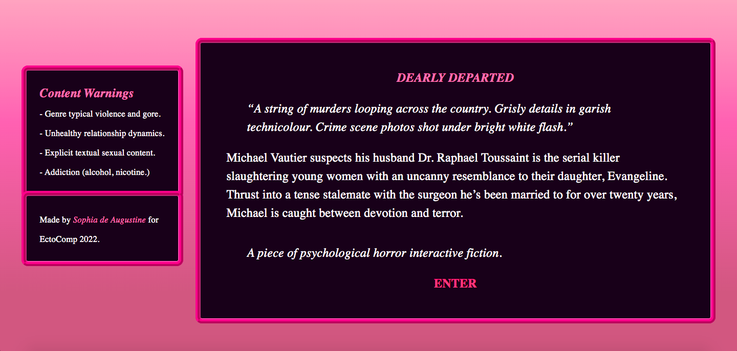
I had this quote of Milo’s up to note my own experience–one person one year left my entry for last, specifically mentioning the cover art made them push it back out of fear of a stinker. Which I think jibes with his general point if not the specific instance.

I generally don’t need or want too much in terms of aesthetics and if I sense I even might be pulled by an excess of aesthetics, I back off. (Full disclosure: I’m one of those cranks who usually mute sounds, and I may even edit the Twine to avoid timed text.)

The thing is … cover art’s something I want to do, but I don’t want it to be super high priority. Maybe I’m being lazy when I say I don’t want to force too much of my own vision on the player. And I’m more bummed if, say, something stylish promises a lot and gives a little, or if someone puts a feature in just to say “hey, look, I can tinker with things.” An extreme straw man would be Comic Sans font. But of course if someone puts care into the aesthetic bits, it often shows in other places.

Good point, though I think in some cases, a person only has so much time. If someone has a great idea they can throw together in a month, and it’s missing a few bells and whistles, I’m okay with that.

I’ve found it’s tough to change gears even for a half hour or so. And so often, someone who is conscientious about needing to make changes says – oh, hey, wait, this could be changed, too, and this as well. So I generally have a few questions to address to make sure I don’t just do the bare minimum. Because people may point that out, too.

Maybe I sympathize too much with someone willing to add an odd feature and recognizing how it’s never as little work as you hope, because I’ve been there. And I don’t mind if an author plays to their strengths.

And yet at the same time there’ve been times a default Twine work has me on edge a bit. Usually there’ll be some interesting detail in the writing to pick me up and help me get going.

6 Likes

I have no skin in the competition- but as someone who plays a lot of games made in Twine and dabbles in making them myself- I think I’ve formed the general bias that unstyled Harlowe will typically be among someone’s first forays into using the program, and normally the quality of those games isn’t amazing. Funny enough, I find that plain unstyled Sugarcube makes me a little more worried that there’ll be major game breaking bugs, since most people trying overly ambitious things lean into that format- it’s more of presumed issue with the quality of writing in Harlowe. It just comes off as a low effort attempt, (and of course Twine’s whole ethos is everyone can participate, and everyone is welcome to- so a low barrier to entry isn’t a bad thing in of itself!) which makes me a bit worried how much effort will have been put into the writing as well.

I have a fairly strong visual art and writing background- so it kind of made sense to me that once I had figured out you could change things to make them look prettier, that I would in my Twine projects. I have a whole mess of half baked experiments, in varying states of doneness, several of which are plain skinned- 35 before I ever mushed together something to hand into SpringThing, and not counting the one I’m working on currently for Ectocomp.

While I like making things look pretty, and I like writing spooky stuff, I find actual programming a living nightmare- some of the reviews for Sweetpea mentioned that it seemed as if I had accomplished some minor form of state tracking, but I didn’t, it was a hideously inefficient sprawl of passages carefully linked where pertinent, and a mostly linear story keeping that all on the rails. Someone coming from a stronger programming background would be baffled by the spaghetti code I noodle around with- and probably wonder why I didn’t tighten it up, just as I might wonder why they didn’t bother to make their work pretty.

‘Prettiness’ for me mostly just means figuring out how to incorporate some pink into the styling, since it’s my favourite colour. It’s incredibly subjective. I love how Twine gives you the option to readily change the look of things- it’s a part of my projects I really enjoy digging into, and I’ve taught myself a fair bit of how to make things I want to have happen with CSS (thanks to the help of forum answers, tutorials, and the documentation) which has been super fun and fulfilling.

I will say, having first really engaged with IF seriously through Twine games, I was kind of shocked at how… ugly, I found Inform 7 games. Playing through Russo’s Sting was a total shock, because I’d gotten used to the very pretty, customized interfaces lots of Twine authors put together. It’s also been something I’ve struggled with in Ink, and why I have yet to complete a proper project in it- I just find it kind of difficult and annoying to customize as compared to the relative ease in Twine.

The prettiness of a project won’t sell me on it if the writing’s no good of course- but I’ve always been a person inclined towards aesthetics. It’s a bit like going into writing groups- it’s not a guarantee that someone’s first finished short story will be bad, necessarily, but often it could do with a bit more polish- and I find it’s just a coincidence a lot of the time, unstyled Twines often happen to be among earlier attempts of writing something to completion (which God knows I find difficult in of itself, haha) for the author.

EDIT: I figured I should probably share some of what I mean when I say I stylize my stuff- it’s not anything groundbreaking, I just love the colour pink (and purple looks pretty good alongside it.) I also often reuse bits of code, since I have a fairly predictable aesthetic sense. So here’s a handful of screenshots from projects, from about newest to oldest…


13 Likes

I’m not sure I’d recognise “the default Twine” if I came across it - except that I’m aware that multiple default forms exist, and thus there are several possible default Twines.

As far as I’m concerned, custom styling (in Twine or any other platform) is a bonus but well down the list. As long as I can access the game with whichever choices the author made, then I’m only going to give bonus points to an author for making their customisable game fit the theme and mode of their game, not take them off because they chose to concentrate on other areas of gameplay. And the game was probably going to score at least 6 before considering style. If a game is plain, that means my focus should be on the other stuff - which it will be if I can access the game.

It’s a bit like I will judge monochrome images in an IF by what the chosen black/white images give, not dock points because I think colour would have worked better (since the creator may have chosen to focus on line, pattern and non-image elements of the IF, even if colour images were within both technical and authorial capabilities. That’s before considering that there are likely some people who are using Twine who find CSS beyond their abilities - certainly if they are like me, who found HTML easy at university and CSS insurmountable).

Accessibility is important for me, but I recognise that the responsibility for that falls in different places in different formats (for example, in Inform, most of it goes to the interpreter, but in Ren’Py - my chosen platform - it’s entirely with the game). Twine is theoretically in between the two, in that it’s possible to do elements of it in both the game and the interpreter to some extent.

3 Likes

Because I am a product engineer, my mind read all that and thought : what is the problem here ?
Can we make the barrier to entry to customize your twine as low as possible ?

In other word : does a “gallery of themes” exist for Twine ? (The same way it exists for tumblr or wordpress or an itch game page)

I’ve this same recurring thought about ink games : to provide some easy-to-use custom css/html files to my fellow inkers so that they could more easily “tune” the aesthetic of the vessel to fit the aesthetic of their story.

8 Likes

In my experience, I haven’t really found many. There is an example project on Twine’s wikia, that people are encouraged to download and tinker with, and this one outdated page, but from what I’ve seen, most of the templates available (mostly on itch.io) are for the Sugarcube format (and I prefer Harlowe, which is the one newcomers tend to gravitate towards, due to it’s lower barrier for entry.)

I know that Manon maintains some great resources over on Tumblr and is open to people asking questions/for help. There’s also the Twine Discord, where people are encouraged to ask questions, or some of the outdated forums (which are what I consult the most) but people who are a bit too shy to ask what could be silly questions or aren’t even sure of what questions to ask to guide them along stylization with CSS or HTML kind of have to fumble it out on their own, in my experience.

I really appreciate the existence of these forums and the old Twinery one, because it lets me surf through other questions and answers without having to clumsily scroll through Discord searches- if you even know there is one to join, since I spent many of my early days mucking around in Twine completely unaware there were even more closed off communities to interact with.

6 Likes

I don’t think it’s a problem per se. More like people realising how bias we can be towards a certain genre/type/aesthetic of games.

Also there are UI themes available for Twine on the internet (either on the old Twine forum, some random websites and on Itch -though it’s mainly SugarCube than Harlowe).

1 Like

I always notice when a game is pretty, but I don’t notice if it’s not, unless it’s ugly. I couldn’t even tell you what the basic format looks like or what Harlowe or Sugarcube even is. A lot of players (and probably more authors than just me) have no idea what is standard and what is not, so I think your complaints come from an experienced game designer/programmer’s perspective, since you know what all that stuff is.

It’s a good point that nobody expects I7 authors to jazz up the format. You’re going to get something that looks the same every time, and I don’t hear complaints about that.

9 Likes

The priorities of the tool affects the priorities of the players. It’s good to think about this, because we often don’t.

If you poke around puzzle-game forums – I mean Sokoban-style puzzles – you run into a lot of PuzzleScript. PuzzleScript has a very distinctive look. It doesn’t really let you customize the UI at all. The opening screen is always a few lines of text in a pixel font. You start with X and undo with Z. The screen is a grid of simple pixel sprites. You can a little bit of animation if you work at it, but that’s it.

(Example game: Pushing U by Notan .)

But this non-customizability is a good thing. PuzzleScript is great at getting people to write lots of small puzzle games. You can’t spend time polishing the graphics! I mean, you can, but you’re polishing small pixel sprites so there’s only so much to do.

And when you play a bunch of PuzzleScript games, you focus on the puzzle mechanics because that’s all there is to compare.

I don’t think it would be as productive a tool if it supported highly polished characters and animation. (If you want to take a PuzzleScript prototype and rebuild it in Unity or whatever, that’s possible. But you design the game first.)

Inform has always been sort of the same way. You can release an Inform game on the web with a custom stylesheet. But it’s kind of a pain and the stylesheet tends to get lost as people play the game different ways. (Downloaded in Gargoyle, linked from IFDB, etc.)

That’s sort of okay! For one thing, it means that an Inform game has a “default model” which is very easy for the interpreter to adjust. That’s why Lectrote supports dark mode, font adjustment, etc for every single game it plays.

But it also means that when you play a bunch of comp games, you’re thinking about the writing rather than the visual presentation.

10 Likes

This thread makes me think that the Twine app would do authors a huge favor just by prompting users to select a color scheme off of a menu of color schemes when creating a new game.

Right now, if you go to https://twinery.org/2/ and click “+ New”, it’ll drop you in a Harlowe game with white-on-black text. The only way to change the whole theme is to start editing the Stylesheet, and the documentation warns users:

Overwriting existing CSS rules is an advanced technique. It has the potential to significantly change the presentation of content.

It seems like offering users just a little more help here with a handful of pre-crafted color themes (including built-in @media (prefers-color-scheme: dark) colors) would be great.

17 Likes

Someone who does jazz up their I7 games: Ryan Veeder. So it’s not as though it can’t be done. I quite like what he does with colour, but I don’t know how it affects accessibility. You can download the default Glulx files from his website if it’s a problem.

2 Likes

I think judging a book by its cover is fine. That’s what the people who put cover art on books put it there for! The covers of She Who Became The Sun, Roman Woman: Everyday Life in Hadrian’s Britain, and Wine For Dummies are all extremely different and for good reason - they’re marketing to different audiences.

As for a lot of games, the aesthetics are part of the experience - saying that you should judge something only on its words would mean that the excellent Harmonia, 3rd place in 2017 and one of my favorite games, should not have its incredible art and excellent UI taken into account, and that First Draft of the Revolution’s presentation is entirely incidental to the experience of judging it. I guess I’m going a little strong on this, but, like, you know, good presentation is nice! You can’t toss it out, and you shouldn’t! Most interactive fiction games aren’t just words, presented conditional on user input, but an experience. So, I think it’s fine, even, like, philosophically, to judge games on their audiovisual aspects.

Anyways, like Encorm said, it doesn’t necessarily disqualify a game from being good if it doesn’t have a lot of styling, but I don’t think one should be bothered, philosophically, for giving points for better visual presentation.

I really like the middle one!

8 Likes

The cool thing about using a lesser known dev system is that no one knows what the default style looks like. People have made positive comments about Pageant’s style, but that was using dendry’s defaults! No one (that I know of) complained that New Year’s Eve 2019 was also using the default dendry style. I don’t know what’s the default style for texture, and I don’t recall anyone make note of a texture game’s lack of style. Speaking of Harmonia, I wonder if anyone else is making any Windrift games…

I also haven’t seen anyone complain about Choicescript styles. Default-style choicescript games have done pretty well at ifcomp, even though I don’t think default CS is “objectively” better or worse-looking than default sugarcube/harlowe. So there’s something going on with expectations and assumptions. Maybe there are too many people doing cool things with twine styles, so players start expecting cool styles from twine games, whereas developers generally haven’t made elaborate styles with choicescript/ink/texture (at least in the ifcomp context)? A Paradox Between Worlds was one of very few choicescript games to use custom styling, and that seemed like something unexpected.

8 Likes

Bookmarking this thread, because I’d love to learn more about how to make Twine look good.

I learned Twine through a combination of in-person guidance, the online manuals, and relentless experimentation, and am fairly comfortable with it now; but my attempts to pick up CSS were less successful. Accordingly, my first Twine creation (in this year’s Spring Thing) alternated between the default Harlowe style and a simple, but I think effective, method of using differently coloured backgrounds for different narrators. One very kind reviewer urged players to give it a go, and not to worry about the default style on the title page, for which I was very grateful.

I’ll make a note of Sophia’s links and check them out.

2 Likes

I’m late to this party, and others have said, much more coherently, the points I would have made. But I’ve been thinking about this a lot over the last few IFcomps.

There’s a couple of things that wind around each other here. Twine was, when it first emerged, a really useful tool for people who were not necessarily able to interact with some of the more complex toolsets necessary for creating IF. For a whole bunch of reasons. It was simple to create something good, created a whole new creator/audience dynamic for IF, and gave under-represented groups a voice. Which was awesome.

But like all tools that mature as people find ways and means of extending what they can do, this has happened to Twine and other choice engines. Over and above the text. In general, this has tended toward the experiential. Integrated graphics and sound, on-screen styling, methods of interaction. Menus. Animation…and so on and so on.

We’ve seen seen the standard of choice based aesthetic and experience progress year on year. A few games over the years: Porpentine obvs., Phantom Williams, Agnieszka Trzaska and Chandler Groover, pieces like Fabricationist DeWitt, Cactus Blue Motel, Bogeyman, Master of the Land, Cannery Vale. And a load of others.

Each one raises the bar that little bit higher. Not just for the reader, but for the author also. And that enhanced user experience has become, I think, very much part of a readers expectation. It’s difficult not to look at a work presented in the standard Twine UI now without at least some level of judgement.

But it’s hard. I’ve bounced off doing something complicated in Twine now at least a couple of times, and this is a shame as I’d love Twine still to be that accessible tool. I think someone previously mentioned that a really great thing would be some form of styling templates for Twine. I agree entirely but would take it one step further. A few simple wizards embedded in the tool. MUCH better documentation around how to style. Some out of the box one-click add ons for in-game elements. A drag and drop screen designer.

The text, for an IF choice game, is still very much the main thing. But the experience is also a big deal. I wish it was easier to create.

7 Likes

The (currently) two volumes of the Twine Grimoire by G.C. Baccaris are also a great starting point… (they’re right near the top of that page)

4 Likes

In other word : does a “gallery of themes” exist for Twine ? (The same way it exists for tumblr or wordpress or an itch game page)

A few months ago I published this collection of themes for Sugarcube. It includes a handful of colored themes.

Authors can copy and paste the premade themes into any Sugarcube game. The code is also set up so that authors can (sort of) easily tweak colors and fonts with just a few changes as long as they are somewhat familiar with CSS to begin with.

https://pbparjeter2.github.io/sugarcolors/

8 Likes

I just want to go on the record here and say that ChoiceScript does not allow for any customization of its appearance. CS has a built-in function that allows the player to choose between three “styles:” black text on white background, white text on black background, and the default of black text on a cream/sepia background, but the author has no control over this.

Authors have no ability to change the font, font size, or font color. Likewise, it’s impossible to change the background color (or use a background image), and you cannot do any “tricks” with the text such as make it disappear, slide into view, etc.

Authors can, however, dig into the CSS file and tinker with that a bit, but is no online documentation whatsoever, and so you have to be pretty skilled with CSS to get something that works.

The only “non-default” style CS games I have ever seen use the 3 different templates offered by the website paid for and hosted by a long-time CS supporter named “DashingDon.”

Unless your game is hosted on his site, there’s almost no “styling” a ChoiceScript author can do.

5 Likes

If we introduced a recommendation that people change the default style, I think it’d create another barrier to entry.

I also think it’d lead to a situation where people would tweak the style just for the sake of tweaking it, which wouldn’t necessarily make for better games.

I do think it’s a good idea to give simple instructions for tweaking the Twine stylesheet to make it your own. This is basically what I did for The Thirty Nine Steps: change the body typeface, change the header, hide the UI bar. Some guidance towards that would be great.

4 Likes

Parser games are fundamentally words. Books have covers, but the only time you’d see a book review comment on the font of the content and typesetting is if they were making reading harder. Which is about 0.001% of the time. That’s why I mostly don’t care about seeing parser games jazzed up, either. Plus you can put a coloured frame or picture around the text and you’re still not messing with the text itself.

Twine has gone more into multimedia at a base level, and or perceived expected level. Sounds, graphics, real time, link games, etc. As soon as you add these swords, you can die by them, too. I don’t mean this pessimistically. If a Twine has great prose, I’m more likely to be annoyed if any flourishes actually get in the way of that prose. (Slow-printing text, I sentence ye to death!)

-Wade

3 Likes

I don’t regard it as a bias to want TWINE authors to style their work away from the default TWINE system, anymore than it is a bias to want Inform7 programmers to replace the default responses, or ask an oil painter not to leave large unpainted sections of their canvas. Not doing these things is a sign of inexperience or carelessness, unless the artist has made a very deliberate artistic choice to defy the conventions of their medium.

To write high quality IF is difficult, because it requires both writing skills and computer technical skills, a combination that takes time and practice to develop. Tools like “Harlowe Stylesheet”, to replace technical skills, and “AI content generators”, to replace writing skills, can only take you so far in this craft.

2 Likes