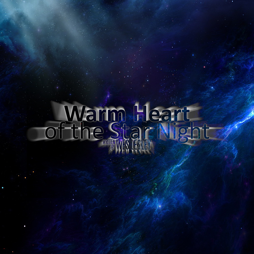
I’m curious what the general vibe you get off this bit of cover art is.
If you wanna give me your thoughts on the title itself, that’s fine too.[/size][size=150]Hopefully it’ll be the first in a series all called “Warm Heart”.[/size]
It’s too big and hard to read. Shrink that down to 120x120 pixels and see what you think for Small Cover.
Your cover should be square, and anywhere from 400x400 - 600x600 pixels usually. You also need a version that works at 120x120. The small cover needn’t be the same image if you want to simplify it.
the blurry stuff around the letters makes them hard to read. The hollow letters are hard to read against the background. I would ditch the blurry stuff and make the letters a solid or at least semiopaque color that contrasts with the background.
And the image is too large, although I imagine you’re going to shrink it for use as a cover.
I’m unsure what it tries to say. Is this tragedy? Scifi? Dating sim? Horror? A star-gazing sim? The glow and background makes me think low-brow scifi, but the words in the title sounds more high-brow.
The different in style between warm heart and of the star sky is too subtle. Also, maybe adding some distance to ‘written by Wess Lesley’?
The glow doesn’t really come off right. I would just go for white text, with our without glow. This also makes for an easier read when the cover is seen in thumbnail size (always remember to preview your artwork under the same conditions as people are going to see it in.)
Put some spacing between the lines of text.
The glow/blur effect is way overdone. Dial it back to a subtle outline glow.
Use the same font for the first and second lines. If the second line is a subtitle or series title, use the same font but make the font smaller.
 [size=150]Hopefully it’ll be the first in a series all called “Warm Heart”.[/size]