That was quick. Click and drag from outside the outline seems to work nicely and makes it a little more user friendly (“user forgiving” might be a better term to use here).
I really had fun with this, both for the novelty and for the nostalgia. In the old days, I would develop the whole hint book when I’d finished a game, mainly to make sure I hadn’t missed anything, then I’d have to write over every hint in pencil so that I could still read them after the invisible ink faded.
A few more observations:
I noticed that the “ink” also fades in your squiggly clues. This is a great novelty, but it could be a bit of a nuisance when playing a real game and you need to refer back to the faded clue, which is now hard to read. You can Shift+click to restore it, but I’d prefer that it didn’t fade in the first place.
I found myself Shift+clicking on all the clues after the novelty had worn off. I wonder if this should be the default, or perhaps an option.
You suggested that the initial revealing pen size should be about the font height. I’d suggest that it should be a little more generous (perhaps font size plus leading), as you automatically increase the size when revealing longer hints. This increased size is easier to use.
All in all, I love this. Will you make it available for others to use?
Yeah, I only ever handled the actual InvisiClues booklets for a small number of Infocom games I played, and it was almost always motivated by a sort of completionist urge more than a need for hints. I’d get the hintbook for games I liked more than for ones that I was having trouble with. Because gnawing away at the problems was more or less the entire selling point, for me anyway. So not being able to solve a puzzle would make me avoid spoilers instead of seek them out.
But then after “beating” the game, and usually getting to the point where I could zip through a game by rote, getting the InvisiClues was a way to wring a little more out of the title. Both to pick up on whatever “Have you tried…?” marginalia I might’ve missed, but also just for things like the red herrings and so on, the actual text of the hintbook. Like it was all optional content for the game, like a hidden ending or something like that in a modern game. Or maybe like a “deleted scenes” extra on a DVD/bluray.
You shouldn’t have to [shift]-click, just “regular” clicking anywhere in the blank should “renew” any parts that were previously developed.
Yeah, I’ve thought about adding a toggle in the side menu to switch between click-and-hold and click-to-develop. I’m slightly torn on the added UI complexity. And I think what’s going to happen is that once the novelty wears off most players will just stop using the feelie altogether, because the hint content will be available without all the interface idiosyncracies elsewhere.
Instead of making the initial pen size bigger, I think the way scaling works might be tweaked a little. Like a logarithmic ease-in or something like that.
I’m not going to do final tweaking on that until I’ve completed the “real” hintbook, because i think the recalibration is mostly wanted for scribble-filling larger hints, and I think the demo has way more big hints than the real version will.
Another option I considered was triggering the auto-fill logic if a click and hold fill gesture lasts longer than three seconds or something like that. But I don’t know if changing the drawing behavior in the middle of a gesture might be irritating or off-putting.
I’m also not sure how much it warrants worrying about, because, as you observed, I suspect most players will progress something like:
manually fill the first couple hints
[shift]-click to fill the next few if they have to
access the hints via some other method if they need more hints or after leaving the interface between play sessions.
I also think the kind of hints that are going into the hintbook are things that most players probably won’t end up consulting frequently, if at all. Each kind of puzzle has an NPC that’ll offer hints for it “for free”, and they’ll just outright solve many of the puzzles on request, usually in exchange for something the player can obtain by solving a different kind of puzzle. So the external hintbook is mostly for providing information about how to use those sources of hints ((which are supposed to be self-explaining, so the hintbook is just a backstop if that doesn’t work). And probably for meta-gamey strategy sorts of things: Is there a point of no return for completing side content and if so where is it? Do I need to conserve [some consumable item] or will I find more later? That kind of thing.
So I think the main thing the web version of the hintbook is going to be used for is just the vibe of the thing.
At some point. I’m planning on making the source for the game and the related materials available at some point after the game’s been released.
I’m not sure how immediately useful it will be in its present form, as it relies a a bunch of Bourne shell, python, and node.js scripts to build the page. If there’s interest it probably wouldn’t be difficult to build a web frontend for the build process and/or a hint editor.
It’s also worth noting that there are several hint formats in the old InvisiClues books that the feelie makes no attempt to implement (like the section on how points are scored in several booklets, and the “Was it suicide?” question in the Deadline hintbook).
As someone who never saw the original physical InvisiClues booklets (only modern web renditions), what were these formats? I only know the traditional question-and-numbered-answers one.
I don’t know all of them; I think every InvisiClues booklet, or at least every one I’ve looked at, has some minor variations on the basic question/answer format.
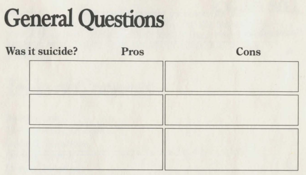
Here’s the question I mentioned from the Deadline hintbook:
Description: The question “Was it suicide?” from the InvisiClues hintbook for Deadline. The hints are divided into two columns labelled “Pros” and “Cons” and the hints are unlabeled.
In addition to the formatting, I’ll call out that the font appears to be Times New Roman or one of the multitude of similar fonts, which would have been a very common selection for printed material in the '70s and '80s. The vibe is very “stable old institution”; it was originally designed in the '30s to exude “newpaper of record” for The Times, and it eventually became more or less the default choice for print publishing for many years.
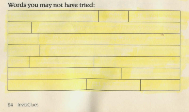
Moving on, here’s a couple examples from the InvisiClues for Zork I:
Description: A list of “Words you may not have tried:” from the InvisiClues hintbook for Zork I. The hints are formatted as a single rectangular block divided vertically into lines and divided horizontally at irregular intervals.
Description: A table labeled “Treasures: Their Values and Locations” and subtitled “(Use only as a last resort.)” The hints are presented as a solid rectangle nearly as tall as the page is, divided vertically into four columns and horizontally into nineteen lines. The columns are labeled “treasure”, “value (touch)”, “value (case)”, and “where”.
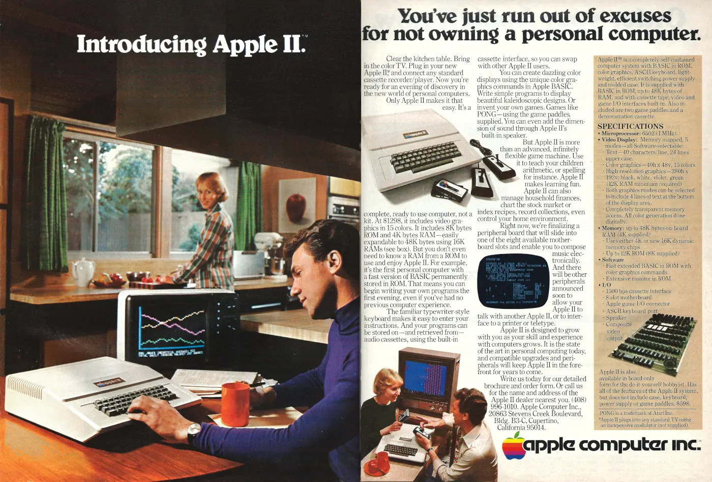
The font here is the one I mentioned previously, the '80s redraw of Belwe. Check the Ws, Ys, and Vs for the distinctive pennant-like decorations. Belwe, and particularly Belwe Bold was a frequently-used display font in the '80s. Here’s an important example:
Description: A two-page print advertisement for the Apple II. One page is a full-page photo of a man ostensibly typing on an Apple II with a coffee cup in one hand. The computer appears to be set up on a kitchen table. In the background, a woman standing at the kitchen sink is looking over her shoulder to smile at the man. The computer’s color monitor displays a few wiggly lines that presumably looked like advanced computer stuff in the late '70s. Over the photo is the text, “Introducing Apple II.” The text is in Belwe Bold.
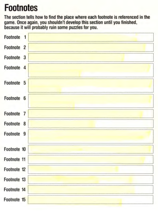
Description: The “Footnotes” section of the hintbook for The Hitchhicker’s Guide to the Galaxy. Under the section heading it says, “The section tells how to find the place where each footnote is referenced in the game. Once again, you shouldn’t develop this section until you finished, because it will probably ruin some puzzles for you.” Under this is a list of hints, each labeled “Footnote [number]”.
The font here is boring ol’ Helvetica or something very like it. I assume going with a sans-serif font was intended to give the text a more “modern” look. Most of the other examples seem to prefer a serif font, which would be more associated with printed books and novels, which Infocom was quite deliberately trying to position its games alongside of (getting their games sold in bookstores on the shelves next to printed books instead of just in computer stores, for example).
I’ll also note (because I’m sure everyone is finding all the font minutia riveting) that the use of serif fonts for things like the question and headline text appears to be a deliberate stylistic choice (and not just whatever the printer would use by default) because even in booklets that use serif fonts for the “visible” stuff like the questions, the hint labels and hint text were (I believe) always sans-serif. Example from Deadline:
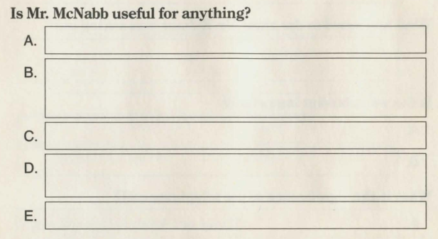
Description: The question “Is Mr. McNabb useful for anything?” from the Deadline InvisiClues booklet. The question is printed in a serif font (I think Times New Roman) but the letters used as labels for the hints (A, B, C, D, E) are printed using a sans-serif font (I believe Helvetica).
I assume this is for legibility of the hints (which were always a bit fuzzy and low contrast even when freshly-developed). Dunno if it was a limitation of the invisible printing process—if you look at the Yes & Know game booklets discussed upthread they all appear to be exclusively in sans-serif text.
When designing the feelie I initially was using all sans-serif fonts for everything except the title page. That’s the most common design choice for most web content, as the general perception is that sans-serif text is easier to read on screens. But I went back and did what I’m inferring Infocom did, which is use serif fonts for stylistic reasons on the “visible” text, and sans-serif fonts for legibility reasons for the invisible hints and their visible labels.
Ah, and that reminds me of another foible of the web feelie that impacts its ability to replicate “real” InvisiClues books: as written, it only allows plain, unformatted text for the invisible hints. That is to say that it isn’t doing full HTML rendering in the hint blanks.
And that means some formatting tricks that are used in historical InvisiClues can’t be accomplished with the web feelie.
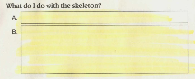
As a specific example, there are multiple clues in the Zork I hintbook like this:
Description: The question “What do I do with the skeleton?” from The Maze section of the Zork I hintbook. It has two blanks. The first blank, labeled A, looks like it could fit a single line of text. The second blank, labeled B, looks like it could hold several lines of text.
If you develop the hints, the first says “Let the dead rest in peace.” and the second is a bunch of whitespace with “[This space intentionally left blank]” centered at the bottom. To achieve the same effect (making a red herring question look plausible by making the last clue look like it might contain detailed information or elaborate instructions) I’ve been just using verbose placeholder text.
The specific “[This space intentionally left blank]” gimmick would be easy enough to create a separate hint type for. But I don’t know how many other text formatting tricks like it are used across all of the historical InvisiClues booklets, and updating the hint-generating logic in the web feelie to accept general HTML text markup would be…non-trivial. As in if I was trying to do that, I’d probably start by looking at an existing third-party library for text-to-HTML-canvas stuff, like fabric.js, instead of trying to code it up myself because it’s a messy problem.
Bump for a feature add. If you’re on a touchscreen device you should now be able to double tap to auto-develop a hint.
Anyone who’s using a touch device, verifying it works would be great.
Double clicking (with a non-touch pointing device, like a mouse) will do the same thing, but I’m pretty sure that doesn’t need any testing. Double clicking is a “stock” JavaScript UI event type, but you have to roll your own handler for the same thing with touch.