I’m having a very odd problem with Twine’s Test mode (versus the Play-option). I get a lot of glitches in Test mode for some reason, and I need to find out why. I’ve been reading up about the Test-mode, and everyone says that it’s no difference from Play mode, but there must be something that’s acting up.
The glitches often appear when there are a lot of CSS involved. Lines “melt” together, height and width changes irregulary etc. But whenever I hit Play mode, the game works as intended.
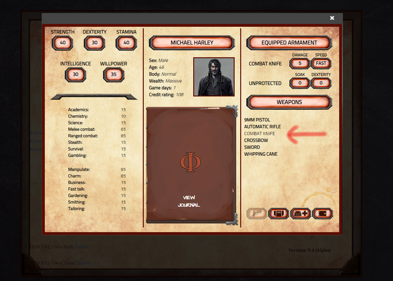
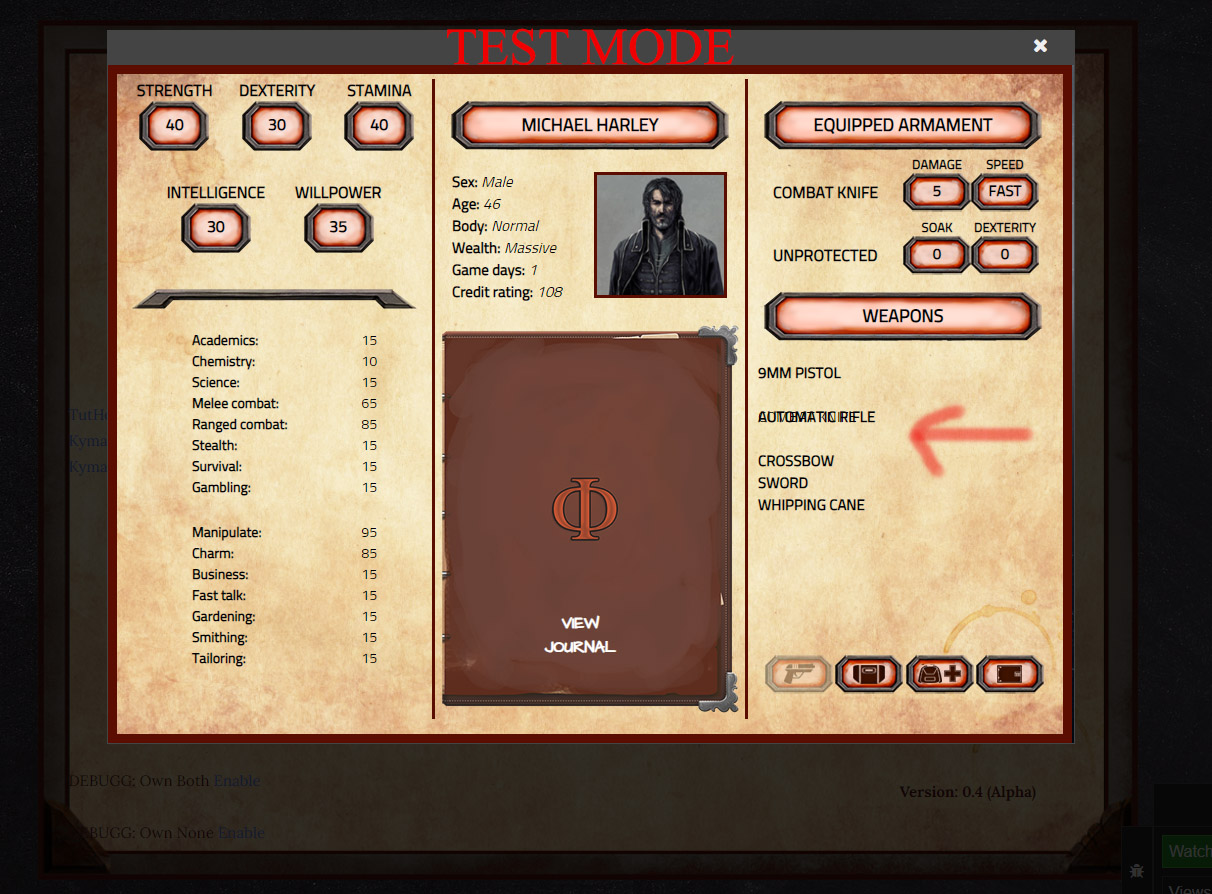
I’ve included two pictures to show you what I mean. It’s the Dialog API-based character sheet for an RPG I’m making. The errors happen outside the Dialog API too.
Has anyone else experienced this? I’m afraid it’s a problem that could plant itself and affect playability on different browsers/computers if it’s left unchecked.
Have you tried using the browser’s inspector to check out that section of the HTML?
Saying that test mode is no different from the play mode is a lie, or at the very least misleading. Test mode inserts div blocks into your code that you can toggle the visibility of with the preview button to show your scripting tags.
In theory, the the test mode should look the same as the play mode, but if your html is bad (say, missing a closing tag or something) the inserted divs in test mode will exacerbate the problem.
So, to summarize, you should check the section of the outputted html and also your code for incorrectly formatted html where it’s marking the equipped item as not-bold, because it looks like that’s the area that’s causing it.
As explained by @tayruh, SugarCube’s ‘Test’ mode injects additional HTML elements into the page being shown so that they can be used by that story format’s ‘Preview’ feature. This alters the HTML structure of the page, and if your CSS selectors are directly dependent on the parent-child relationship between the elements it can result in them not being applied correctly.
The following contrived TWEE Notation base example that demonstrates the issue.
When you the ‘Play’ option to view the ‘Parent Passage’ of the above example the text of the Child Passage should be green, and if you Inspect the HTML structure of the main ‘Passage’ part of the generated page it will appear something like the following…
If you then use the ‘Test’ option to view the same Parent Passage you will see that the Child Passage’s text now blue, and the HTML structure of the main ‘Passage’ area of the page has changed to something like the following…
Thanks @Greyelf and @tayruh, that was thoroughly explained. I suspected that Test mode did something to alter the structure of the output, and I guess this is what’s causing the glitches.
I had to over-complicate the CSS a bit to avoid the “flashing links issue” when you reload a Dialog API from a Dialog API. I use two divs - a placeholder and the actual link. The link is hidden unless you hover over it.
This is the code that controls equip/unequip of Combat Knife (same structure for all other weapons):
It’s really a lot of code for doing one simple thing. I cannot find anything wrong within the html, however. Although I’ve failed to come up with a better solution that looks pretty.
Sorry, it’s just that when I stumble upon something that’s not working, I need to wrap my head around it and sort it out!
In your example the value of $activeweapon is either not equal to “knife” or it is, which means you should be able to replace the <<if $activeweapon is "knife">> call with an <<else>>