I don’t really understand the mechanism by which text is centered, or how Quixe determines the width of the window for the purposes of the virtual machine, but I’d like the text to be centered regardless of whether you’re viewing it on a 4K display or a mobile display. I’d also like to know whether there’s a way to vertically align it. Any assistance would be appreciated.
Here’s the code I’m using, for reference:
[spoiler][code]Include Basic Screen Effects by Emily Short.
When play begins (this is the print the introduction rule):
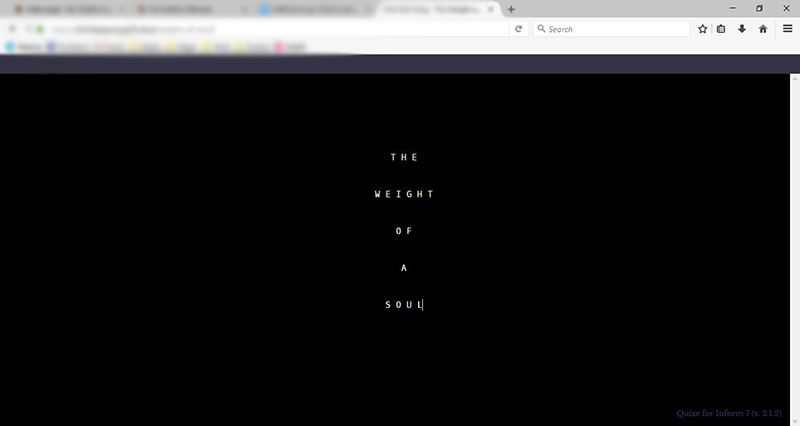
say “[paragraph break][paragraph break][paragraph break]”;
center “T H E”;
say paragraph break;
center “W E I G H T”;
say paragraph break;
center “O F”;
say paragraph break;
center “A”;
say paragraph break;
center “S O U L”;
wait for any key;
clear the screen;
say paragraph break.[/code][/spoiler]
And here’s what I have in my modified glkote.css:
.Style_preformatted {
  font-family: Oxygen Mono, monaco, lucidatypewriter, courier, courier new, monospace;
  font-size: 15px;
}
(Yes, I tried it without the custom font, and the alignment still doesn’t match up, at least according to my friend with the 4K display. The text is center-aligned relative to itself but is too far to the right of his screen.)
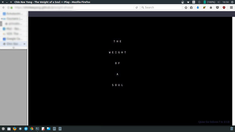
The first friend’s screenshot, the text does look centered, based on the window width, but it’s unbalanced because they have a left sidebar menu active, which may be “overlaying” the game space.
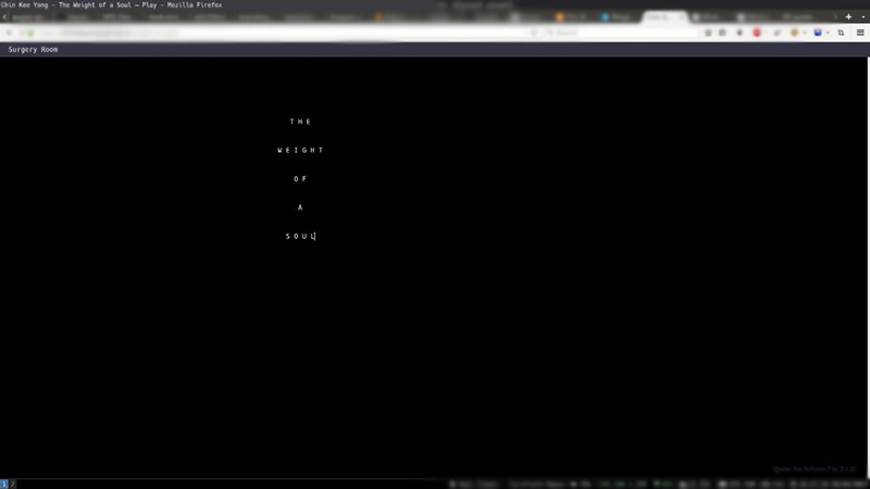
The second friend/third screenshot appears to be set to a much smaller text size or is maximized on a much larger monitor, like a 16x9 aspect screen blown up. It’s possible that the … whatever it is 80 column width display …is keeping the text size on a bigger screen, actually centering it in the space it is using, which may be the upper left corner like it’s windowed within the browser. Since there is no visible border, it looks misaligned. But I bet it’s in the center of the portion of the screen the interpreter is using (if you typed letters till they stopped, they’d probably wrap several inches before the actual right side of the browser because the “window” the game is in is not reaching the edge.
There may be ways to combat this, but it may be like watching a 4:3 TV show on a widescreen monitor that has to have empty space on the sides. This is a common problem with “choose your own interpreter”.
I wish Fluid apps could be distributed and could work on PC. In that case you set all the display parameters for your app, which plays in its own browser.
Perhaps don’t use centering for this type of situation, or create a .jpg logo of the title in a border how you want it displayed and show that.
Here’s a quick jpg I made, and the square around it is slightly lighter than black. Would it work to center this image, and then you have artificial borders to give you the “centered” look?
I’m sorry that didn’t help, but I think it all comes down to players’ individual browser settings and window size and screen resolution at the particular moment they play your game, which is impossible to predict. I believe that’s why modern websites do that thing where there’s an optional background that appears and stretches when the browser is wider than a normal page, keeping the main page content narrow and centered so that a reader’s eyes or head doesn’t need to track too far left and right.
In general, it’s just easier to avoid formatting text so that “center” is a critical design requirement.