It depends, but I usually go for black text on a white background at least. It might be a leftover from my Macintosh days.
For older games, I tend to use monospaced fonts (e.g. simply running Frotz in a terminal window). The author may have expected it, and even in games that supported mixing proportional and monospaced text (e.g. the Infocom games), this was not always enforced as much as it perhaps should have been.
Some games clearly expect the interpreter to render emphasized text as italics (not underlined), so for those I seek out an interpreter that supports that. (Incidentally, Frotz recently started using italics by default when available.) More recent games probably expect that the interpreter will use a proportional font, so they are better at specifying when it shouldn’t.
But I usually don’t go so far as to specify exactly which font to use.
And of course, some games have no usable interpreters so I have to use emulation instead. Which limits my choices.
I didn’t realize Monaco was still a thing in the Mac world, but back when played Infocom games on a Mac Plus, I would always use Monaco 9 points, to the point where I used ResEdit to upgrade the interpreters on the games that didn’t support it. I just didn’t particularly care for Geneva 12 points, so I was a bit disappointed that the version 6 games used that with no option to change it.
Fun fact: Even some of the non-graphical Infocom games specifically check if they’re running on a Mac. Both Beyond Zork and the Solid Gold version of Wishbringer avoid using bold or italics in at least some cases. I’ve gotten the impression that Brian Moriarty cared a lot - even more so than the average Infocom Implementor - about getting his games to look good, so maybe he just didn’t like the look of bold/underlined Monaco 9 points? (He also added special cases to Trinity for when running on Atari ST. Probably because that seems to have been the only one of the original interpreters to actually use italics rather than underlined text?)
I was thinking mainly of the Legend Entertainment parser games (Gateway, Eric the Unready, etc.), but I’m sure others could come up with other examples of games that still hold up well.
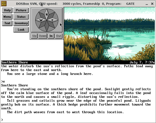
(I don’t like the “Menu” mode. The “Half” mode strikes a nice balance between the graphics and the text, I think.)
This is what Bob Bates wrote recently in response to a question about how they were developed:
The short form is that my biggest worry upon starting Legend was that we’d get sued by the litigious new owners of (what was left of) Infocom. So I wrote up specs for a new parser and black-boxed it out to an independent company. What came back was written in C, and we built our engine around it. All the Legend games were written in C until we migrated the engine to C++ for Blackstone. The Unreal games and Wheel of Time were written using the Unreal engine. Thaumistry was TADS, which I chose over Inform (and other engines) because it very powerful and customizable all the way down.
Which makes it sound like DOS emulation is the only sensible way to go?
As I’m sure you know, many of the Infocom .z3 games had Mac-specific variants to address exactly this problem. (The original releases did not distinguish monospaced segments like ASCII maps; the Mac variants added a line to set the fixed-width bit for thos print statements.)
Just FYI, for any Windows games, DOSBox-X is far better than DOSBox.
DOSBox has no plans to ever support Windows games and anything that currently works is purely accidental, while DOSBox-X supports DOS and Windows including Win9x and Me.
Because Windows is a much bigger OS and games are much more finicky than their DOS counterparts (think trying to have multiple versions of QuickTime for Windows or Direct-X on the same system), DOSBox-X supports using qcow2 disk images arranged in a a parent-child relationship, so that a single OS disk image can support unlimited mutually incompatible games without eating all your storage space, and allowing each game to ‘see’ a pristine Windows environment where it is the only thing installed.
For even more fun, consider the DELAY routine in Bureaucracy. I don’t think any modern interpreter handles that one as intended, for pretty good reasons. (It uses a busy-wait loop with a hard-coded number of iterations for each interpreter number.)
I guess it might be possible to rewrite it using timed input instead.
Yes, but only where necessary. There are still things that look like they were written with a mono-spaced font in mind, but the games don’t enforce it. For instance, the cornerstone in Deadline and some of the Library Mode information in A Mind Forever Voyaging.
For Deadline it’s purely cosmetic, and I don’t think any of Infocom’s own version 4/5 interpreters used proportional fonts for the lower window so I guess it was never considered an issue in AMFV.
I hadn’t heard of DOSBox-X, but since I don’t own any copies of Windows 1.x/2.x/3.x/95/98/Me, the advantages may not be as pronounced for me. (Though FluidSynth support might be nice, now that I no longer have a sound card that does native MIDI…)
(I’m trying to make my posts replies to the relevant parent post, but I guess I keep hitting the wrong reply button?)
Monaco 9pt was what I first discovered text games in at the age of about 13… Zork 1 and the Unnkulian Unventures, and the look remains my most preferred. However, that was on a Mac Performa 550, where size 9 was still readable… I use 11 or 12 pt now with my present screen resolution. We had a Mac Plus before that, too… such good memories of games like Dark Castle…
I’m quite photosensitive so prefer darker colour scemes. Not a fan of the Amiga versions of Infocom games either. I find the interpreter to be uniquely ugly starting with the standard system font, colour scheme, but also including the distracting Amiga UI elements including windows chrome. Thank goodness for Frotz and the other z machine interpreters
I also like to use monospace fonts. Currently I like Courier Prime, though I went through a Linux Libertine Mono phase a few years back that still survives in my Inform 7 installation. For colors, I use dark green on light gray in Frotz and Glulxe, which is not necessarily a beautiful combination, but it helps to visually distinguish an IF game from a terminal window (for which I use the opposite, light gray on dark green) or a text editor (black on white).
…And now part of me is thinking I shouldn’t be telling all this to strangers on the Internet.
I’m also in the camp that prefers a dark color scheme on most websites for text - light text on a darker background. The only combo I severely dislike is when the background is bright red - especially with white text or a purplish text it makes the letters seem to quiver and swim in contrast in peripheral vision.
One thing to think about is making sure the colors you choose are discernable to someone with different types of color-blindness. It usually comes into play if you have any hyperlinks of differently-colored/highlighted text. You can upload a screenshot to simulate how the colors of your interface appear with different types of color-blindness on this website: https://www.color-blindness.com/coblis-color-blindness-simulator/
Someone else had also mentioned that using pure black at 0,0,0 as the background can also cause problems for some and recommend bumping the brightness for any black background up a couple points.
It seems rare in IF, despite being standard elsewhere (if not this forum). Obviously it was harder to do at one time, so no surprise early games did not do it .
Not a fan. It’s easy to lose your place in a completely square paragraph - except for occasional stylistic effect if you want the text to seem like a magazine or newspaper article.
IMO, justified text is suitable only for print (or PDFs which are designed to look/feel like print, even if no one actually prints them). It takes actual effort to make justified text look good, without awkward spaces that are far more distracting than a ragged right margin. On mobile, in particular, justified text is usually a disaster.
I like to use justified text. The ragged right edge of text blocks annoy me. However, not all justified text algorithms are created equal, and not many make the jump to mobile screens very well.
For the demos I wrote for my game engine, I have the text justified, but I disable it if you resize the browser window to less than 800px wide (which means it’s also disabled on many mobile devices) because the justification spaces it really funky and makes it harder to read. Kindle on mobile seems to do it fine, but the Moon Reader app seems to struggle with the it, so I have it disabled there. It’s a case by case basis.
Also, all this talk of Monaco being classic makes me wonder how many IF players own a Mac. I don’t think I know a single Mac owner IRL. I have a few online friends that have a MacBook that they mostly use for work, but a Windows desktop is still their main device. It’s funny how many people here primarily use Mac compared to everyone else I know.

 However, not all justified text algorithms are created equal, and not many make the jump to mobile screens very well.