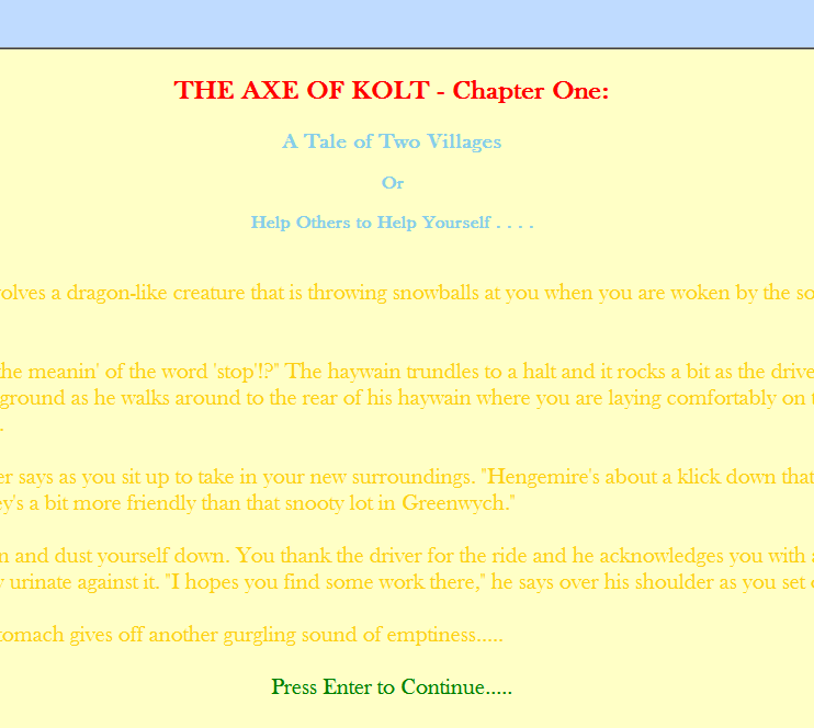
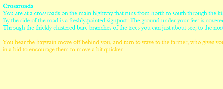
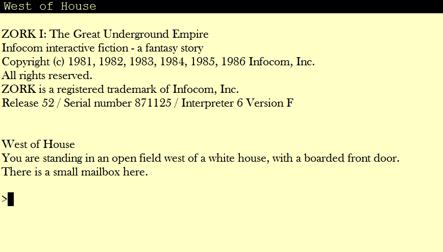
Ok, let me just say right off the bat that use of colour, per se, does not bother me, and it’s a valid - and fun - authorial right. I’m only displeased when an author makes assumptions about the colour the player has as background. I mean, you actually use the colour “white” as a font colour… you may think my background colour of choice is “yukky” (I’m fine with you thinking that, btw.  To each his own. This is the colour and fond (Baskerville Old Face) I found to be easier and most pleasing on my eyes), but white-background is very common nowadays, and your game would be partially unplayable even then.
Shame that ADRIFT doesn’t allow you to set background colour, maybe that feature should be implemented?
A good idea, but I’d lose the “Please don’t change the default colours” bit, because if a player has changed them, there’s a very good reason for it. Instead, why not just say the last bit? “This game was envisioned as being playable Cyan On Black. Since ADRIFT does not yet support an authorial override of a player’s background colour, be advised that if your background colour is not black portions of this game will not be easily readable. For maximum experience as intended by the author please ensure your background colour is set to BLACK”.
I do agree. No reason to change your style. I was merely saying that, as an author, you can’t take certain things for granted.
Yeah, well, they can try staring at the screen through my eyes if they want to.
You may not see any reason to change your style; and I do not see any reason to change colours to something that’s harder on my eyes when it’s clear, from the outset, the author didn’t even spare a moment’s thought to the matter and just assumed everything would be exactly how he wanted it to appear in every interpreter.
BUT, if I see an explanatory note saying that the author intended the game to be played in a certain configuration, I’m a lot more lenient. That tells to me that the author has thought about it, weighed pros and cons, and decided to sacrifice a bit of player friendliness in favour of his intended experience. I can totally get behind that.
If I don’t see any such note, my confidence in the game drops to below zero instantly. Am I going to trust my time and energy to a game with puzzles where the author didn’t even consider that different people might not have the same background colour in their interpreter?
Just saying. So you got four people to play the games and they weren’t bothered. That’s great, if you ever only want four people to play your games.
EDIT - Just FYI, this is what I’m used to seeing when I play IF. It’s a combination of colour, font and font size that’s taken me a long time to get right, and takes into account my screen resolution and the size and type of my monitor, as well as the colour settings on my monitor and my overal Windows theme. It’s not random, and I’m sure that what you’re seeing on your computer, in my screenshots, is not the same thing I’m seeing here.
If you think I’m going to throw away these precise and specific settings, in games which are 100% text and require me to stare at letters on a screen for a long time, for no good reason, you’ve got another think coming. I’m glad to play games that aren’t standard in their format - if they are considerate enough of my setting and my eyesight to either override my settings OR explain what I have to do and why.
[rant]
[/rant]


 [/rant]
 ) I use a cyan font on a black background. AFAIK, there is no setting in the Runner to lock the colours and it would be difficult if not impossible to give the player any choice in the matter.