I have yet to play the game, but have read reviews and therefore have an impression feel about it, so I have an outsider’s take on your WIP.
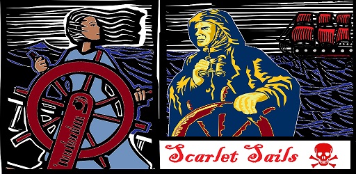
I gotta say I don’t like it. My first reaction is against the style. It looks like a linocut - and I read your blog after, where and you describe it as woodcut, which is a very similar aesthetic. To me they both convey a static, ornate and not very piratey feel. Woodcuts and linocuts can convey details like wood and water well, but even so I think their look is more suited for portraits and still lifes.
When I think of your game, based on what I know, it’s rollicky and adventuresome, which is not the vibe I get from the current pics. I get a heavier vibe that we’d be dwelling on the character(s) of the two people presented. That’s the ideas that portraits tend to sell, plus the dark/dour colours assist that vibe. I’m not getting a fun feel.
In composition, the frame shape and composition aren’t complementary. If you go for a widescreen composition, splitting in the middle makes it look like 2 squares rather than a united cover image. Putting the title entirely in one of the squares reinforces that sense. If nothing else, I’d have the title centred so it crosses both characters.
The woman has realistic colouring, which makes the man (yellow) hard to interpret. He needs to move into the same colour space as her for both to be interpreted correctly and in relation to each other.
But that’s accepting this image. I mean, my inclination is to return to the original idea (the 2 sailors, in opposition to each other? I haven’t played the game but that’s the story I get) but then come up with an entirely new take. The colours are too dour, fun is not conveyed, I don’t like the woodcut aesthetic as a match for the ideas (though that could change if the colours brighten), the composition problems, message not clear.
Sorry if this is dispiriting for the amount of work you’ve already done, but it’s very tough to get good results in graphic design without a lot of experience. Have you considered commissioning a title page from a pro, or do you know anyone yourself with more experience? Or hitting up someone whose output you like on deviantart, etc.?
(PS I’d offer you my own services (wadeclarke.com/art/) but I’ve zero time for anything like this at the moment : ) )
By the way, on these forums there’s a collaboration topic, which also has some good advice on other DIY solutions -
https://intfiction.org/t/artist-to-illustrate-cover-for-my-game/8317/1
-Wade
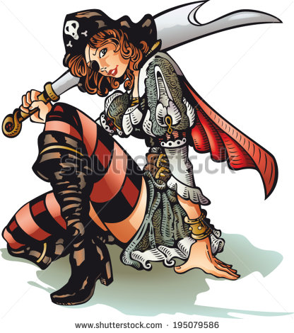
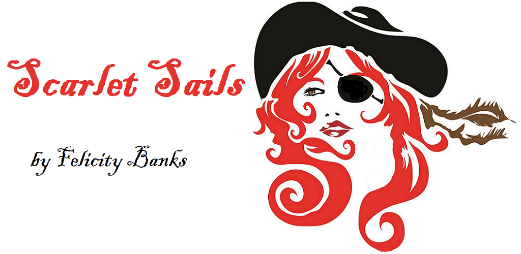
 I had an artist lined up but she vanished (also, I got scared she’d do something I didn’t like) so I started putting together something else. My current drafts are at felicitybanks.wordpress.com/201 … g-a-cover/ with some other thoughts and several very cool images that were discarded. The pic above is representative of my current front-runners. Feedback is most welcome at this stage!
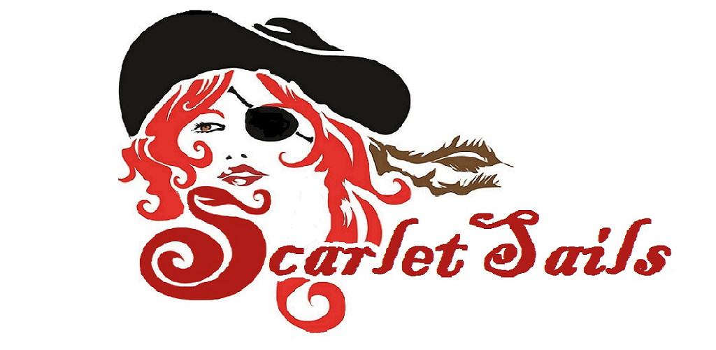