I’ve been writing small parser-based games using Inform 7. Now I’m trying to write menu-based games but am having some simple problems getting the menus to work. Could someone point me to an online example of how to do this?
Why am I doing this?
I’ve been writing small parser-based games using Inform 7. Now I’m trying to write menu-based games but am having some simple problems getting the menus to work. Could someone point me to an online example of how to do this?
Why am I doing this?
I second the question. I consider the Legend interface, IMHO the best one ever, having the right balance between pure text, graphic IF and point-and-click, and I suspect that an extension implementing it will be welcome.
Best regards from Italy,
dott. Piergiorgio.
One thing I liked about the Legend interface was that if you didn’t like the vocabulary menus you could remove them. I always found the “half” mode much nicer to play than the default one.
Jon Ingold did experiment with menu-based parser input in games like Dead Cities and A Colder Light, and the Wilds of Orkney demo. Unfortunately no source for these was made public, as far as I know, and they have problems on many modern interpreters.
I have had great success using AW Freyr’s “Hybrid Choices” extension which allows you to switch between the parser interface to a numbered choice menu at any given time, and the choice interface can affect the world model normally. The entire game can be done as a choice-narrative as well. Steph Cherrywell has used it several times in Zozzled and Brain Guzzlers From Beyond among others.
Here are various topics discussing the extension:
https://intfiction.org/search?q=hybrid%20choices
The basic gist is you have “pages” which can be thought of as similar to a passage in Twine. A page has a “cdesc” (choice description) attached to it which is the text when it shows up somewhere else as a numbered choice. And you declare the page “for” another choice page or pages, which makes it show up as a choice from other pages. You can write an “end-page” which displays text (or not) and drops the player back in parser, and rules which direct to pages from any point.
This is very flexible and powerful, as you can write “choice toggle” rules which can hide or show available choices based on world state (only show a page to unlock a door if the player is carrying the key for example) and you have all the I7 options for randomizing and customizing text based on the author’s whim.
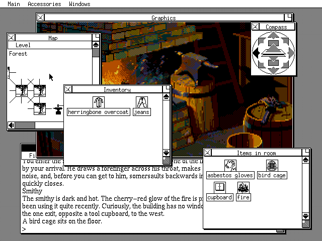
Here is another example of a noble attempt to make a more user friendly GUI for adventure games, albeit one that I personally don’t think worked very well: The “Magnetic Windows” interface from Magnetic Scrolls. It’s technically impressive, of course, but trying to arrange all - or even some - of the windows into something aesthetically pleasing was… difficult. In this screenshot I didn’t even try.
It got even worse because at least in some of the games not every picture was the same size.
I guess in the classic Mac OS GUI, you were not really meant to arrange the windows to have everything visible at once (or to be aesthetically pleasing). The idea was to extend the limited screen estate by bringing a window to the front when clicking on it, hiding other windows behind it, but leaving enough bits of them visible to click on if you want to bring them forward.
It works well when you are used to it, and I find I still try to arrange modern GUIs in a similar way, for example by opening web pages in separate, partially overlapping windows, partially off-screen, and I get frustrated when programs won’t let me.
There are other extensions which can kind of replicate the Legend-style interface, but they can be tricky - specifically Jon Ingold’s “Flexible Windows” (and Emily’s “Location Images” which uses Flexible Windows to display a picture upon room description.) There has also been a help-menu extension which gives a sidebar of tutorial commands.
I sort of hope the upcoming update of I7 has built-in solutions for this. I think one of the prospective intentions is to include more modern methods for authors to customize the display.
Reading Emily Short is always thought provoking. She objects, rightly, that presenting all the verbs available in a parser game is an ugly list, but I wondered if we couldn’t display them as a word cloud. That’s (if I’ve got the term right) where the words are randomly placed on the page, but differ in size according to the frequency with which they’re used.
So what an author would do immediately prior to release, is run the game through a “test harness” that would robotically try every object in the game with each verb, saving the output to a file. It would then run through the output, discarding standard responses (“you see nothing unusual about the earwig”) which didn’t change the state of the model world (because “taken” although laconic, might well represent an important step in moving forward).
Very likely “Examine”, “Inventory” and the movement commands might be so common that they’d swamp all the other responses, so we might exclude those, or print them big at the top or something.
Then print out all the verbs (but not the object names) as a word cloud for that game. The difference in word sizes would then indicate which verbs most often produced a fruitful response in that particular game, and so would provide a broad indication of what might be useful to try, without spoiling any puzzles.
It might mitigate that paralysis of choice induced by the apparent ability to do “anything you like” that newcomers to parser games find daunting.
Just a thought.
Edit: or, much simpler, apply the process to a (good, thorough) walkthrough.
I’m sure that everyone take  the verb menu as “common verb menu” that is, the verbs everyone expects even from the most crude parser. Take, drop, examine, look, inventory… whose, by definition, don’t spoiler (nor misled…) nothing.
OTOH, there’s people whose prefer, the good ol’ typing (personally, I consider keyboard typing the proper look & feel of IF… but this seems rather on the “La Palisse” side of debating…)
Best regards from Italy,
dott. Piergiorgio.