▲ Return to the Table of Contents
Constructing a Persistent Interface
- An interface outside of the Harlowe story allows you to display information across visited passages.
- Passages can then transition, while the interface remains unaffected.
The Largest Hurdle
Harlowe’s basic HTML structure in the <body> tag looks like this:
<body>
	<tw-storydata>
		<style role="stylesheet"> ... </style>
		<script role="script"> ... </script>
		<tw-passagedata> ... </tw-passagedata>
	</tw-storydata>
	<script data-main="harlowe"> ... </script>
	<tw-story tags="">
		<tw-passage tags="">
			<tw-sidebar> ... </tw-sidebar>
			<tw-include type="startup"> ... </tw-include>
			<tw-include type="header"> ... </tw-include>

			>>> CURRENT PASSAGE CONTENT <<<

			<tw-include type="footer"> ... </tw-include>
		</tw-passage>
	</tw-story>
</body>
What’s not evident is what happens to the HTML when a new passage is visited. Upon displaying a new passage, the <tw-story> tag is completely removed and reinserted at the bottom of all content within the <body> tag.
Luckily, CSS has a perfect solution for this situation buried within it’s flexbox abilities. The following will describe how to construct a persistent flexbox template around your Harlowe story, despite the <tw-story> tag being constantly removed and reinserted.
Injecting The Template
The only way to really work outside of the <tw-story> is with JavaScript, but it’s not complicated when armed with a basic knowledge of HTML and CSS. The following is in the story’s JavaScript page:
let interface_root = document.getElementsByTagName( "body" )[0];
let interface_structure = ' \
<x-layout left id="left_pane" style="display: none;"> \
    LEFT COLUMN \
</x-layout> \
<x-layout right id="right_pane" style="display: none;"> \
	RIGHT COLUMN \
	</x-area> \
</x-layout> \
<x-layout top> \
	TOP ROW \
</x-layout> \
<x-layout bottom> \
	BOTTOM ROW \
</x-layout> \
';
interface_root.insertAdjacentHTML( "beforeend", interface_structure );

let left_pane = document.getElementById( "left_pane" );
let right_pane = document.getElementById( "right_pane" );

window.interface = {
	hide: function () {
		left_pane.style.display = "none";
		right_pane.style.display = "none";
	},
	show: function () {
		left_pane.style.display = "flex";
		right_pane.style.display = "flex";
	},
}
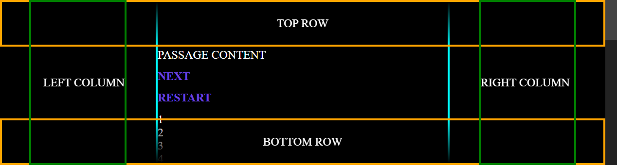
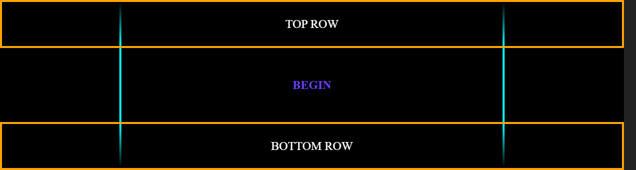
…notice that we are using custom HTML (described previously) and the column elements are set to display: none; by default. We’ll show those columns only when the story requires it. The top and bottom rows are going to be faded gradients that sit above the story passages so that the text gently fades out as the content is scrolled (see the image below). The following CSS will be in the story’s style sheet:
:root {
  	font-size: 24px; /* <== base story font size */
	--scrollbar_width: 24px;
}
body { /* <== base layout container (direct parent of <tw-story>) */
  	background-color: #000;
  	color: #fff;
	margin: 0;
  	padding: 0 2.5rem;
	display: flex;
	gap: 2.5rem;
	justify-content: center; /* <== bunch together horizontally */
  	overflow-x: hidden;
  	overflow-y: scroll; /* <== always show the scroll bar to avoid horizontal shifting between passages */
}
body::-webkit-scrollbar { width: var(--scrollbar_width); } /* <== custom css variable */
body::-webkit-scrollbar-track { background-color: #222; }
body::-webkit-scrollbar-thumb { background-color: #444; }

x-layout[left], x-layout[right] {
	position: sticky; /* <== restricts elements from scrolling with the body content */
  	top: 0;
	display: flex;
	align-items: center; /* <== center vertically */
  	text-align: center;
	width: 200px;
  	min-width: 200px;
  	z-index: 200; /* <== infront of top and bottom gradient fades */
  	box-sizing: border-box; border: 4px green solid; /* <== for demonstration purposes */
}
x-layout[left] {
  	order: 1;
  	justify-content: flex-end; /* <== right align */
}
x-layout[right] {
  	order: 3;
  	justify-content: flex-start; /* <== left align */
}
x-layout[top], x-layout[bottom] {
	pointer-events: none; /* <== allow clicking through top and bottom gradient fades to the <tw-story> element */
	position: fixed; /* <== pulls element out of flex-box flow and locks it to the screen */
	display: flex;
  	width: calc(100% - var(--scrollbar_width)); /* <== scrollbar needs to be accounted for when <body> is set to scroll */
    align-items: center;
  	justify-content: center;
	height: 4rem;
  	z-index: 100; /* <== gradient fades infront of <tw-story> */
  	box-sizing: border-box; border: 4px orange solid; /* <== for demonstration purposes */
}
x-layout[top] {
  	top: 0;
  	background: linear-gradient(180deg, rgba(0, 0, 0, 1) 0%, rgba(0, 0, 0, 0) 100%);
}
x-layout[bottom] {
  	bottom: 0;
  	background: linear-gradient(0deg, rgba(0, 0, 0, 1) 0%, rgba(0, 0, 0, 0) 100%);
}

tw-story {
  	margin: 0;
  	padding: 4rem 0; /* <== compensate for top and bottom gradient fade heights */
  	width: 64ch;
  	min-width: 48ch;
  	display: flex;
  	height: fit-content; /* <== ensures passage content can scroll */
  	flex-direction: row;
  	align-items: center; /* <== center passage vertically */
  	justify-content: center;
  	text-align: left;
  	order: 2; /* <== left pane = 1, <tw-story> = 2, right pane = 3 */
  	/* (!) disable the following default harlowe styles (inherit from <body>): */
  	font: inherit; font-size: inherit; line-height: inherit; background-color: inherit; color: inherit;
  	box-sizing: border-box; border: 4px cyan solid; /* <== for demonstration purposes */
}
tw-passage { width: 100%; } /* <== allow passage content percentages to take up the entire <tw-story> width */
tw-sidebar { display: none; } /* <== hide the harlowe navigation side bar */
Note: The order style ensures that all flexbox <body> children appear in the desired order regardless of the order they appear in the HTML page. Remember, the <tw-story> tag and all it’s contents are removed and re-appended with each visited passage. Despite this, our template remains properly structured and doesn’t flicker/redraw. Flexbox is built for being modified live and it’s the nature of responsive web design.
You might notice that all of our interface panes do not scroll with the story content. This is to ensure that our interface remains on the screen at all times, but has the benefit of keeping the passage scroll bar to the far right of the browser window, like any other Twine story. I find this preferable to having a scrollbar inside the panes of the interface template as it allows the story content to breathe and there’s much less distraction happening.
》Tip: By default, all child elements of a flexbox become a part of the flow. However, there is a way to take an element out of the flow and deliberately position it on the page by using display: fixed;. This allows us to keep the top and bottom panes fixed to their corresponding positions and keep the flexbox to a simple 3-column layout.
And lastly, it’s probably better to only hide the interface on passages that are not a part of the main story. I suggest the following in the footer passage:
{
(if: (passage:)'s tags contains "no_interface")[
	<script> interface.hide(); </script>
](else:)[
	<script> interface.show(); </script>
]

<script>
	let scrollbar_width = document.body.offsetWidth - document.body.clientWidth;
	document.querySelector(':root').style.setProperty('--scrollbar_width', scrollbar_width + 'px');
</script>
}
…now, if you put a tag called no_interface in a passage, then the columns will be hidden. Otherwise, the columns will be visible. It’s easier to manage it by the passages that don’t require the interface when authoring large stories.
Also, there’s no way for CSS to know the actual width of the scrollbar, if the browser doesn’t support setting a width to it. We need the scrollbar width to calculate the width of the fixed top and bottom rows of our interface template. Fortunately, we can use JavaScript to calculate the scrollbar width and override the custom CSS variable --scrollbar_width in the :root. (Microsoft Edge and Google Chrome support specific scroll bar widths, but Mozilla Firefox does not.)
》Tip: By overriding CSS :root variables with JavaScript, we essentially get to change the style sheet programmatically and the changes update all affected elements automatically throughout the entire story immediately. This has huge benefits because we don’t have to target individual HTML elements or CSS selector styles one at a time. This is how one might go about changing a story’s entire the colour scheme for colourblind users, for example, or allow the user to customize their own story theme.
Updating Template Information:
Because we’ve setup our interface template outside of Harlowe’s code base, we have to do a bit of heavy lifting to have it update properly. However, it’s not as hard as one might think. In the footer of each passage, I suggest calling a custom JavaScript function that passes on the relevant Harlowe variables. That way these variables can change in the middle of the passage’s code, but because the interface template updating is done in the footer, the JavaScript function receives the proper Harlowe values after the passage logic has concluded.
To illustrate this in a simple manner, your JavaScript window.interface object should include something like this:
update_left: function ( value ) {
	left_pane.innerHTML = value;
},
update_right: function ( value ) {
	right_pane.innerHTML = value;
},
…and in your passages, you could create variables such as:
(set: $life to 4)
(set: $max_life to 5)
(set: $gold to 3)
…and in the footer, you would update the template content with:
(if: (passage:)'s tags does not contain "no_interface")[
	<script>
		interface.update_left( "Life: " + $life + "/" + $max_life );
    	interface.update_right( "Gold: " + $gold );
	</script>
]
…then you would get Life: 4/5 in the left column and Gold: 3 in the right column.
Note: It’s also possible to control the content in the interface template by copying the innerHTML from a hidden Harlowe hook. You can do as much or as little as you want in JavaScript. I prefer using my own HTML because I like the control it offers and, by building it myself, I understand it more.
》Food For Thought: Having an interface template surrounding your story might make it tempting to use the template to control the story (as opposed to simply providing more information about the story). I do caution against creating an interactive template because, not only does it create more layers of coding complexity, it also goes against the nature of how Twine stories are intended to function and how they fundamentally work. Use custom interactive interfaces purposefully and sparingly. This is only a suggestion though.
Rationale :
An interface allows you to present persistent story information to the user at a glance. However, by only using Harlowe code to do so, the interface would have to disappear and reappear with each new passage (or you’d have to build a story that never leaves the passage and negates the built-in story history feature). Having story text disappear and reappear with new content makes perfect sense, but having the interface surrounding the story do the same is not usually desirable.
With stories that feature game mechanics, interfaces are very useful. As a narrative battle unfolds across multiple passages, the health bar can remain. As a dungeon is explored further, a persistent map can show the player’s location. An interface can even be just decorative to give your story a unique visual appeal. The interface method described here is a great tool for any Harlowe author’s arsenal. Someone might even think your Harlowe story was written with SugarCube. 