23 Minutes
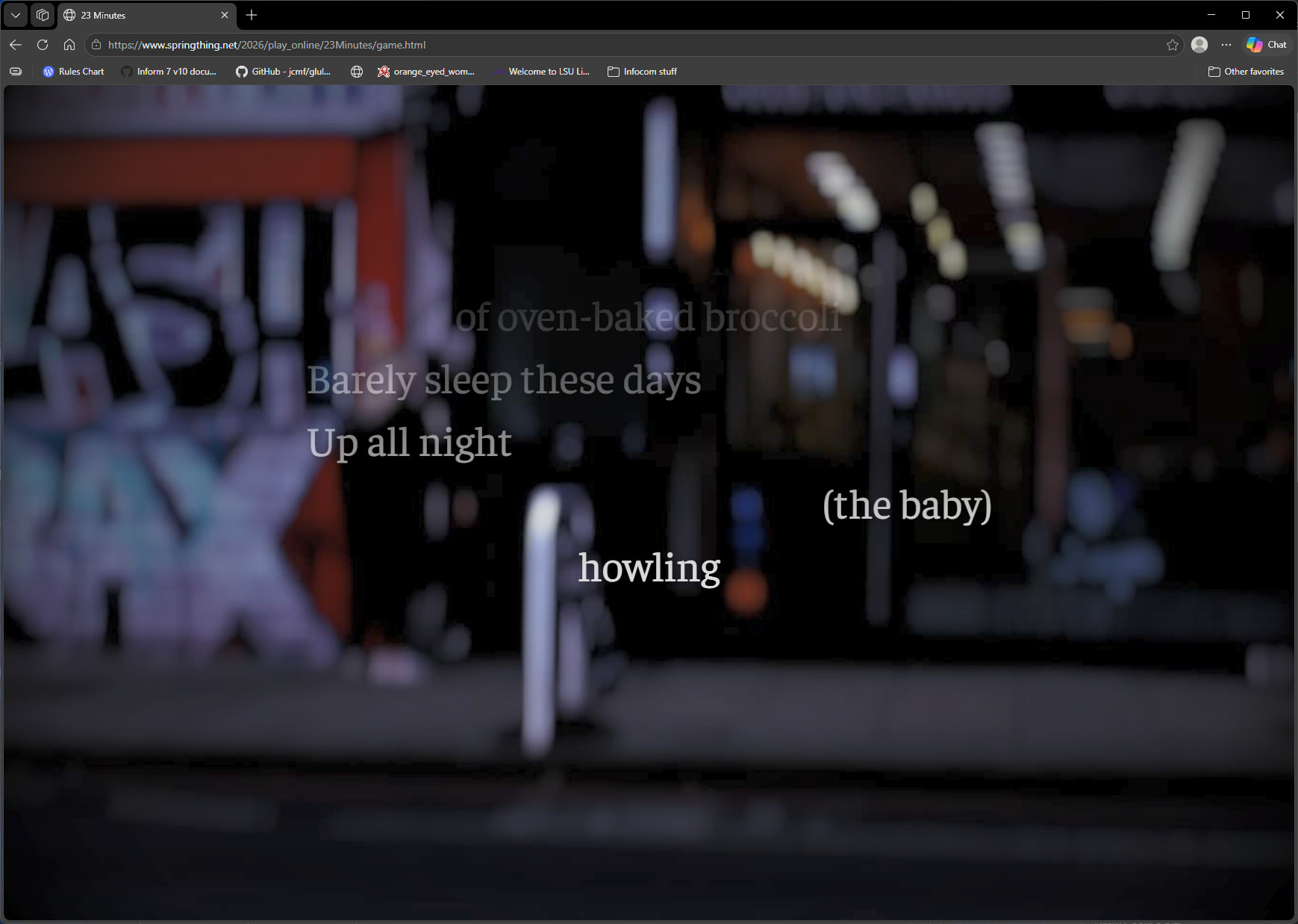
23 Minutes is a long-form kinetic poem with a striking visual design. Darkened, blurred-out images of London sidewalks and streets afford background to white (#ffffff) text (font-family: Faustina, Helvetica, sans-serif;). Text becomes lighter and less distinct as it scrolls up the page, but the latest line is always white.
Accessibility
I believe this text will be comfortably legible for most readers, as some care has been taken to keep the text bright over a reasonably dark background. One consideration is that the font-size is relative to the total size of the viewport. That being so, the taller the window is, the more legible the text will be. I do not believe there is a light-mode equivalent scheme for this design, or, alternately, devising one would be rather high effort.
General Appeal
This is a nice work to look at. The images get changed up quite a bit, and their blurred nature complements the emotional qualities of the game. The content and presentation are well-married. In fact, I would go so far as to say each is essential to the other. So far as interacting with the html itself, I was surprised by the amount of clicking required: essentially once-per-line in a very long poem. This is not necessarily a problem with the work, but I think many readers will enjoy their experience most if they consume 23 minutes over the course of a few days.
Would I do anything different
As a trained (albeit unsuccessful) poet, I am a near-bottomless font of unsolicited opinions! So far as the actual presentation goes, I think I would experiment with advancing the text by stanza rather than line but have few other notes besides. I have recently embraced the practice of offering a choice between light and dark modes, but this work is closely aligned with its specific presentation. I’m not sure that offering a different color mode would easily reflect the intent of this piece.
Overall assessment
23 Days is a strong example of alignment between content and presentation. There’s an interesting use of overlay that is presumably enforcing a certain amount of contrast between text and image. I appreciate the way the washed-out, distorted images complement the mood of the poem and plan to study the CSS to see what can be learned from it.
This is a unified work that utilizes visual styling to great effect.