Well, the main problem you’re having has to do with how CSS works.
The “C” in “CSS” stands for “cascading”, which refers to how the stylesheet rules used “cascade” down, in a “least specific” to “most specific” order, with the last style in that order being the one that’s actually used. When there’s a tie with two things being equally specific, then the last one specified is the one that’s used.
IDs, like #passages, are more specific than classes, like .devb, because IDs are supposed to be unique on a page, while you can have multiple instances of the same class on a page. Thus the CSS for #passages button is preferred over the less specific .devb button CSS.
If you want that last chunk of CSS to work, then you’d need to make it more specific than the #passages button chunk. The simplest way to do that would be to do this:
#passages .devb button {
    color: white;
    background-color: black;
    border-width: 1px;
    font-size: 75%;
    padding: 0.1em;
}
That will work, because #passages .devb button is more specific than #passages button.
One thing which can help when trying to work these kinds of things out is using the “Developer Tools” window in your browser to play around with the CSS there until it works. (You can hit F12 or CTRL+SHIFT+i in most browsers to open that up, or right-click on an element on the page and choose “Inspect Element”.) Most times the “Developer Tools” window will open up to an “Elements” section, where the HTML can be explored, a “Console” section, where errors will be displayed and commands can be entered, and a “Styles” section, where you can see and play around with the CSS on the element currently selected in the “Elements” section.
For example in the “Styles” section you can compare your version to my version in the image below:
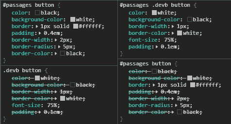
(Note: I also added border-color: white, just so that I could see the button better when testing.)
As you can see on the left in the above image, the .devb button CSS is mostly overridden by #passages button in your version (CSS with strikethrough text is overridden). Looking at the right side, you can see that by changing .devb button to #passages .devb button it makes it so that that CSS overrides #passages button CSS.
So, by using the “Developer Tools” window in your browser, you could’ve seen what was happening and figured out why the CSS in your Stylesheet section wasn’t working. It’s a handy tool.
Additionally, you can create and edit styles in the “Styles” section to make things look the way that you want. Once it all looks good, then all you need to do is copy those changes to your game’s Stylesheet section and then your game will look that way. I use that all the time when styling stuff.
Hope that helps! 