In Which Max Fog's Tiny Reviews Only Study Blurbs & Cover Art

Traffic

Blurb

A somewhat “old-school” style text adventure set in modern day. Contains mild puzzles, most of which have multiple solutions (a basic walkthrough will also be provided). This game is unlikely to change your life in any meaningful way, but I hope you enjoy it.

Alt Cover Text

An image of a highway with two lanes that are moving in the direction the POV is facing and a few more in the background to the left over some separating bushes, where cars are moving against the flow of traffic to the right (on its left, but on the POV’s right). The cars in the focused-on section (rightmost) are stuck in traffic.

I’ll admit, this is like getting blood out of a stone. It’s pretty straightforward: the player’s in traffic, and supposedly the same traffic as in the image? Just hope then it’s not British traffic, since the cars are on the left. Interestingly, no title on the image.

So the blurb states: ‘somewhat “old-school” style’. But why the need for the quotation marks? I don’t think there’s much to think about here, but it was worth a try. Putting the game down by saying “unlikely to change your life”, but at least it’s modest. The one thing I really hate in blurbs is calling your product “amazing” or “hilarious”, and then not justifying that with good humour of some sort in the game (“hilarious”? There must have been some sort of mix-up in the cartridges. You got the full family-friendly life simulator… When you start playing the game would be funny, because it’s making fun of its own blurb.)

Overall, not entirely catchy, but hopefully the kind of thing that is solid and modest.

2 Likes

Sidekick

Blurb

It’s the Old West and Buck Swagger is the man of the hour and his feats of derring-do are known all across the western territories. You, however, are Buck’s long-suffering sidekick and know all too well that those feats are actually your feats and that Buck is, in reality, a vain dimwit with great teeth and good press.

Now, Buck’s been summoned to Mercury Springs, a small town under the heel of a ruthless gang of villains. His assignment? To rid the town of evil. Your assignment? To complete Buck’s assignment for him and to keep him from getting himself killed in the process. If successful, you’ll receive none of the accolades. But such is the life of the sidekick.

Alt Cover Text

A slightly cartoony image of an empty street in a classic “wild west” town, with the sherrif’s building and desert in the background, and tumbleweed rolling across the floor. The sky is blue with a very bright setting sun that shades the bottom half of the sky yellow, and the floor is orangey red.

I think I’m suffering a bout of stoney cover arts. This cover really sets that vibe of the western town. It’s simple and fairly unsurprising, to be fair, but it does the job. It certainly has a little more charm than some. The cartoonishness definitely strikes me as fairly comedy, or at least light.

Oh no. You’ve got a classic start. The well known guy who is actually useless. It’s a simple trope that can definitely go either way. But it uses nice structure to help it flow. Unfortunately, there’s not much to it, seeming to fill in empty spaces with filler words. But its overall vibe is confident yet not too strong, and certainly not sad or heavy.

Overall, a simple cover matches a pseudo-confident blurb to make some that balances fairly as a moderate at best game. But who knows?

The Master’s Lair

Blurb

“The Master’s Lair” is a kind of escape game - you have broken into the Master’s domicile to steal the mysterious magic claw. But the bigger problem is: how do you get out of this place? Control your hero with text commands, multiple choice or voice input through the mysterious master’s domicile to find the hidden exit. You can expect lots of magical things, deep conversations with stuffed animals and secrets from your master that you would rather not have known about.

  • An interactive story (interactive fiction) in German and English - Dozens of puzzles and numerous magical spells - Numerous stuffed animals and other peculiar conversation partners - Controls can be switched between text input, multiple choice or voice input at any time - Game screen configurable in terms of colors, fonts, etc. - Completely free of charge: Free download and no in-app offers, - Important: No personal data is collected.

Versions for Windows and Android. A Mac version will hopefully follow in time.

Alt Cover Text

A plain white background with a green egg-shaped emerald, cleanly cut and shaped around the sides with a flat top. Below it, in a fancy handwriting-style font, the title “The Master’s Lair”.

A simple cover art. Simple and plain, yet not rushed, which makes me think this game has been thought through - or it’s long and a little hastily designed. Choice of font is not too difficult to read, yet not entirely clear - an odd choice which is not the best design, but specific nonetheless. It makes me think diary. And the gem/emerald - an important thing in the game? Something you want to steal? Not the main thing, however, which is strange enough…

Lengthy blurb. Already, by starting with telling us what it’s about, not what’s happening right now, you’ve got more distance between player and narrator. Not a highly stylised voice, however. No snarkiness so far or love or quirks. Which leaves you to think: why not drop them in the game? Why tell them what “The Master’s Lair” is about - as opposed to straight up telling the player you have always wanted your revenge against the master…? It’s not something to dwell on, though. You don’t get much information about the game, and more about the interface itself: voice control, multiple languages, and so on, though cleverly interspersed with mentions to the game (“… that you would rather not have known about.”) I like the fact they do that. Although, I’d say, save that for a piece where the interface is important in-game (controlling robots that can only communicate through text in Suspended, the concept of a “critical edition” of an old game in Repeat the Ending - both these examples would be justified if they used that technique. Anyway, not to dwell in that. There is a lot of enticing UI things here, so hopefully these actually significantly improve gameplay, otherwise the player will be let down (and hanging around).

Overall, almost unimportant cover combined with a cover that has a lot to say. Definitely not the worst there is.

(One thing I think you can tell from all my reviews so far is when I’ve had a good day or a bad day…)

1 Like

First Contact

Blurb

Railei, Pennsaran Arcanorum, Year 10.146, First day of the fifth month. A young (47 years…) elf named Etuye Alasne is to enter the hall where the inaugural lesson of her Class, where a fateful meeting is to happen… A meeting with a Daemon and an Angel.

Content warning: depiction of war and its horrors, depiction of breastfeeding

No cover art here!

Railei. I have no clue where this is. I don’t think I’m meant to know (supposedly it’s a fantastical setting?). The year is very interesting, since it seems to date itself as something in the 10 000s? (I am assuming since AFAIK many European countries replace the comma with the full stop (and vice versa) when it comes to numbers. But enough stalling!) So a fantastical setting with a society that’s been going for over 10 000 years since its last time-resetting event (eg. Jesus Christ’s birth in many western countries). That’s a very long time! Which makes me wonder if there’s any worldbuilding when it comes to important events. It would be interesting to see it.

Next, we look at the character. 47 years for an elf is young? So now we have a fairly clear understanding of age when it comes to elves. Perhaps this has an effect on time perception and extension of a lifespan of a civilization. Or, perhaps, the length of a year is much shorter in this world, explaining how 47 is fairly young. In either case, it’s not the same as our world.

Moving on, we look at a Class (with a capital C!). Intriguing! There’s something going on here. What does the class teach? What is this all about? And does this bring about the meeting of an Angel and a Daemon? And more on that, are Angels and Daemons as we know them? And why is this such a big event? Questions pour through the seams. Perhaps it’s time to take a look at this game.

I have also heard there’s sexual content in here, which should probably have been signposted in the content warnings as some people just aren’t comfortable with that. Such as me.

Overall, an interesting concept. If only there were cover art!

1 Like

When the Millennium Made Marvelous Moves

Blurb

Finley is living in a small flat with Johanna, awaiting the wonders of the fabulous Millennium’s Eve. Their expectations are all but high, so they’re planning at least to go for a drink after work, apart from all the big celebration parties. But life has other plans for them. They both have something to learn this evening and somehow Fortune was willing to give them more than one chance to find their luck.

Alt Cover Text

Two hands holding up a distorted brown old-fashioned alarm clock, with the two bells and everything, and the clock is melting at the bottom. Around it in a circle in yellow-outline letters (and transparent on the inside).

This cover art is curious. Somewhat psychedelic, it is a strange concept, and supposedly relates to time travel or some sort of Groundhog Day (clock melting? It’s fairly likely). But what about? I can’t tell. One could probably derive something from the circular motion of the lettering on the outside, though that may have just been aesthetics. I’d say, since it is about the “millennium”, and since it’s an older clock (like, I get there were digital clocks back then, but is that as fun?) it’s probably set (or begins, at least) around the turn of the twenty-first century.

Now that we’re on the blurb, I think I’ll confirm my assumption of “around (more like just before) the turn of the twenty-first century” - Millennium’s Eve, of course, makes me think of 31st December 1999. Sometime at night. And use of Millennium’s Eve? I mean, I wasn’t around to remember anything from back then, but was that a saying? Because if not, I’m thinking alternate history? Or a fantastical version of today’s setting? In either sense (maybe steampunk?) it’s an interesting concept, something going magically, or at least interestingly, wrong on the turn of the century, such a big one as well. Interesting idea!

Overall, a confusing and slightly invisible (i couldn’t see it at first) cover and a curious blurb. Not bad.

1 Like

Big Fish

Blurb

The stage is set in a lakeside town from the end of the last century, where the protagonist begins to investigate a murder that occurred a year ago for some reason.

Content warning: Maybe violence, gore, or sexual themes

Alt Cover Text

An AI-generated drawing of a canal town with old-style canal buildings and a massive fish (nearly building-sized) sort of fused with the buildings.

The cover is curious. A backdrop of the setting of the game (probably) with a very big fish in the middle. Why a fish? Other than the title, of course, but why both of them? Never is a fish involved in the blurb. So why? Interesting. I’d say that around the fish seems sort of damaged, which takes away from the immersion, because it reminds me of sone photoshopped covers which I didn’t like much.

Next, the blurb. The “stage” is set, but is this a play? Does it simulate a play? Not as far as I know. After, it mentions “a murder that occurred a year ago for some reason.” Which just seems like a bad description to me. For example, “under mysterious circumstances” works better. And then finally, under content warnings: “Maybe violence, gore or sexual themes.” Which is a straight up what? This makes it sound like the author doesn’t have a clue what happens in their game. Which I don’t like at all. Sure, it probably meant that there are heavy themes that are optional, or that you might experience if you chose a different path (even if it wasn’t directly optional). But it didn’t sound like that to me.

Overall, a curious cover with a flawed blurb. It could be a lot better, with a few tweaks however.

LATEX, LEATHER, LIPSTICK, LOVE, LUST

Blurb

TRANS*GRESSIVE MATURE “COMEDY”

TWO ENDINGS

QUICKER LOADING/OFFLINE BUILD: LATEX, LEATHER, LIPSTICK, LOVE, LUST by LITHOBREAKERS

Content warning: See in-game list under “PERVERSIONS”; 18+

Alt Cover Text

A very thick red stripe along the bottom connects to another thick red stripe going up the right hand side, but beginning to fade out about halfway up to the black background behind it. Twisted 90 degrees anticlockwise (so it is on its side), the title of the game is listed, one word per line, in bold white capital letters, and all the beginning "L"s that make up the first letter of each word are aligned and coloured in the same red as the stripes for emphasis.

… I don’t think I’m the right audience for this game, at all. But I might as well give it a try …

In the cover, the letters are bold, capital, and big. It’s confident, and there’s a lot going on here. Highlighting parts in red means… Blood. Or love. Or, lipstick, as the title suggests. Either one makes sense with such an impactful poster. I can’t say I’m not interested by what it has to offer. But I know I wouldn’t enjoy it.

The blurb now. It’s got that same confident and bold tone as the cover, but it also seems a little aggressive. Considering the content, it has the right to do so. And the TRANS*GRESSIVE bit: I’m assuming the asterisk is there to separate TRANS from GRESSIVE, so you’ve got trans (possibly transgender characters are important in the game?) and gressive (which could also mean “Aggressive”), and then transgressive (which I admit I had to look up) so probably either controversial or, well, just mature, as labeled by the next bit. And putting quotes around “COMEDY” - is it funny, then? I can’t tell the tone. I am split in one of three directions: dark comedy, which seems probable, just comedy and it is there in case someone doesn’t find it funny (which is the least likely), or it’s not actually funny at all, but it’s being sarcastic. I think the first is the most likely, but still seems like an odd choice to use quotes. “TWO ENDINGS” is self-explanatory, and 18+. So yeah. It’s literally not for me, which isn’t surprising.

Overall, certainly bold and catchy cover art and blurb, and does like many dark TV series do: make the very start very bold and aggressive, so people won’t get surprised halfway through that “oh, xxx was in it but i didn’t know”. Which is good for ratings, and people who don’t like that kind of stuff won’t even play at all, leaving only more positive reviews. Clever (but also narrowing audience).

1 Like

Winter-Over

Blurb

Pickering Station, Antarctica: A place of science, knowledge, and deep isolation. When the last plane leaves for the winter, you and your colleagues may as well be on Mars. At least this winter-over has gone well so far — or as well as can be expected with a dozen or so eccentrics locked up together.

But then someone turns up dead…

You have ten days until the next plane arrives and law enforcement takes over the investigation, and by then the perpetrator will have covered their tracks. Can you bring them to justice first? And can you keep your sanity in the process?

Content warning: grief, mental illness, moderate violence

Alt Cover Text

An image of the side of an Antarctic research station from the outside at sunrise or sunset: it is fairly dark on the icy ground to the left of the station, and the horizon is filled with a thin line of red-orange which is also reflected in the station’s windows. The sky above the red is a light blue. Along the side of the station is the title “Winter-Over”, which starts out very small as it follows the side of the station outer wall, and becomes big by the end of the title.

Okay, I did betatest this game, but I’ll try my best to not let that get in the way. (As a heads up, I do love the cover regardless, so that will come through.)

The cover sets the mood. Dark mornings - or sunsets - that come something like once a year. A beautiful red horizon, and a deep blue ground. And the station, which takes up most of the image and its walls are very close to the camera, leaving this sense of confinement behind. You’re stuck in this station, and can’t leave. This is reflected in the way the title follows the wall, which not only blankets - or “holds” - it, but feels like part of the image, which increases immersion.

The blurb is cold and filled with this muted emotion, where you can feel the loneliness kicking in but still feels like a narrator. You don’t want it too strong. Am I waffling? Anyway, it starts by setting the scene, and the mood, before bringing in this sort-of slow alarm - “someone turns up dead…” Doesn’t have the sense of urgency that I would’ve liked, also who’s dead is kind of an important fact, but it’s fair they didn’t add it in so it has more impact when it happens. And the rest brings in the premise, and deadlines, and problems you’ll have to overcome to find the perpetrator.

Overall, a really great cover with a blurb that starts great but doesn’t kick in any tension when it feels it should.

4 Likes

Thank you very much for your impressions about the game,
love your comments!

1 Like

Deliquescence

Blurb

Your close friend is melting. She doesn’t have much time left. How will you be there for her final moments?

Very short. Five possible endings.

Content warning: Brief mention of suicide

Alt Cover Text

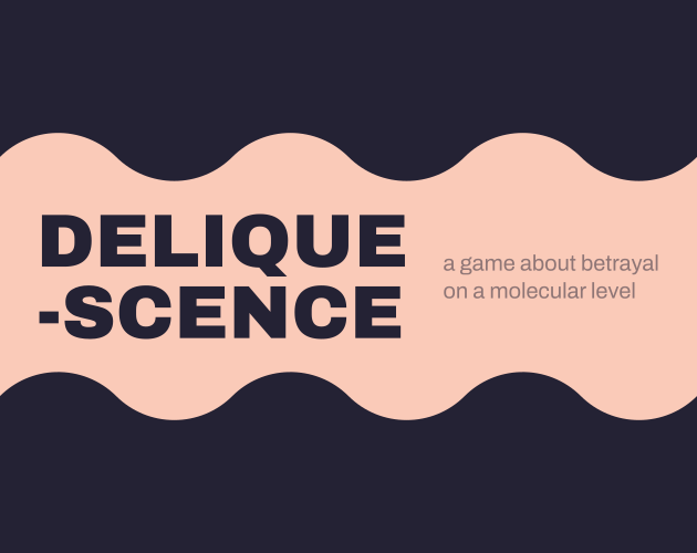
A light peach background with a large wavy dark purple stripe which is thick enough so the other end isn’t visible off the end of the cover, one on the top and bottom of the cover. Thus simulates the effect of a strip of wavy water in the center. In that center peach background, the word DELIQUESCENCE in big blocky capital letters of the same purple as the waves lies, separated onto a second line between ‘DELIQUE’ and ‘SCENCE’ with a dash. Next to it in lowercase, very thin, lighter coloured letters is the phrase (phrase? more like a sentence without punctuation) saying: “a game about betrayal on a molecular level”.

Okay. Okay. Okay. I just have to wrap my head around this concept. In the meantime, lemme do the cover. The simulation of a sort of river using the wavy purple stripes on both sides is an interesting idea, assumingly to show the things deliquescing (is that a word?). Purple and peach are interesting use of colours, though. Sort of soft colours, a nice and connecting palette. For me, it feels comfortable yet cold, like if you were happy where you were, but at the same time had this irremovable chill down your spine. Lukewarm. Is that the idea the author was trying to get across? I don’t know. But I think it’s nice. A horrible peaceful moment. Bittersweet, but neither bitter nor sweet. But you get what I mean. The boldness and punchiness of the title DELIQUESCENCE is confident, maybe a little too much so, considering the game and what it’s about. And the writing next to it feels timid. Not wrongly so, yet it’s probably how contrasted it is with the cover that makes it feel like that. As well as that, the subtitle: “a game about betrayal”, I thought somebody did this to the friend. And then you move on, strangely slowly, to see “on a molecular level”. And there I began to wonder. Is it just that her body and that physics and chemistry in general is betraying her, or did I do this? I think the former is more likely.

Now the blurb. I just have to say: what. Casually, or at least without big exclamations, that your friend is melting. I think there’s something about it that makes me feel distant from this friend, almost as if I didn’t care about her much. “Your close friend” - no name, just a label of friendship. Which, well, fair enough - but at the same time, I want a connection, especially to someone who “is melting”. It just feels fair. Anyway, this friend is melting. She’s just straight up melting. No explanation. Just some molecular betrayal. And where will you be? Are you going to care for her? Or ignore her? And five possible endings. So a moderate amount of choice, even for a small game. Generally, I think, short games have more endings, because it makes it easier to replay to find a different ending. But yeah. Melting friend, and a good use of content warning. Not too vague, but not overly specific.

Overall, very thought-provoking cover art, good / slap-bang there-you-go blurb (which is good in this case).

TLDR: I have to play this.

2 Likes

I’ve taken a short break over the weekend, during my (short and risky) release, and taking some time to think about that. So I’m back, although admittedly more tired than usual, with…

A few hours later in the day of The Egocentric

Blurb

Walk around a comic strip starring an egocentric truck driver. But you are not him. You are a jaded cop with a case to solve. Your story unfolds in the captions below as you try to outwit the young trucker and his frighteningly tough uncle.

Not everything is as it seems, however. Arm yourself with a sharp sense of satire to uncover the truth about your adversaries. Beware, you might just end up exposing the real story behind your own badge in the process.

Very short play-through time, but success will require some replaying. Click the question mark on the game’s title screen for a walkthrough.

Alt Cover Text

The image is a cartoon sketch. In it, a man (supposedly a bodybuilder) in tight jeans and t-shirt holding a duffel bag over his right shoulder walks away from us, toward a gym titled “dygnet ruht GYM”. Inside the gym are two people, one of whom is boxing someone off to the left. The main man (walking toward the gym) has a thought bubble, in which are the words, “Open 24 / 7 - tsk… That’s redundant. I already called to check the hours.”

To start with the cover. It’s a curious image: who is this person? And what does checking the hours have to do with the plot? (I guess it’s meant to be a joke, but I don’t get it…) Is there some sort of mystery to this person is, or am I overcomplicating this?

Also, the title is really strange to me: “A day in the life of the Egocentric” are the overall vibes, but we get stuff about how long later. Later than what? Or is it some commentary on the context given in the blurb - how you’re a cop following this truck driver, and you’ve been waiting for hours? Actually, first, let me talk about the blurb. It’s a cool but probably worn-out trick: “the story of xxx is really awesome. But this story is not about them.”, or, more obviously to the situation, “follow xxx around as they do yyy. But you are not them.” Either way, I think it’s lost a lot of its charm. But it’s still not bad to have if you want it - it’s just not totally original anymore. Then we use metaphors such as “arm yourself” with “satire”, which is funny because cop arms himself - geddit? geddit? But then it sorta has this weird sentence to end that second paragraph, which is when it turns serious - but it doesn’t quite make sense. You’re exposing your own story? Yeah, but in-game “you” already knows your story, unless you’re an amnesiac - and no signs point to forgetfulness - unless you forgot that you had amnesia - in which case we go round in an ever-spiraling circle like those optical illusions you might find at the science museum.

So overall? Basic cover that doesn’t quite do it for me, and a blurb that does catch that sense of satire, but renders it confused or damaged like a bus ticket that you fold over and over as you wait for thirty minutes, and by the time the bus is there you know what it says and you know why, but its proof has faded.

That was a terrible analogy.

1 Like

The Garbage of the Future

Blurb

On a dark and ominous night, two workers drive to the lake to do a job. It’s a dirty and difficult job, but somebody has to do it. It’s probably best not to think too much about it, or about the strange feeling that something horrible is lurking in the shadows…

A short horror story/game about a tanker truck operator, and the small possibility that he might live to see another day.

Alt Cover Text

A tall ink drawing of a person standing next to a large truck in front of a set of trees, one of which has a sinister face in it, and behind a dark night sky. The person is holding a hose that comes from the truck and into a large body of water below the man, and out of the hose flows what is supposedly garbage or oil.

Can I just say to begin that this image, to me, is really good. There’s something simple about it, yet complicated and dark. Something almost lurking about how it looks at this person makes them look so small. But apart from that, it sets the mood of a dark and looming forest, and the way the water is immediately below the person’s feet. Ready for him to sink.

The blurb is simple, with a nice amount of mood but not much to strengthen it. The feel of helplessness is layered here, and a presence that may or may not appear. However, just to point out, it probably wasn’t necessary to say “story/game”. Probably just one of the two. I like how at first, the job itself isn’t specified, it’s unknown. Then the blurb compliments the art and the title, but for that short moment you’re left hanging in the darkness…

Overall, a good art work which catches the eye (sort of) and a blurb that’s good, but just a little thin.

2 Likes

Miss Gosling’s Last Case

Blurb

“We are saddened to report that Miss Winifred Gosling of Marswich Green met her untimely demise this morning in a heartbreaking canine mishap. Miss Gosling, 76, was well-known for her long and illustrious history of crime-solving, and her loss will be keenly felt…”

What utter drivel! It wasn’t “a heartbreaking canine mishap”, it was arsenious oxide poisoning, and a basic Marsh test would have demonstrated that beyond a shadow of a doubt. But alas. Once again, it seems, you must take it upon yourself to do the constables’ job for them, armed only with your wits and your loyal collie—and solve the case of your own murder.

Content warning: Genre-typical depiction of dead bodies and discussion of murder, but no violence or gore

Alt Cover Text

A light cartoon image of the bottom of a set of brown stairs in a house to the left of a landing. In the top of the image, a doorway to another room is cordoned off with yellow tape in a cross. And more importantly, at the bottom of the image: two legs sticking out of a pink dress with pink shoes on, and the rest of the body is off screen. In the bottom left is a grey-and white dog. In large, dark red letters, the title “Miss Gosling’s Last Case” is displayed at the top of the screen.

So, the design of the image is very off center. Miss Gosling’s pink shoes are very wonky and are shaped on her feet in strange shapes, and the dress is slightly off. This all gives the feeling of this light game, which could be slightly childish yet also could just be more comedic. The colour scheme uses easy-on-the-eyes colour palettes, and this helps bring about that sense of calm. This isn’t a violently fast-paced game; it shouldn’t be depressing and it definitely shouldn’t be horror. It’s laid-back - to an extent. The big red letters are bold, giving this feeling of somewhat urgency, yet not being too over the top. The dark red is not hard on the eyes, the letters are rounded and lowercase, and it seems fairly careful about not being too in-your-face.

The blurb starts with this long quote from what seems to be an obituary, but just as it seems to go on just a little, it pulls you out - not suddenly, but gently, and reflects then on what you have read. It’s not funny, per se, but it’s light and slightly satire. You get this sense that “this person knows what they’re doing”, considering how this narrator casually talks about “Marsh Test”, which admittedly I have never heard of. If perhaps this is actually a well-known thing, correct me. But anyway, you’ve got hints on who this narrator in but there are doubts in each direction. Which is when it decides to lay down the final moment of clarity - definitely good at drawing people in (at least me).

Overall, a slightly wonky cover meets a well-designed blurb in a middle ground that seems careful at shocking their audience while emanating a nice surprise for them.

1 Like

A Warm Reception

Blurb

You’re a reporter assigned to cover the wedding of the princess of the land. When you get there, you find an empty castle and are pulled into the mystery of what happened.

Explore a vast castle. Solve baffling puzzles. An old school style text adventure without the old school cruelty. Excellent for new players and veterans of the genre (has in game instructions and a limited list of verbs to reduce confusion).

Alt Cover Text

A painting of a grand gray castle on a large hill. Near the bottom of the hill is a small (shoulder-height) white brick wall, and walking in front of this wall on a road is a person pushing a horse along. In ornate black storybook gothic lettering above the castle, layered over the plain sky is “A Warm Reception”; and below the castle, in front of the hill, are (in the same lettering but a tiny bit smaller) “Come for the wedding,” and on a new line, “Stay for the adventure”.

The cover has this very bleak feeling. Everything is mute and grey, old and medieval. The sky is a shade of blue-grey; the castle is grey stone; the hill is a very dull green - it’s as if somebody were painting England at anytime from autumn to spring. For all I know, they could be. The drabness of the sky. The lifelessness of the grass and the people. Don’t get me wrong, England is great, but its weather isn’t. The lettering (which for one is black, which I didn’t expect) is old and gives the sense that “Toto, this isn’t Kansas anymore…” (Or what she actually said in the story.)

The blurb is promising: an adventure-filled castle when a reporter does stuff that reporters would love to find in real life: the stuff that could get them appearances on multiple different channels. A missing wedding. Anyway, it mixes the current and the meta, as a good many do. They stay separate however, which is not particularly interesting nor different but worth mentioning. Getting the older school players while promising not to waste people’s time (“without the old school cruelty”), time being the essential word here: people live to imagine they prepare their time wisely, but they do also love to waste a lot of it lost in a world of … Well, whatever floats their boat. So this was subconsciously a good addition to the blurb.

Overall, an interesting but ultimately too dull (for what you’re describing) covert, and a blurb that certainly gets the job done, if only a little too extensive when getting to verbs.

Verses

Blurb

Then the externality comes apart like something wet. Then the truth reveals itself to be a nutrient or a poison. Then the sun goes away and the rain comes, and you and I freeze in it, the translucent bluishness of our skin.

Content warning: animated text/flickering, violence, unsanitary

Alt Cover Text

A white rectangle, in which is an almost perfectly rectangular (with a few tiny notches on some sides) turquoise mosaic inside, made of many wonky and not quite perfect squares of paint. All are turquoise and of one shade or another, and there is a dark patch near the bottom right.

The cover is certainly a good way to use the word “curious”, which I admit I may have overused during my cover art studies so far. It’s slightly imperfect in many places, which is think is purposefully done to enhance this imperfect feeling. It feels … almost right for something as simple as this. The shading itself I don’t think carries much meaning, but it’s a weird cover.

The blurb… The blurb. Nice use of anaphora with “Then the”, and clever to maintain its reader’s focus with the power of three - not boring, yet. And every sentence in itself - has use of complex words, which makes for something that feels slightly off-key. Weird. As if (and I do know what the game is about, but I’d think this either way) its meaning was lost in translation. The first one - ‘externality’, which from looking it up, doesn’t quite seem to work as something that comes apart, and why something wet is beyond me. As if externality has another meaning. Probably it does anyway: I just did a quick Google search, so it may have been missing. The second sentence is fairly clear, as the truth is revealed: nutrient (good [for you]), or a poison (bad [for you]). It’s clear what it’s trying to say, though the metaphor is fairly odd. I like it. And the third sentence makes the most sense by itself: the cold rain, the sadness. Though the reference to the ‘bluishness’ has no clause, leaving it hanging. Which again adds to that theme of translations being lost. Also a side note: the content warning notes “unsanitary”. Unsanitary what? Maybe this is intended, but it feels hanging.

Overall, an eye-catching cover that is fairly simple, and a blurb that stores a lot of … curious … meaning.

3 Likes

The Lost Artist: Prologue

Blurb

All artists deserve to be free. Don’t you agree?

This is a narrative driven game made to simulate the experience of being a successful detective on the cusp of a strange case.

Simply the prologue. What would you do with a whole story?

Alt Cover Text

On a black screen, in the center the word “Artist” in army green, bold and sentence-case lettering.

The cover is a little too aggressive. Paired with the blurb, it feels oddly like the author is trying to say “Here you go; now go away. And I don’t care what you think at all, but you better enjoy it.”

Okay. I went way too overboard there myself. It’s not that aggressive. In the blurb, there are two rhetorical questions. One is prompting you to think about freedom. It’s a leading question, and it makes up the opening paragraph. It’s interesting, for sure, but a little forced. If you know what I mean. Then it goes into the description of the game, which sounds like it really could be cool. But it’s cut shirt with no further explanation of the plot and tells you that basically you’ll barely be experiencing any of it. And then it asks you something weird: “What would you do with a whole story?” Well, a lot. This question feels like justification for not finishing off the story. Which is totally fair, it just feels a little too much like … a “deal with it”.

Overall, the cover is bare and the blurb leading before cutting the string.

1 Like

One thing that didn’t come across quite as well as I’d hoped: the cover is supposed to look like a papercut (with all the elements cut out of different types of paper and stacked on top of each other). When you’re not great at drawing, stylization is your friend!

2 Likes

Quest for the Teacup of Minor Sentimental Value

Blurb

A shadow grows in the frozen north, and dark forces assemble in the wilds and on the roads. Fortunately, you run a small tearoom in a quant forest village and so it is not your job to deal with any of that. Unfortunately, your favourite teacup has suddenly and mysteriously gone missing.

It shouldn’t be too hard to track it down, though…right?

Thanks to Brad Buchanan, G. Deyke, and Joey Jones for playtesting.

Content warning: Infrequent, mild profanity; Actual, Literal Satan

Alt Cover Text

A brightly lit photograph of a person in a white t-shirt holding a teacup full of a dark brown tea. Over this image, in cracked yellow capital letters, the title of the game.

The cover is a cover of contrasts. On one hand, you’ve got something light, happy, warm (the photo below). And then over this, you’ve got this text very reminiscent of the cover of “The Vambrace of Destiny” from last year’s IFComp. The cracked texture I guess is supposed to make it look old and fantasy based. With this very serifed capital font that adds to this “Scorcher VIII” feeling. Which is why this contrasts so much with the background image, which is probably a stock photo, and is probably also used to get people to drink tea for a certain company, as well as the name itself, which aligns more with a funny version of the image than with the font used. In short, I get the feeling it’s either a bad game, or a self-aware satire. With such a name, I think the latter is certainly more likely.

The blurb kicks off in a direction more font-style-focused, and has this heavy, gritty, LotR feel, before making an 180-degree turn and walking in the complete opposite direction. And that foreshadowing in the next paragraph … it’s so obvious it’s kinda funny. Also the “infrequent, mild profanity” literally feels like a rhythmic buildup to “actual, literal Satan”: they both have a similar structure. Although if you put “mild” before “infrequent” it would work better.

Overall, a clever cover and blurb that just serves its purpose.

I didn’t reply earlier @SomeOne2 but just want to say loving these reviews. And mucho thanks for your Bad Beer one! Glad you found the cover uncanny! And that it felt like chalk drawn. I designed it in an iPad art app, using a chalk brush :slight_smile:

2 Likes

Turn Right

Blurb

Long day done, groceries bought and you’re so nearly home!

Unfortunately it’s rush hour, and getting out of this supermarket car park is a difficult job at the best of times.

Will you ever get out of this place? It can’t take forever, can it?

All you need to do is turn right…

Alt Cover Text

On a black background is the text “Turn Right”, one word per line, in a basic yellow font. On the second line with “Right”, there is a thin yellow arrow pointing to the right.

The cover makes sure you know what you’re doing. In a summary, it’s trying to get you summarised. Sort of. (I know I’m being confusing, but I don’t know why.) The yellow is bright but not harsh - it’s like the yellow at an American traffic light, albeit without being able to see the specific LEDs. The connotations of such a reference could be slowing down, or in a state of limbo/purgatory: not stopped, but not going anywhere. It’s the kind of things yet get mundane nightmares about. It’s a nightmare central heating in English winter: not strong enough to cause an explosion or anything, but it’s that slow constant heat that gets to you, especially with all that excessive humming going on in the background. Where heat = nightmares. And the humming is just humming.

The blurb promises a good time that, softly and slightly idly, it removes from you. The blurb is just too short in its paragraph length, especially that very first. If you’re going to make it short, make it feel like it should be short. If you want to make it a long sort of sentence as it is at the moment (which if pulled off well is often better), make it long. It feels like you’re pulling away what should be something much longer and making it squeezed.

For example, a short version would be:

Long day: finished Groceries: check. Car keys? Got 'em.
(...)

Or, long would be:

Even a long day at work can't hinder your plans for a nice spot of wine afterwards at home. Fortunately, you've just done all the groceries, which was way harder than it looks when you're by yourself - and now you're packed up and ready to drive out and get home.
(...)

Know what I mean? The final paragraph uses that “All you need to do is xxx” seen in games like Violet. It’s not bad. Perhaps a little overused. But at least it’s done well.

Overall, a simple cover with a snappy blurb that needs to follow through with its goals more carefully. Should be a nice little puzzler, probably.

1 Like